Text Area
Overview
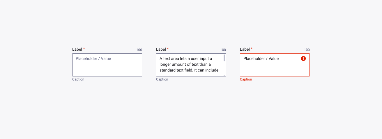
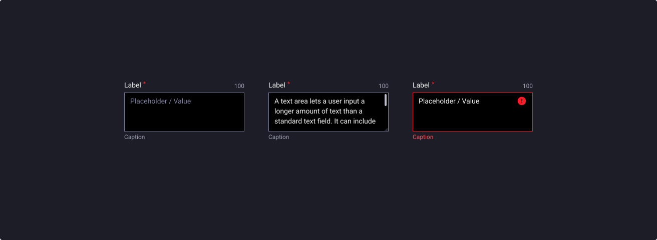
A text area lets a user input a longer amount of text than a standard text field. It can include all of the standard validation options supported by the text field component.
Usage
When to use:
- Use the text area if you want users to enter multiple lines of text.
When not to use:
- Users need to enter a single line of text. For this we recommend using the text input instead.
Anatomy
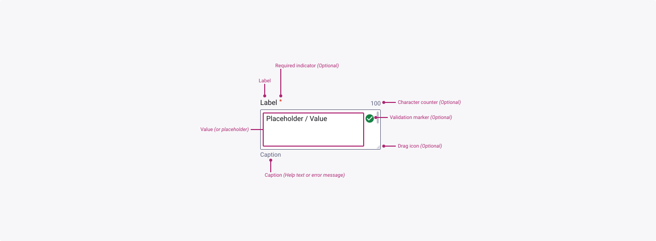

Properties
From the design point of view, each component has a number of options. These options and their names are platform agnostic, and each implementation should adapt these to fit into their framework. In Figma, these are defined as properties that help define each variant.
Heads up
A star or asterisk symbol (*) can be used as a prefix to some Figma component properties in order to inform that the corresponding property is only used that way on the design side (Figma component libraries).
❖ Component: Text Area
| Property | Values | Default |
|---|---|---|
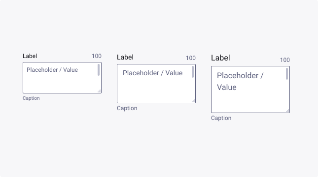
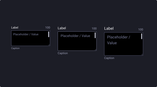
| size | small / medium / large | medium |
| state | default / hover / active / filled | default |
| severity | default / success / warning / error | default |
| disabled | false / true | false |
| hasLabel | boolean | true |
| label | text | “Label” |
| required | boolean | true |
| charCounter | boolean | true |
| placeholder | text | “Placeholder” |
| hasCaption | boolean | true |
| caption | text | “Caption” |
| resize | boolean | true |
| scrollable | boolean | true |
| successIcon | instance swap | check_circle |
| warningIcon | instance swap | warning |
| errorIcon | instance swap | error |
Behaviour
Minimum height
Text areas are ideal for long sentences or paragraphs, and should comfortably accommodate large amounts of text.
They should have a minimum height of 80px (medium) or 64px (small) on a desktop and 96px (large) on mobile (when the height of the text area is a defined number).
Overflow
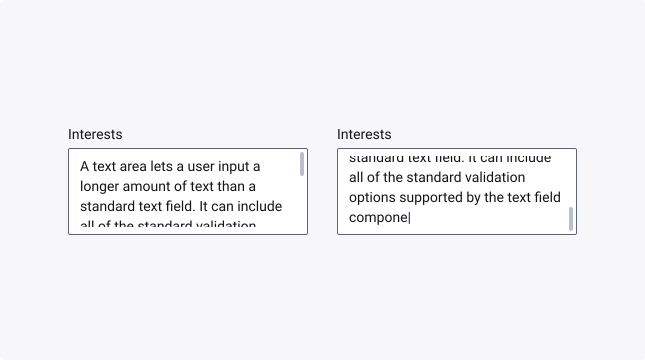
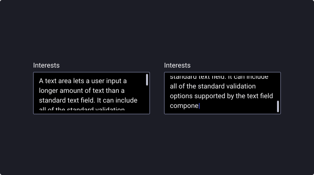
When typing into a text area and reaching the end of the field on a fixed-height text area, the cursor should continue to follow the text as the user types, while the rest of the text above overflows through the top of the field.
Note: in Figma to reflect the active typing behaviour, you can change the text alignment to align bottom as opposed to align top.
When the field loses focus, text should overflow through the bottom of the text area, showing the beginning of the text.
Caption text overflow
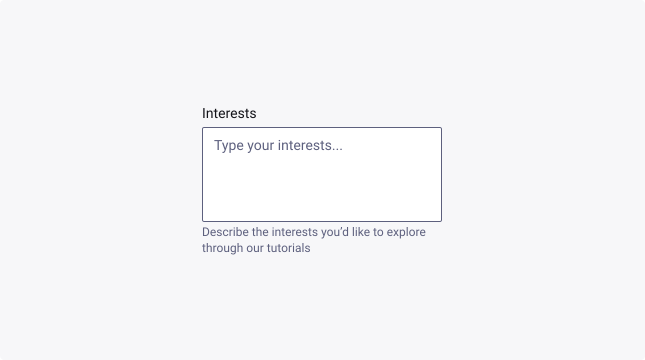
When the caption text is too long for the available horizontal space, it wraps to form another line.

Character count
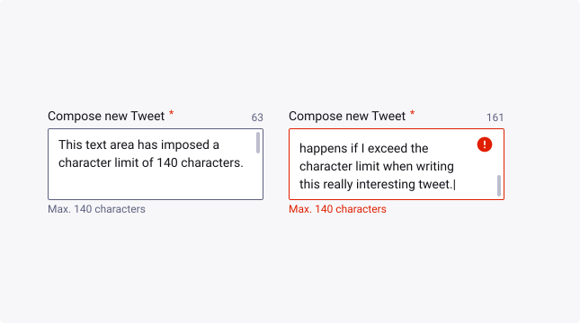
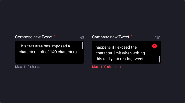
Text areas can display a character count indicator when the length of the text entry needs to be kept under a predefined value. Character count indicators can be used in conjunction with other indicators (e.g., validation icon, “optional” or “required” indicators) when necessary.
We have intentionally left this specific error state out of our design, as it can be reflected in many ways and this component is flexible enough to customise it how you need it.
Drag icon
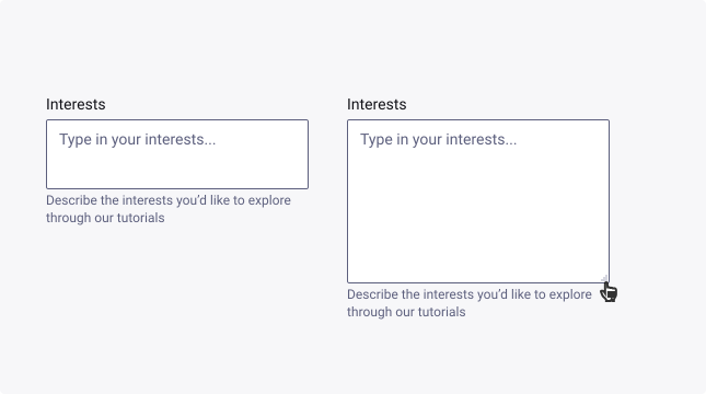
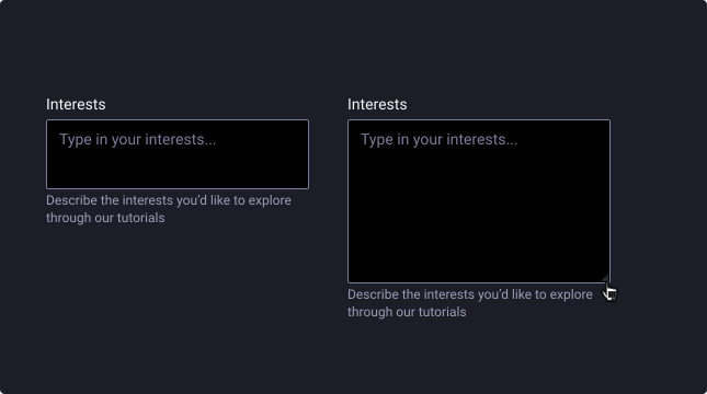
Text areas can either be a fixed size or can be resizable with a drag icon in the bottom right corner. The drag icon should be hidden if the fixed variant is turned on, or if the text area should not be resizable.
Caption text (description or error message)
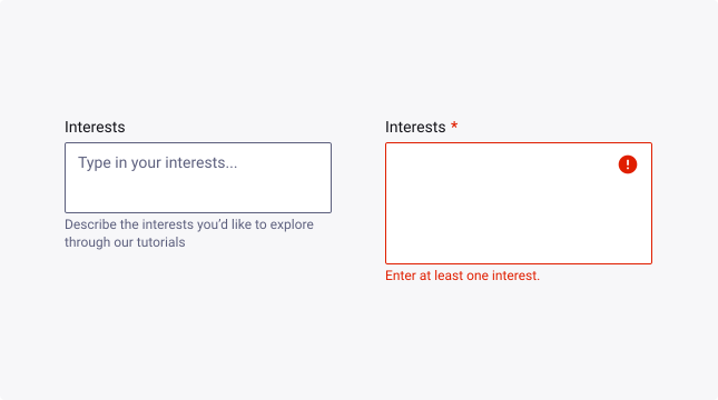
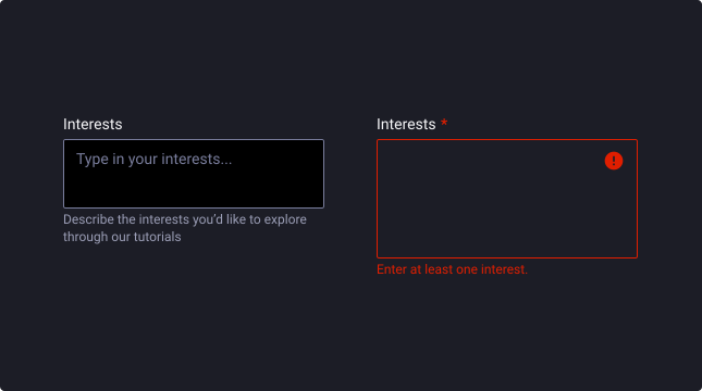
A text area can have caption text below the field to give extra context or instruction about what a user should input in the field. The caption text area has two options: a description and an error message.
The description communicates a hint or helpful information, such as specific requirements for correctly filling out the field.
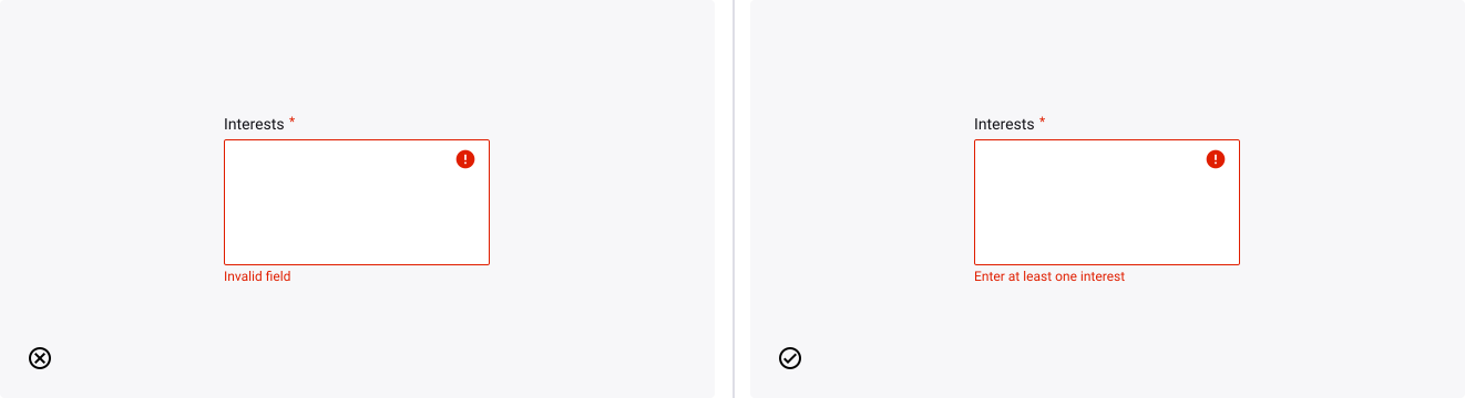
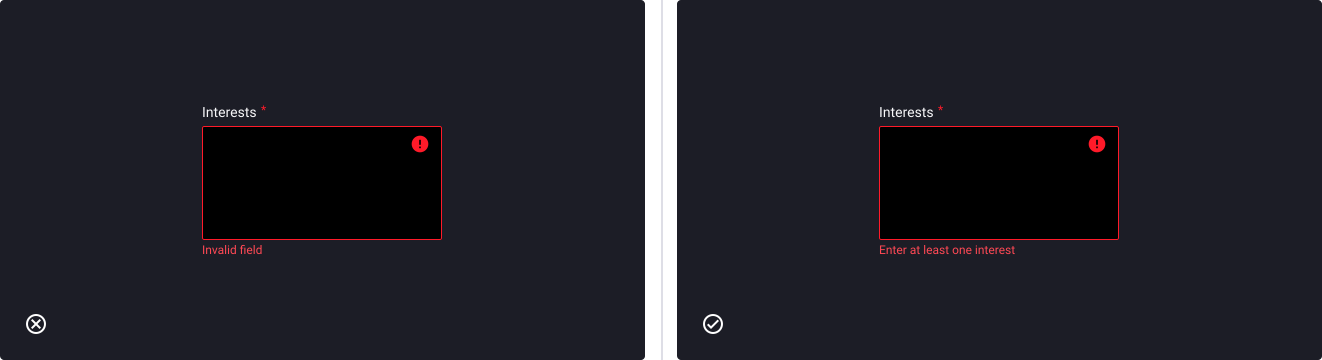
The error message communicates an error for when the field requirements aren’t met, prompting a user to adjust what they had originally input.
Usage Guidelines
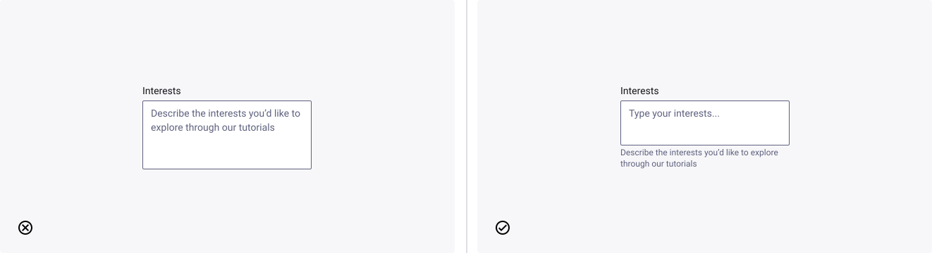
Use captions instead of placeholder text
- Don’t: put important instructions as placeholder text, otherwise that text will no longer be viewable when the user begins typing.
- Do: use the caption text to convey requirements or to show any formatting examples that would help user comprehension.

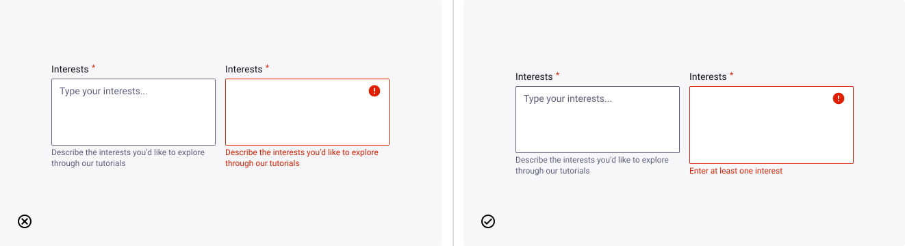
Switch caption text with error text
- Don’t: use the same caption text when presenting an error. Use the error text as an opportunity to help the user understand why something is incorrect.
- Do: replace the caption text with error text. Then once the error is resolved, the help text description reappears below the text area.
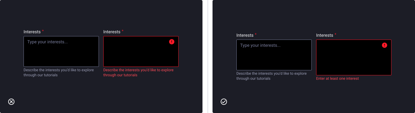
Write error text that shows a solution
- Don’t: state an error and then leave the user guessing why their value is incorrect.
- Do: use a helpful tone to convey a hint or tip to resolve the error, guiding them to understand what needs to go in the missing field.