Tag
Overview
Tags allow users to categorize, label or organise content using keywords.
Usage
When to use:
- Filter data, using the tags to show only items within that particular category.
- Map content to multiple categories or statuses, helping the user to differentiate between them.
- Trigger actions, such as page filters or routing.
When not to use:
- It is purely for decorative purposes.
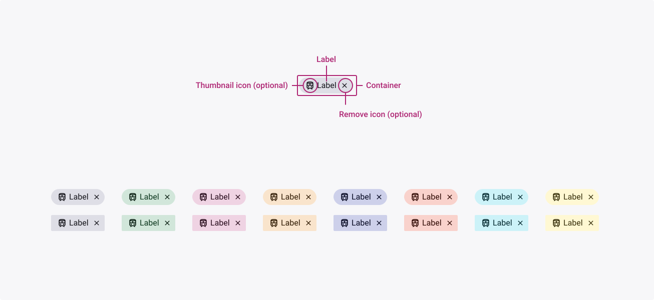
Anatomy
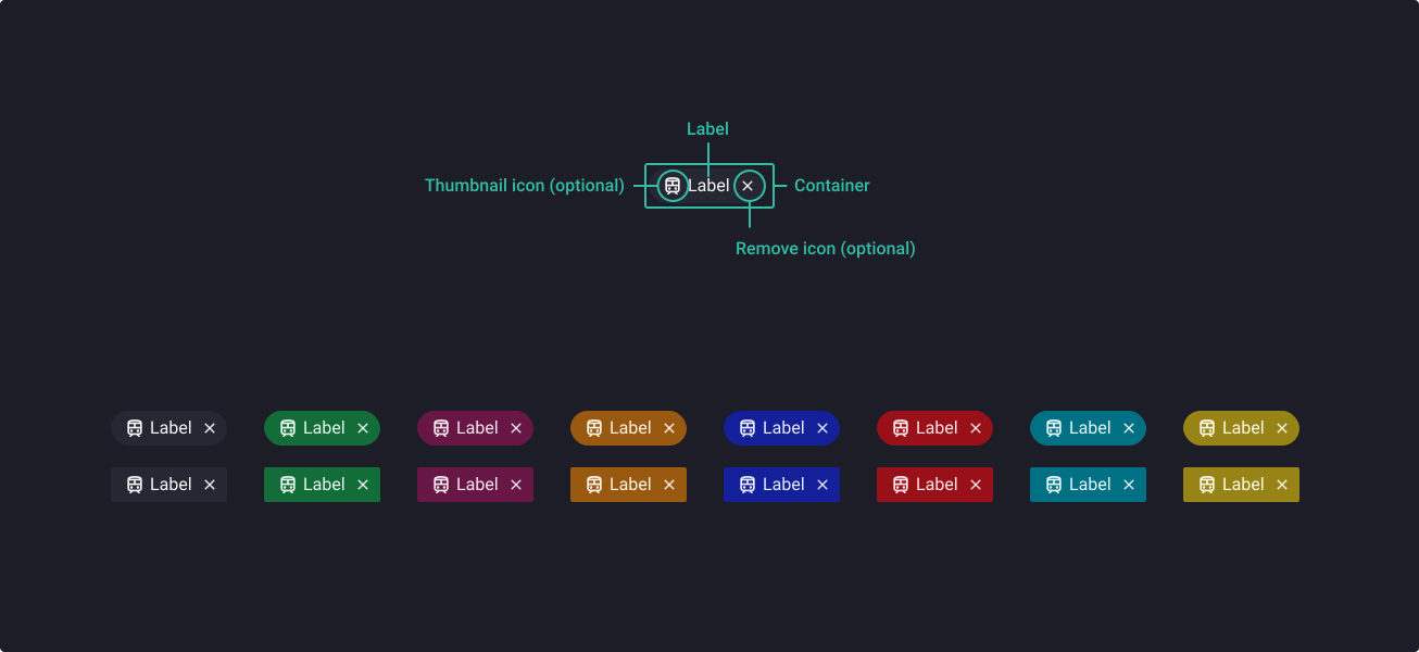
Properties
From the design point of view, each component has a number of options. These options and their names are platform agnostic, and each implementation should adapt these to fit into their framework. In Figma, these are defined as properties that help define each variant.
Heads up
A star or asterisk symbol (*) can be used as a prefix to some Figma component properties in order to inform that the corresponding property is only used that way on the design side (Figma component libraries).
❖ Components: Tags (All colours)
| Property | Values | Default |
|---|---|---|
| size | small / medium | medium |
| shape | rounded / sharp | rounded |
| *state | default / hover / pressed / focused | default |
| selected | false / true | false |
| disabled | false / true | false |
| label | text | Label |
| *hasIcon | boolean | true |
| icon | instance swap | train |
| dismissible | boolean | true |
Behaviour
Using tags for input
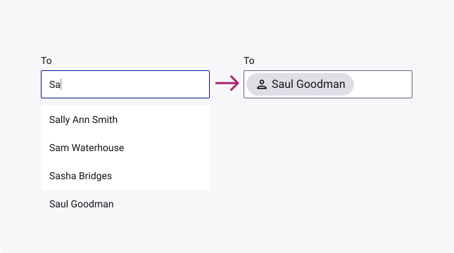
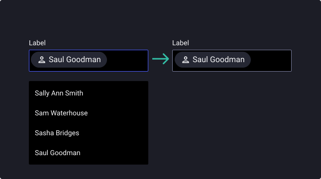
Simplifying information
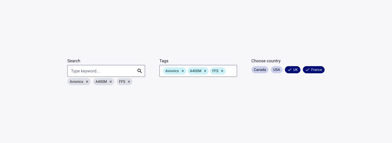
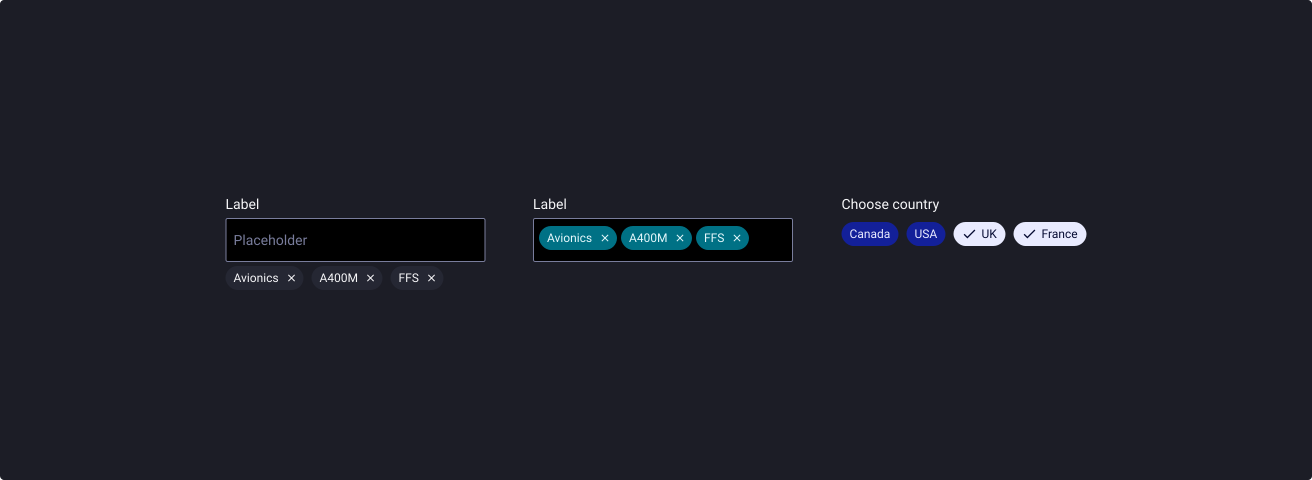
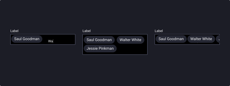
Tags can be used in text inputs to represent a complex piece of information in a compact form, such as an entity (person, place or thing).
Placement
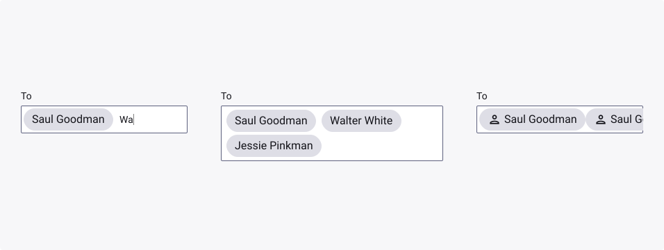
Tags can be placed into input components in multiple ways. They can appear:
- Inline with the text input cursor in a field
- In a stacked list
- In a horizontally scrollable list
Using tags for selection
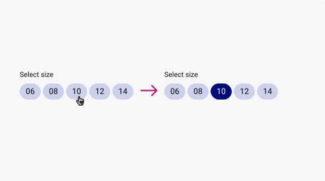
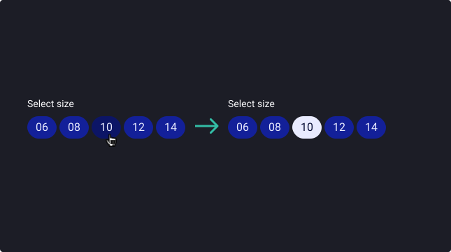
Selecting a mutually exclusive option
Tags can be used to select a single tag from a set of options.
They clearly delineate and display options in a compact area. They are a good alternative to radio buttons, and dropdown menus.
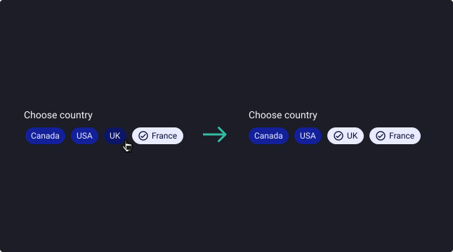
Using tags to filter
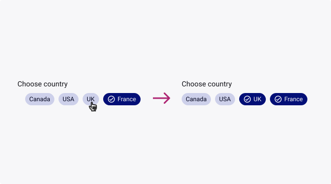
Filtering content
Tags can be used to filter content.
They clearly delineate and display options in a compact area. They are a good alternative to checkboxes.
Using tags as actions
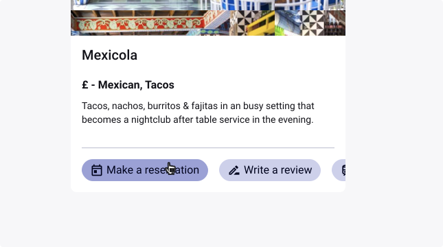
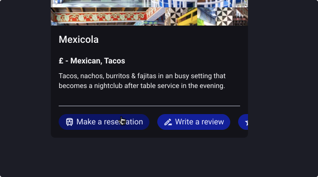
Triggering actions
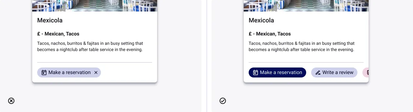
Tags offer actions related to primary content. They should appear dynamically and contextually in a UI and are an alternative to buttons.
Usage Guidelines
Use tags as a group
- Don’t: use tags if the intention is to use it as a single element, use a button or a link as a better alternative.
- Do: use tags in groups, that’s what they are made for.