Group Buttons
Group Buttons consist of a group of buttons that are visually grouped together to represent a set of related actions or options.
Overview
Group Buttons consist of a group of buttons that are visually grouped together to represent a set of related actions or options.
When a button in the group is selected, the selected state is visually highlighted. This can be used for selecting one item among others, renderings of multi-select, as in a style for selecting multiple exposed items in a form or list, or as filters.
Usage
When to use:
- Use Group Buttons when you have a set of related options and want to allow users to select one or many options from the group.
- Use Group Buttons when you want to provide a visual appealing and interactive way for users to make a selection, or change a view.
When not to use:
- Avoid using Group Buttons when the options in the group are unrelated or independent. In such cases, consider using separate buttons.
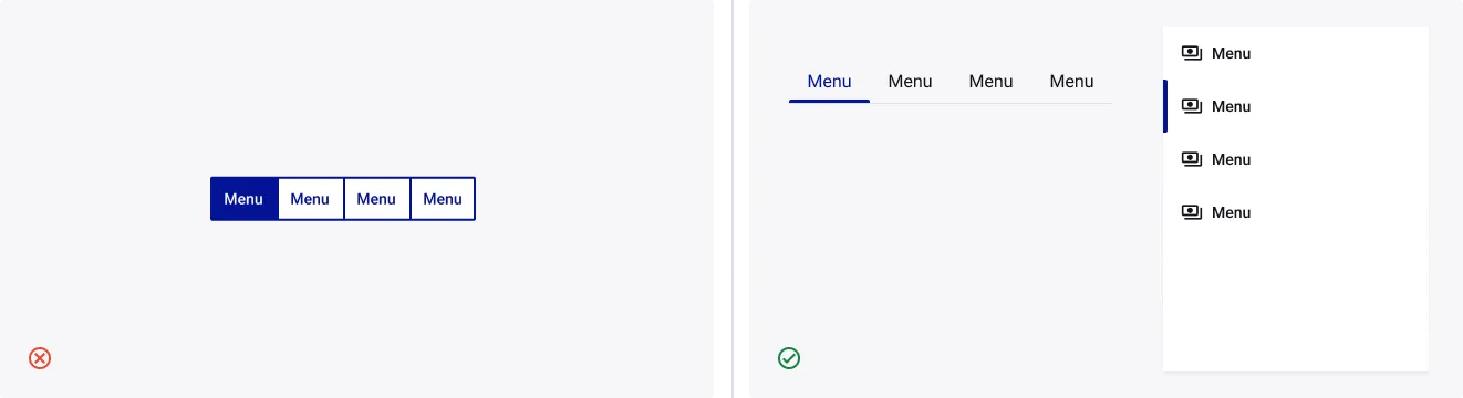
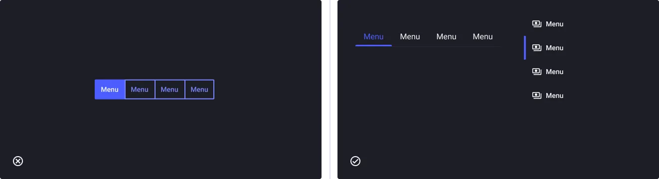
- It is not recommended to use Group Buttons for navigation purposes, as this component is primarily designed for input or selection. In such cases, consider using other UI elements like tabs.
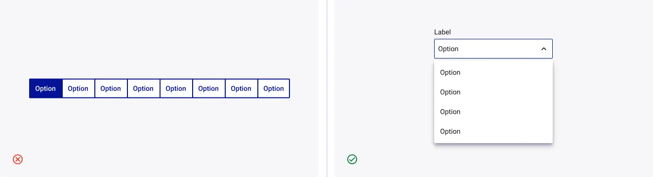
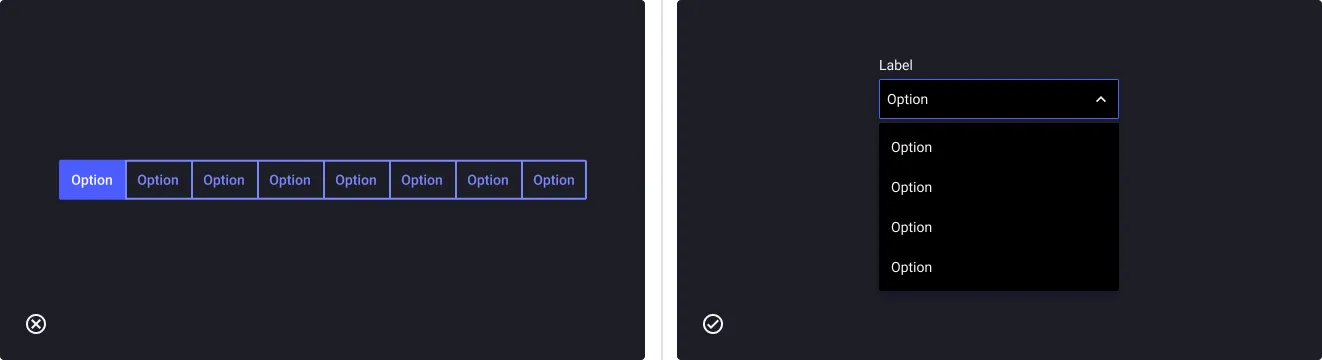
- Don’t use Group Buttons when you have too many actions: separate them into multiple Group Buttons or use a Dropdown instead to overwhelm them.
Anatomy
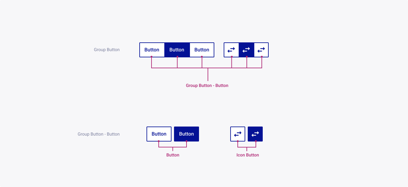
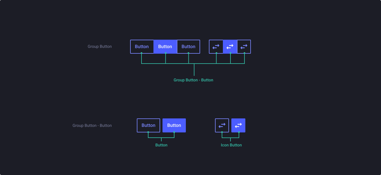
The component anatomy is used to illustrate the general make up of your component, including the spacing and positioning of elements that sit within it.
Properties
From the design point of view, each component has a number of options. These options and their names are platform agnostic, and each implementation should adapt these to fit into their framework. In Figma, these are defined as properties that help define each variant.
Heads up
A star or asterisk symbol (*) can be used as a prefix to some Figma component properties in order to inform that the corresponding property is only used that way on the design side (Figma component libraries).
◇❖ Group Buttons
| Property | Values | Default |
|---|---|---|
| size | small / medium / large / xlarge | medium |
| variant | outline / ghost | outline |
| type | text / icon | label |
| color | primary / neutral / white | primary |
| orientation | horizontal / vertical | horizontal |
| spacing | false / true | false |
| fullWidth | false / true | false |
| 3,4,5,6,7,8 | boolean | 3 |
◇❖ Sub-component: Group Buttons - Button
| Property | Values | Default |
|---|---|---|
| size | small / medium / large | medium |
| active | false / true | false |
| activeEmphasis | medium / high | medium |
| type | text / icon | text |
| style | outline / ghost | outline |
| color | primary / neutral / white | primary |
| orientation | horizontal / vertical | horizontal |
| position | start / between / end / full | start |
| ◇ Button | Nested properties | — |
| ◇ Icon Button | Nested properties | — |
◇ Nested properties: Button
◇ Nested properties: Icon Button
Behaviour
Component behaviour helps to present the states and use cases that the component might encounter.
Group Buttons
Size
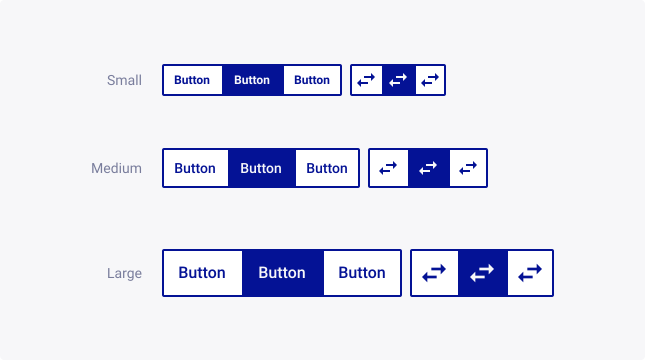
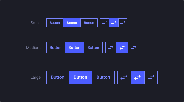
Group buttons exist with 3 different sizes (small, medium and large) to provide flexibility in visual hierarchy and adapt to different layout requirements.
Variants
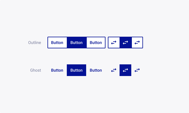
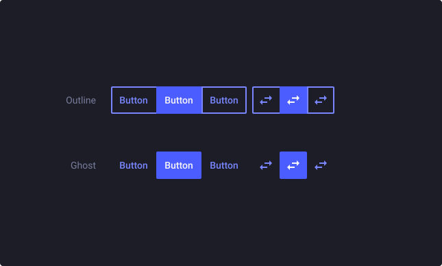
Group buttons can be designed with an outline or ghost variant, which provide different visual styles for buttons, allowing designers to create varied and distinct button styles to suit different design needs.
Outline: Outline variants are designed with a border around the buttons, providing a clear visual separation from the background and other elements on the screen. They can be used for various purposes, such as primary actions, secondary actions, or for buttons that need to stand out in a particular context.
Ghost: Ghost variants are designed with a transparent background, allowing the background or the content underneath the buttons to be visible, while still providing a clear visual indication of the button’s presence. Ghost buttons have a subtle and understated appearance, and they can be used for various purposes, such as for secondary actions, or for buttons that need to blend in with the surrounding content.
Colors
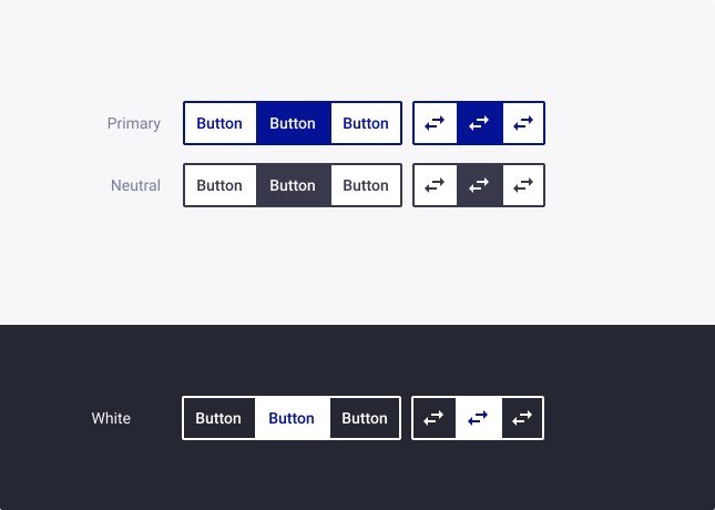
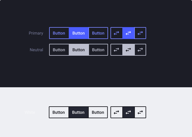
Group buttons can be designed with different color variants to provide visual hierarchy and convey different meanings or actions to users. The primary, neutral, and white color variants offer distinct visual styles that can be used for different design purposes :
Primary: The primary color is typically used to convey the main action or primary call-to-action in a user interface. Primary buttons often have a bold and prominent appearance, drawing the user’s attention and encouraging them to take the intended action.
Neutral: Neutral buttons provide a more subdued and understated appearance, and are often used for secondary actions or for buttons that are less prominent but still important in the user interface.
White: White color variants are designed with a contrasting color palette, such as primary or dark background. Please note that the white variant is designed for light theme only and may not be suitable for dark theme usage. If you need to design for dark theme, use the component from the dark theme library.
Type
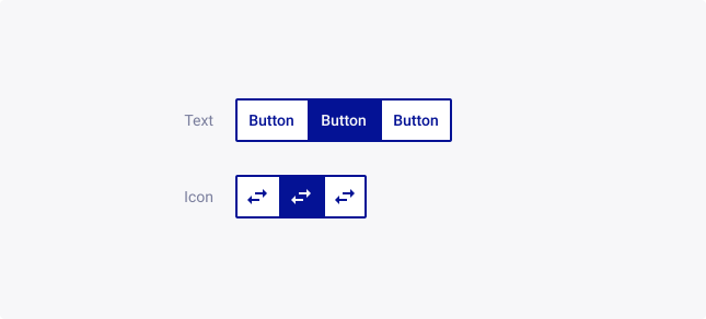
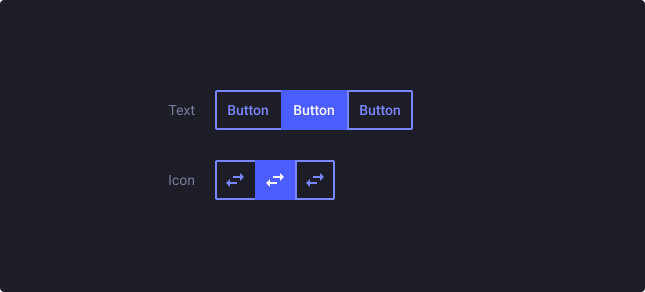
We provide you two types of Group Buttons:
Text Group Buttons: Text group buttons are a type of group of buttons, each containing text labels. Text group buttons are designed to convey information and provide clear and concise labels to help users understand the purpose of each button.
Icon Group Buttons: Icon group buttons are another type of a group of buttons, each containing icons or graphical symbols. These buttons are designed to convey actions or commands through visual representations rather than text labels. To enhance accessibility, tooltips can be added to provide additional context or descriptions for the icons.
Orientation
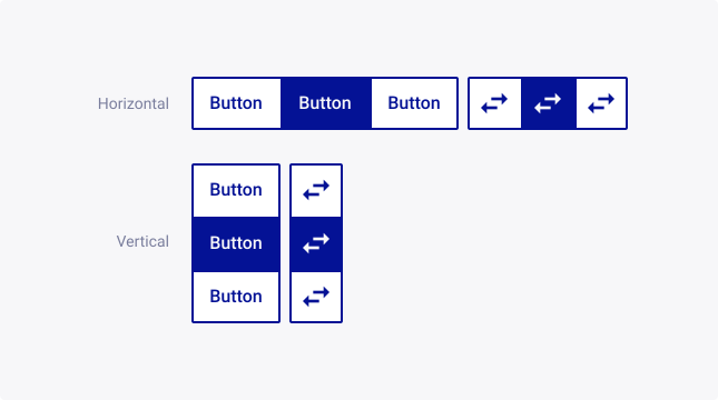
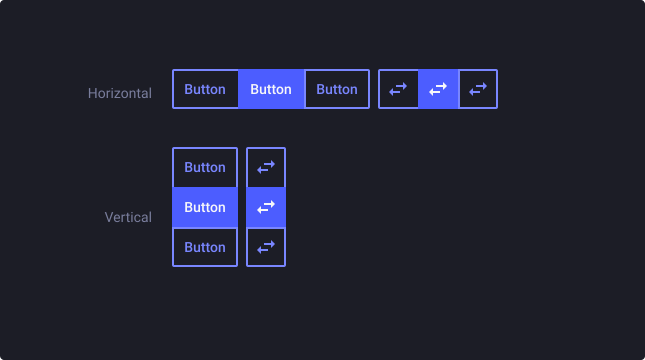
Group buttons can be designed with different orientations, including horizontal and vertical, to suit different layout requirements.
Spacing
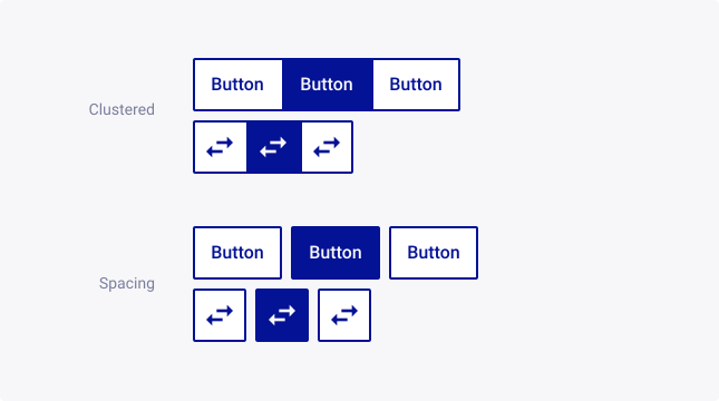
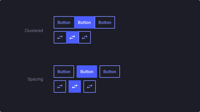
You can choose between a clustered arrangement, where the buttons are placed close together with no spacing between them, or a spaced-out arrangement, where the buttons are spaced apart with a gap between them.
Clustered: Use when you want to group related buttons closely together, such as for a set of related actions or filters.
Spacing: Use when you want to visually separate the buttons from each other, such as for a navigation menu or a set of mutually exclusive options.
Full Width
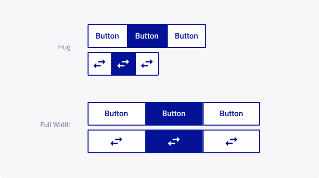
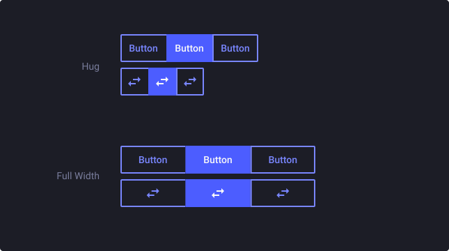
The full width property determines how the buttons are sized in relation to the container they are placed in. You can choose between a hug content option, where the buttons are sized to fit their contents with no extra space on either side, or a full width option, where the buttons are stretched to fill the entire available width with equal spacing on either side.
Hug content: Use when you want the button width to match the content width, such as for a short label or icon-only button.
Full width: Use when you want the buttons to span the full width of the container, such as for a call-to-action button or a tab navigation.
Group Buttons: Button
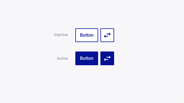
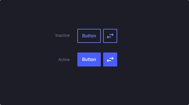
Active
Description about the behaviour, including any relevant links from research and internal Thales use cases.
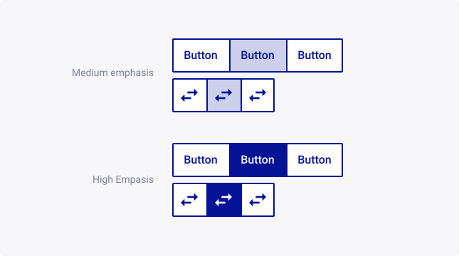
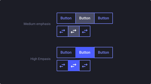
Active emphasis
The active emphasis property determines how the active button is visually distinguished from the other buttons in the group when active.
Medium emphasis: Use when you want to visually differentiate the active button from the other buttons, but not to the point of overwhelming them.
High emphasis: Use when you want to draw significant attention to the active button.
Position
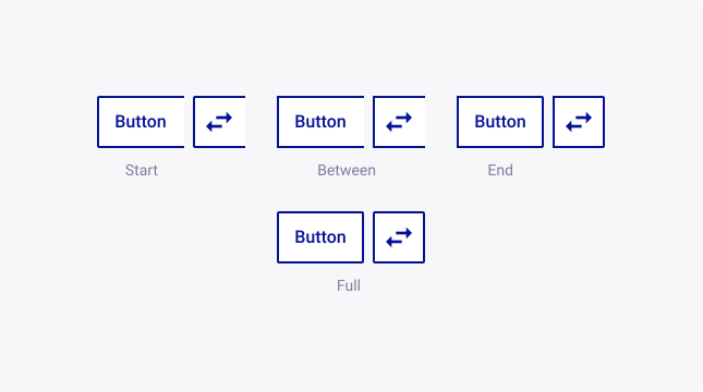
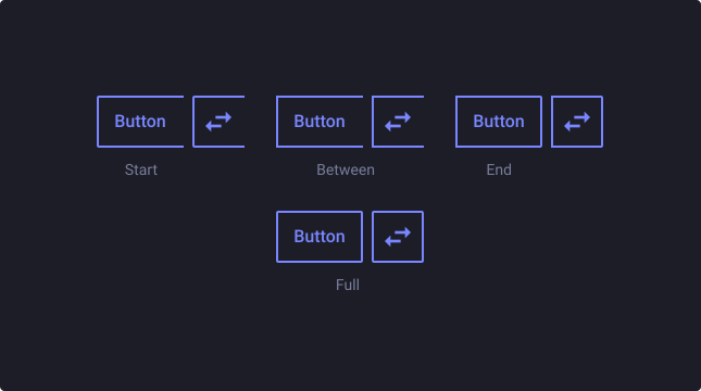
The position property of a button within the group determines its visual position relative to the other buttons in the group.
Start: The button is aligned to the left edge of the group
Between: The button is aligned between other buttons in the group
End: The button is aligned to the right edge of the group
Full: The button is full
Usage Guidelines
Usage guidelines help depict the best practices when using this component by giving examples of the do’s and don’ts.
Appearance
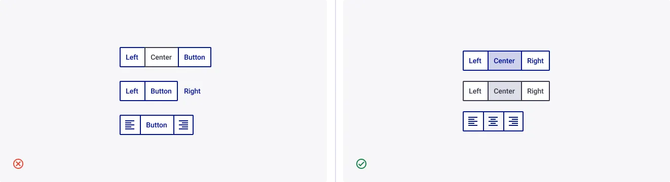
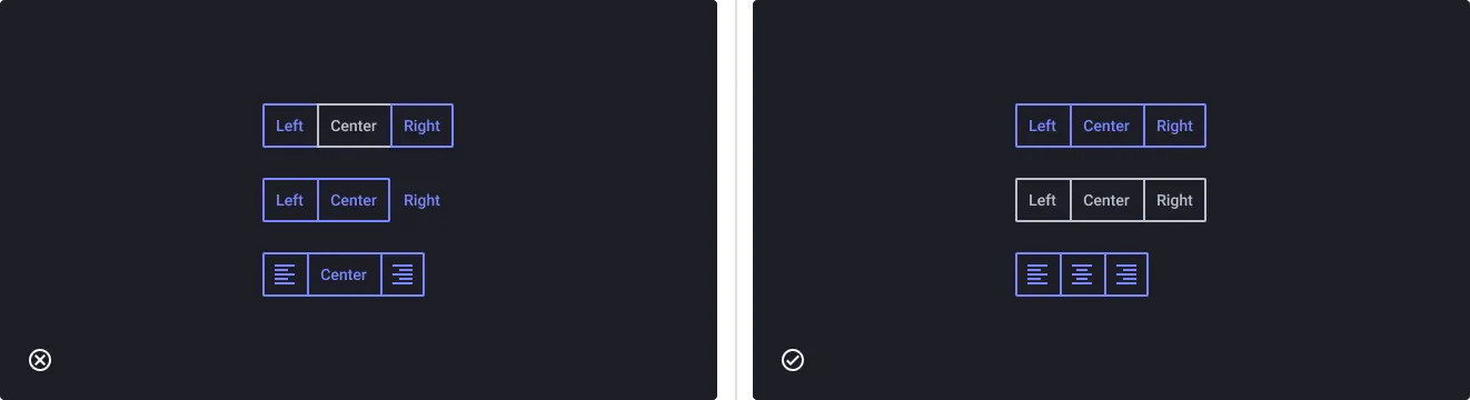
Maintain visual consistency among Group buttons
- Don’t: Mix different button types or colors within the same Group Buttons component, as this can create visual clutter and confusion for users.
- Do: Consistently use one style for all buttons within a Group Buttons component.
Use icons with label only to reinforce action
- Don’t: Avoid using icons in action buttons for merely aesthetic purposes and icons that do not intuitively reinforce the action of the button.
- Do: Icons may be used in combination with button group text labels to further reinforce the explanation of the setting or view associated with interacting with the button.
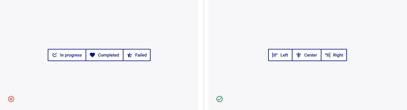
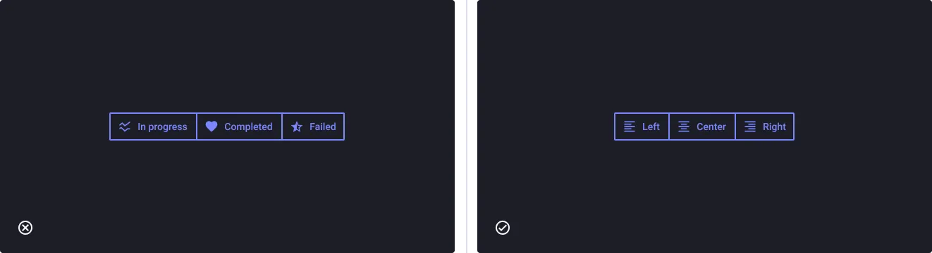
Note: You can add a left icon for Group Buttons - Button by editing its nested properties.
Icon position for labels
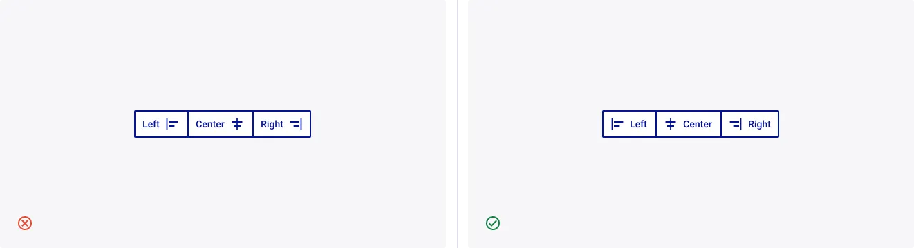
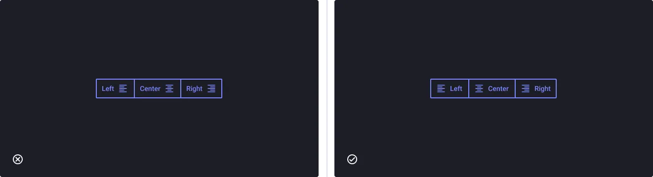
- Don’t: Position icon to the right, as this may disrupt the typical reading direction and create confusion for users.
- Do: Align icon to the left as it is the typical reading direction for most languages, and helps to create a clear visual hierarchy for the user.
Wrapping label
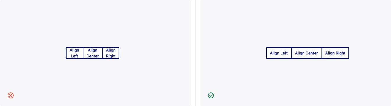
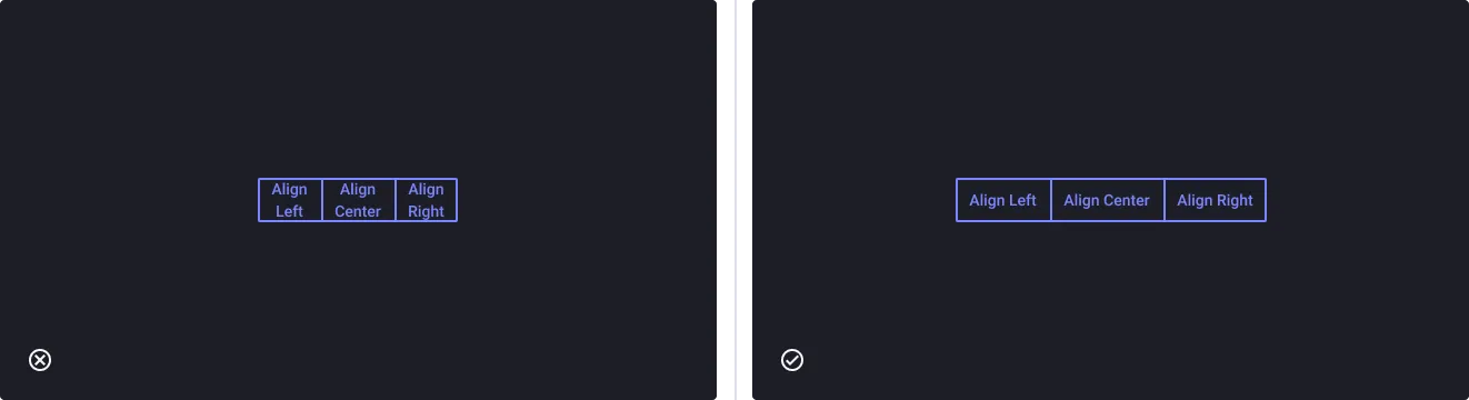
- Don’t: Wrap label text onto multiple lines, as this can disrupt the visual flow of the buttons and reduce their effectiveness.
- Do: Keep the label text for each button to a single line to maintain a consistent and visually balanced layout, improving the readability of the buttons.
Arrangement
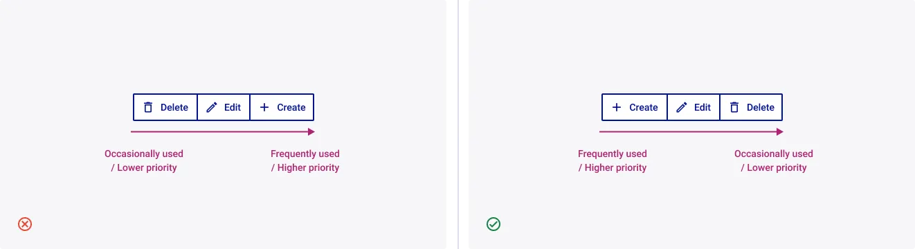
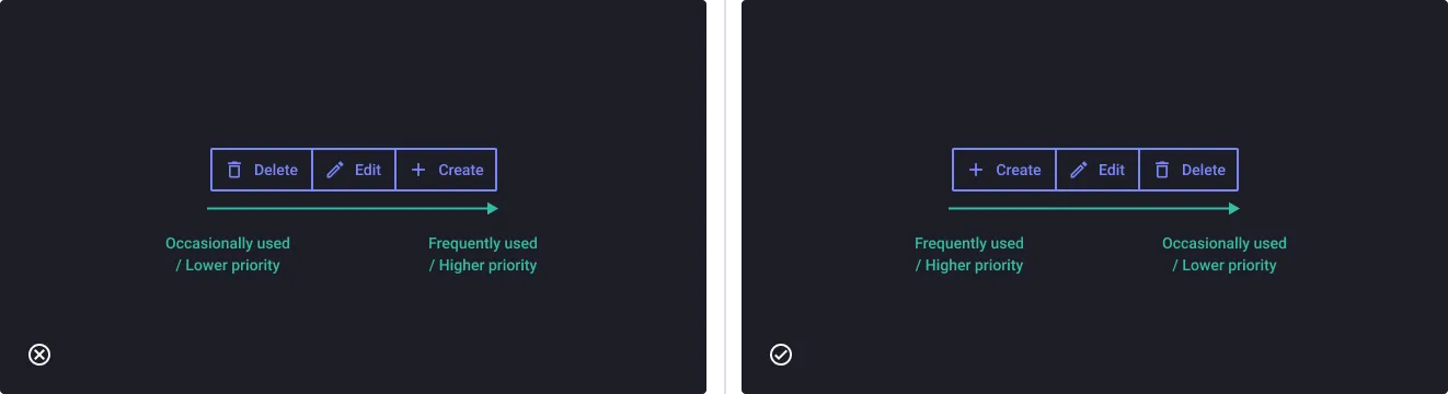
Arrange buttons in logical order
- Don’t: Use inconsistent or illogical ordering of the buttons, as this can create confusion and frustration for the user. This order can vary depending on the product and user needs.
- Do: Do consider the relative importance of each button, and order them accordingly. For example, more frequently used or higher-priority actions should be placed first.
Multiple Groups Buttons arrangement
- Don’t: Bury important primary actions among less important secondary actions
- Do: Position primary actions at first, and differentiate them from secondary actions.
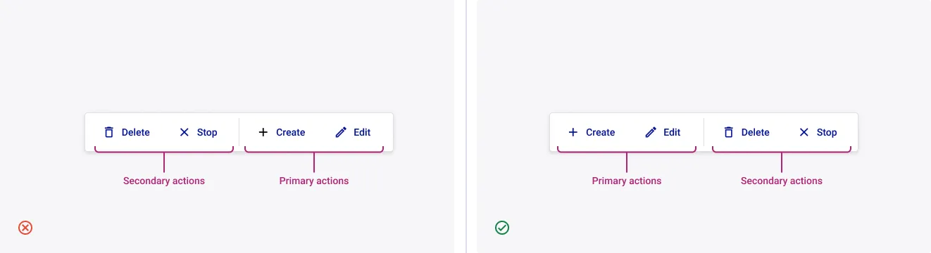
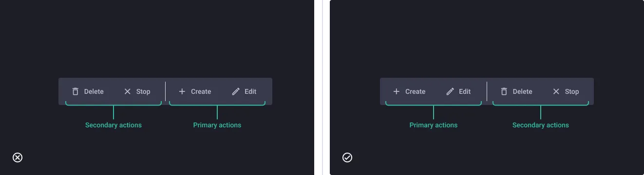
Note: Use multiple Group Buttons with dividers to organize related actions or options into sections, making it easier for users to find what they need.
Examples and recommendations of usage
Single Select
Single selection allows users to choose only one option from a group of buttons at a time. This is useful when the options are mutually exclusive, and the user needs to select only one option. In a single selection group button, selecting one button automatically deselects any previously selected button.
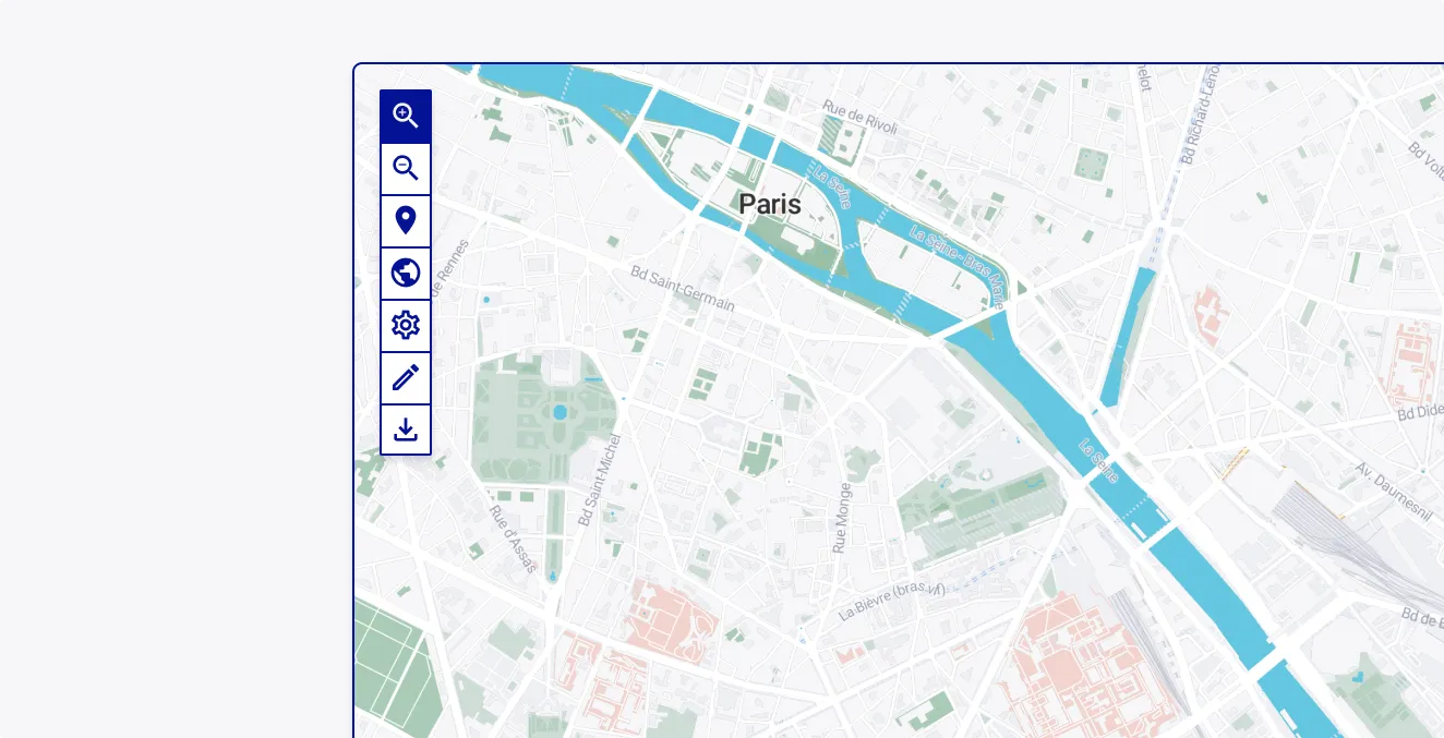
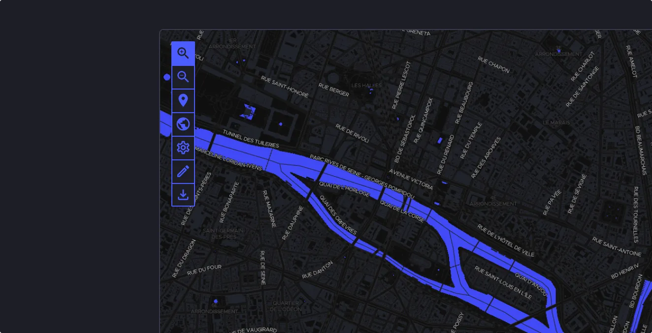
Multi Select
Multi-selection allows users to choose more than one option from a group of buttons. This is useful when the options are not mutually exclusive, and the user needs to select multiple options simultaneously. In a multi-selection group button, selecting one button does not automatically deselect any previously selected button. Users can select multiple options until they have made all the desired choices.
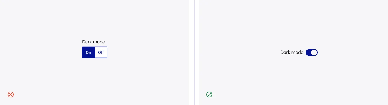
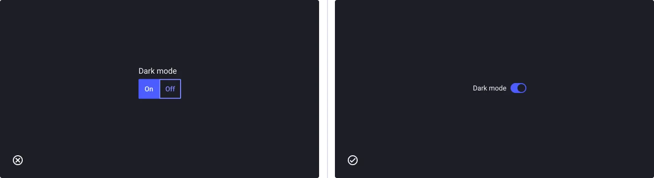
Single Select Group Button vs Toggle switch
- Don’t: Avoid using Group buttons for a single setting such as On/Off.
- Do: Instead, consider using a toggle switch.
Single Select Group Button vs Dropdown select
- Don’t: use Group Button for a large amount of options
- Do: Instead, consider using a Dropdown Select.
Don’t use Group Buttons for navigation purposes
- Don’t: Use group buttons for site navigation.
- Do: Consider using Tabs since they are better suited for navigation, as they provide a consistent and intuitive way for users to move between different sections or pages on a website or application.