Stepper
Overview
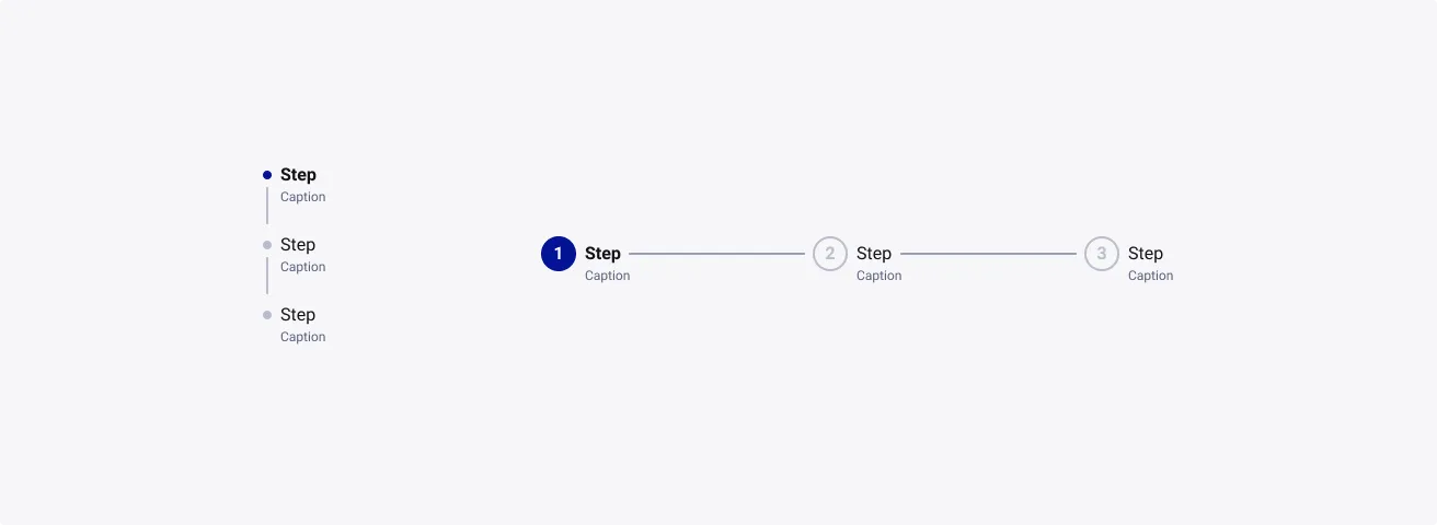
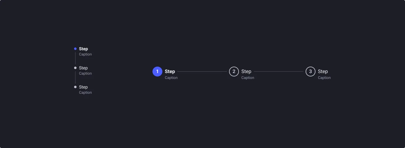
A stepper keeps users informed about their progress in a multi-step process by indicating what step they are on, what has been done and what is waiting to be completed.
Usage
When to use:
- Users need to accomplish a larger goal through manageable steps that would otherwise be overwhelming to do it in one go.
- Users need to go through a sequence of logical and numbered steps with smaller goals.
- Users need to track the progress of a process (e.g. delivery, service, …).
When not to use:
- Users need to be informed of their current location during navigation, consider using breadcrumbs instead.
Anatomy
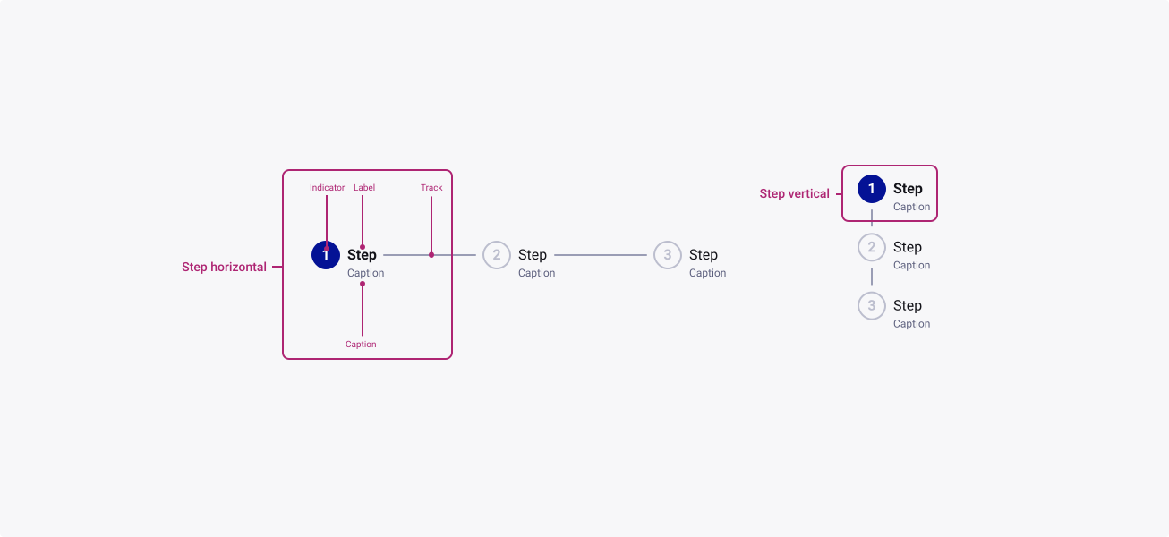
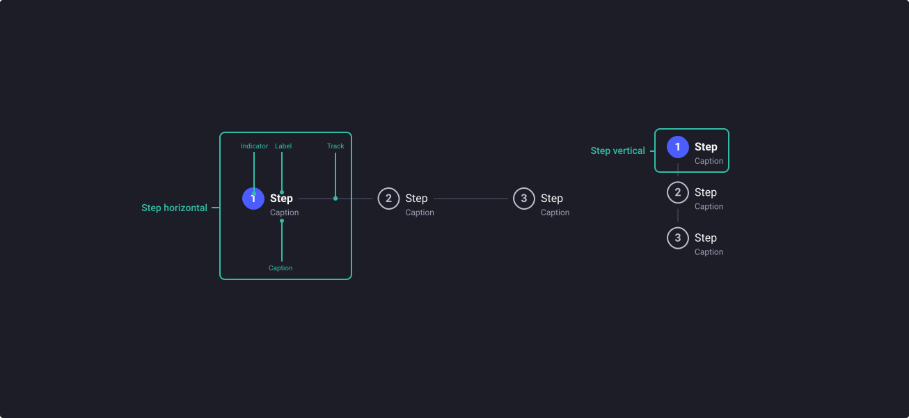
Properties
From the design point of view, each component has a number of options. These options and their names are platform agnostic, and each implementation should adapt these to fit into their framework. In Figma, these are defined as properties that help define each variant.
Heads up
A star or asterisk symbol (*) can be used as a prefix to some Figma component properties in order to inform that the corresponding property is only used that way on the design side (Figma component libraries).
◇❖ Component: Stepper
| Property | Values | Default |
|---|---|---|
| size | small / medium / large | medium |
| direction | horizontal / vertical | horizontal |
| steps | 3 / 4 / 5 / 6 | 3 |
| style | number / icon / dot | number |
| caption | true / false | true |
| textPosition (horizontal) | right / bottom | right |
| content (vertical) | true / false | false |
❖ Sub-Component: Step horizontal
| Property | Values | Default |
|---|---|---|
| size | small / medium / large | medium |
| status | waiting / current / done / error | waiting |
| state | default / hover / focused / pressed / disabled | default |
| style | number / icon / dot | number |
| textPosition | bottom / right | right |
| label | text | “step” |
| showCaption | true / false | true |
| caption | text | “caption” |
| track | true / false | true |
❖ Sub-Component: Step vertical
| Property | Values | Default |
|---|---|---|
| size | small / medium / large | medium |
| status | waiting / current / done / error | waiting |
| state | default / hover / focused / pressed / disabled | default |
| style | number / icon / dot | number |
| label | text | “step” |
| showCaption | true / false | true |
| caption | text | “caption” |
| content | true / false | true |
| track | true / false | true |
Behaviour
Direction
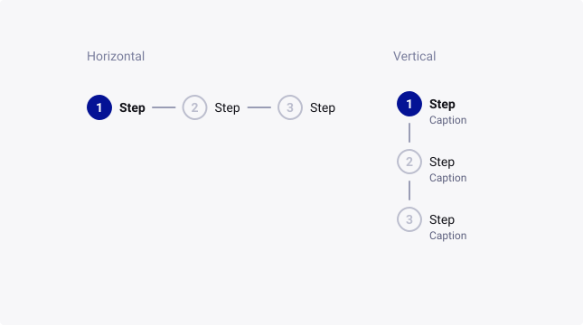
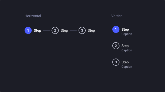
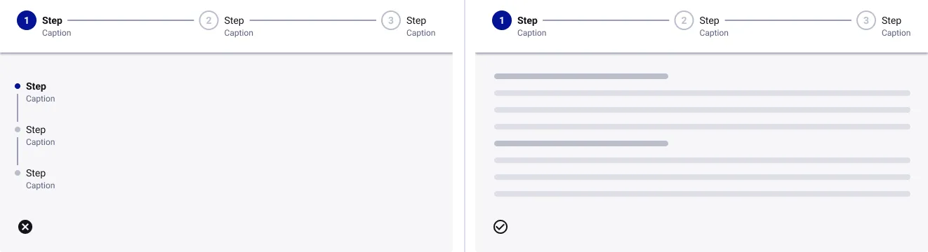
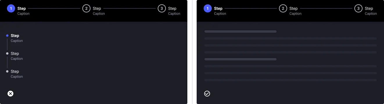
Steppers are available in two different directions depending of the space of the screen and the user’s needs.
For smaller devices, horizontal steppers can be implemented with a horizontal scroll. Or vertical steppers can be used with minimal adjustments required.
Sizes
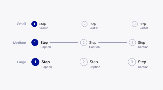
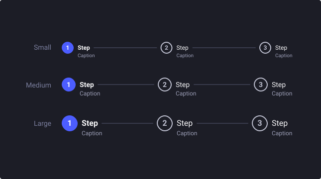
Steppers are available in three sizes to cater for the diverse range of use cases and devices that our business uses.
By default, the medium stepper is used typically for desktop/tablet devices. But for mobile devices, it is advised that you upscale the stepper, to increase the touch area.
For more information about target size, check out W3’s website.
Status
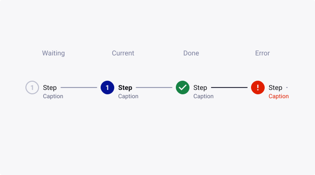
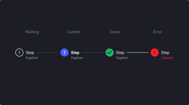
To keep the user engaged in different tasks, step status give an indication of where in the process they are, what has been done, and what are the next steps.
Waiting: This shows an upcoming step that isn’t completed yet by the user.
Current: This shows the step that the user is currently on.
Done: This shows a step the user has already completed.
Error: This shows a step the user has not finished
Step styles
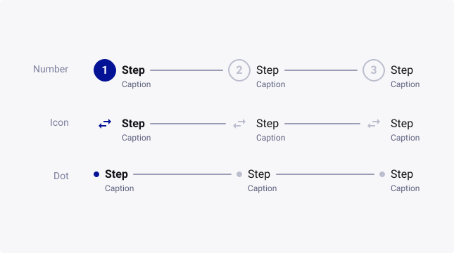
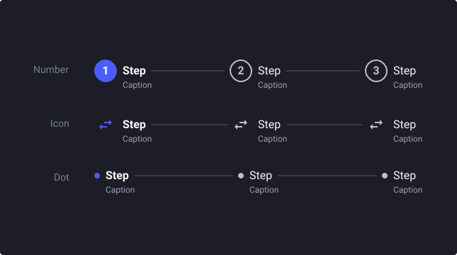
Depending of the goal of the stepper, different styles can be used :
Number: Indicating the step number, making it easier for the user to keep of where they are in a process. This is recommended when used to display a fixed linear process that requires information from the previous step.
Icon: Icons can be used to enhance the step’s goal, in addition to the label and the caption. This is recommended for use when the linear process can be navigated back and forth with no fixed direction.
Dot: A dot can be used to simplify the stepper for narrower screens, such as mobiles or a complex desktop design.
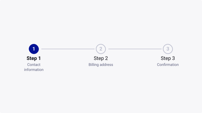
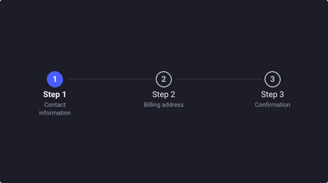
Linear stepper
Linear steppers require users to complete tasks step-by-step in order to move to the next one. Users can only navigate forward, or backward to the adjacent steps.
Non-linear stepper
Non-linear steppers allow users to complete any step in a random order. Users can also navigate to another non-adjacent step.
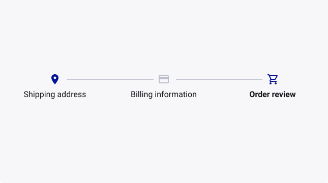
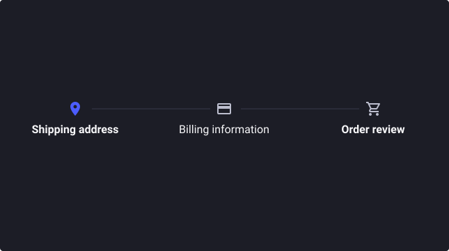
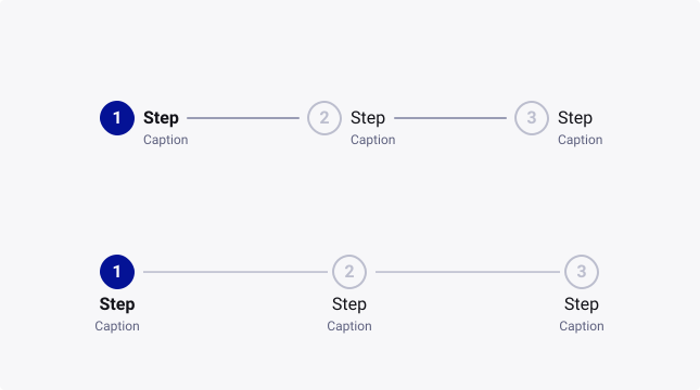
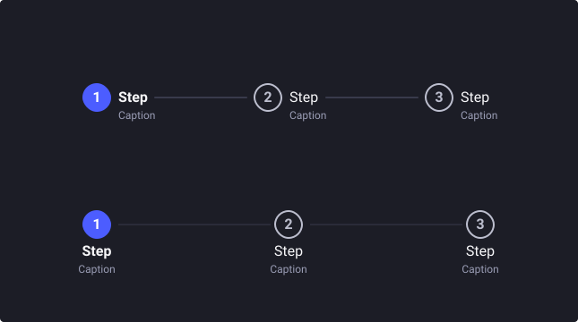
Horizontal - Text position
Depending of the density of your screen, text position can be placed either at the left or the bottom of the indicator. For processes with many steps and a narrow screen, bottom text helps improving readability across steps.
Vertical - Adding content
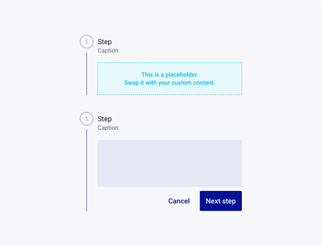
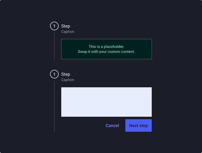
When using a horizontal stepper, content associated to the step can be added. To swap the default content with your own, follow these simple steps:
- Create your composition in a frame and apply Auto layout to it.
- Create a local component with this frame.
- Drag-and-drop the local component from your assets panel while pressing CMD+OPT (CTRL+ALT for Windows) to swap the default content.
- Make sure you apply the correct resizing constraints for the content area so that it hugs the next contents in the stepper.
Vertical - Make the stepper fluid
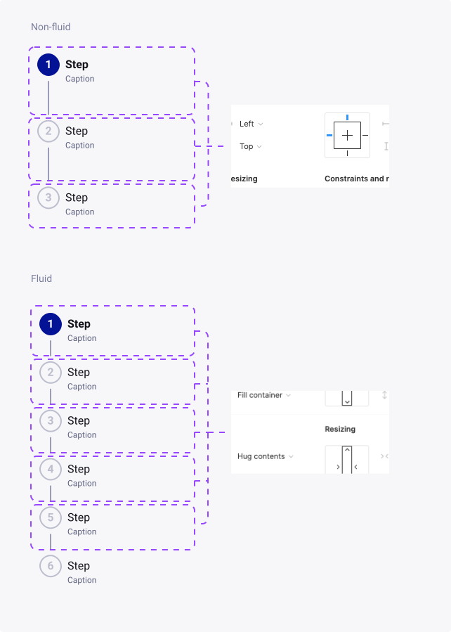
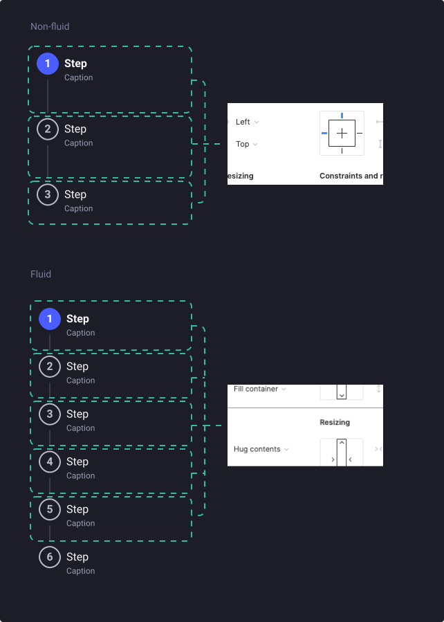
By default, the vertical stepper has a fixed height with all steps set to “Hug contents”.
In order to make the vertical stepper fluid, non-current steps excepting the last one can be set to “Fill container”.
Usage Guidelines
Keep step labels short and concise
- Don’t: Use long names for steps
- Do: Use labels that clearly indicate the purpose of the step. You can also use the labels to enumerate the step, and use the caption as step label.
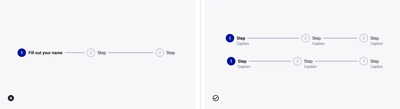
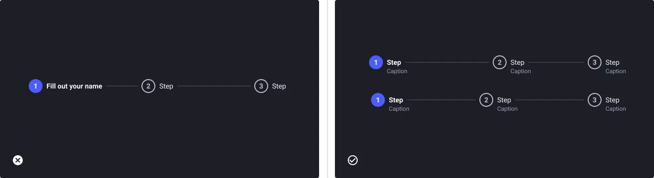
Consistent use of nouns or verbs throughout all steps
- Don’t: Mix nouns and verbs
- Do: Use the same naming type through all steps
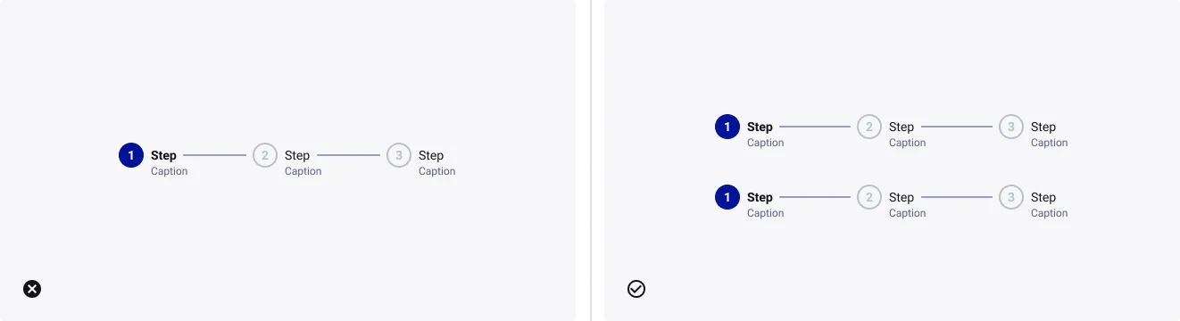
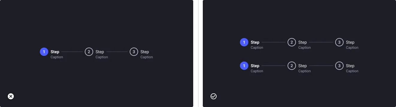
Avoid using multiple steppers on one page
- Don’t: Use multiple steppers on one page.
- Do: Organize content by theme within one step to avoid decision fatigue.
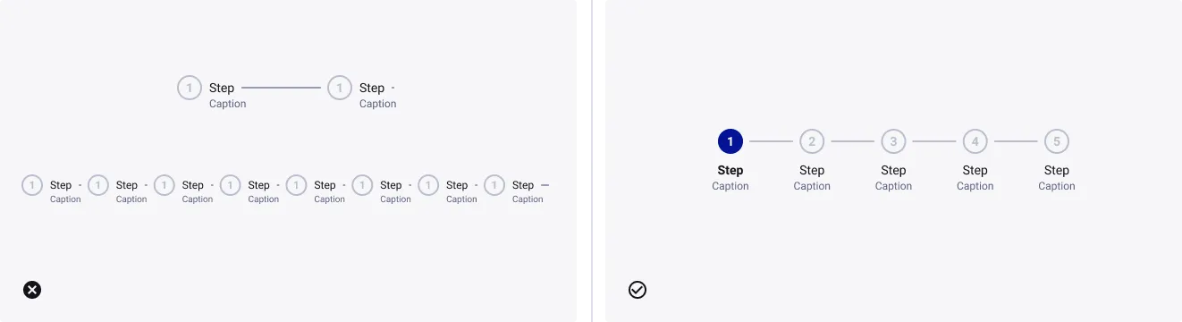
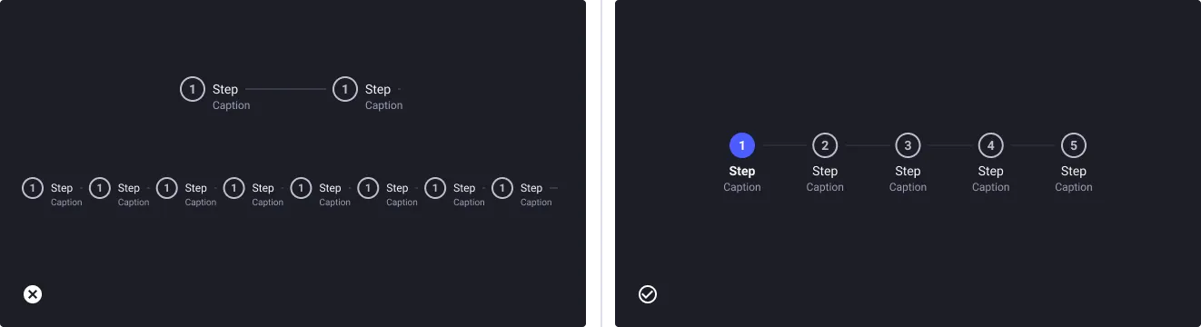
Use between 3 and 6 steps
- Don’t: Use the stepper for processes with fewer than 3 or more than 6 steps.
- Do: Simplify the process by organizing your content by theme or breaking up into multiple tasks.