Combo Box

Overview
Combo Boxes combine a text entry with a dropdown menu, allowing users to filter longer lists to only the selections matching a query.
Usage
- Users need to select a single item from a long list of items.
- The values of the option list are secondary information and do not need to be displayed right away.
- You want to allow users to be able to quickly search or filter through the item list.
When not to use:
- Users need to select from a list of two options, where one of the options can be implied as on and off or yes and no. Consider using a toggle switch control instead.
Sources and references
- Combo box - SAP Fiori
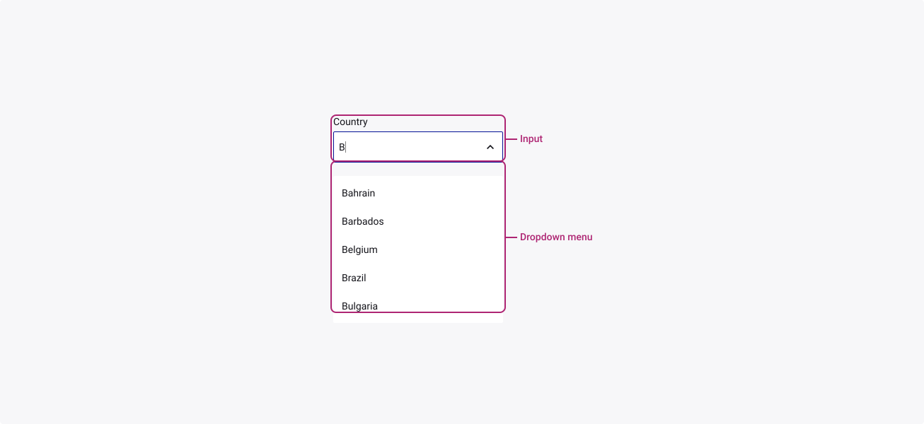
Anatomy
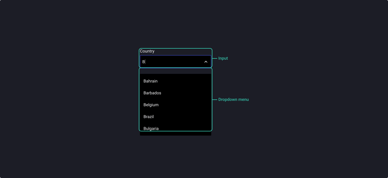
Properties
From the design point of view, each component has a number of options. These options and their names are platform agnostic, and each implementation should adapt these to fit into their framework. In Figma, these are defined as properties that help define each variant.
Heads up
A star or asterisk symbol (*) can be used as a prefix to some Figma component properties in order to inform that the corresponding property is only used that way on the design side (Figma component libraries).
◇◇❖ Combo Box
| Property | Values | Default |
|---|---|---|
| size | small / medium / large | medium |
| state | default / hover / filled | default |
| open | false / true | false |
| error | true / false | false |
| disabled | false / true | false |
◇❖ Sub-component: Text input
Note: this component is composed of other TDS elements (Dropdown Menu & Text Input) and therefore we recommend you refer to the documentation of those components to ensure that you use the component in the most appropriate way.
◇❖ Sub-component: Dropdown menu
Note: this component is composed of other TDS elements (Dropdown Menu & Text Input) and therefore we recommend you refer to the documentation of those components to ensure that you use the component in the most appropriate way.
Behaviour
Note: this component is composed of other TDS elements (Dropdown Menu & Text Input) and therefore we recommend you refer to the documentation of those components to ensure that you use the component in the most appropriate way.
Sizes
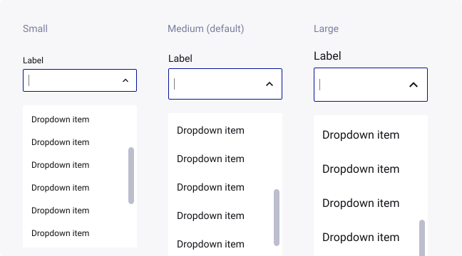
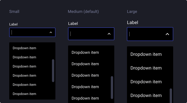
Combo boxes are available in three sizes to cater for the diverse range of use cases and devices that our business uses.
When the menu is open, each option in the menu should be the same height as the field. Use a consistent size of form components on the same page.
For example, if you are using a medium size combo box menu also use the same size text inputs, buttons, and so on.
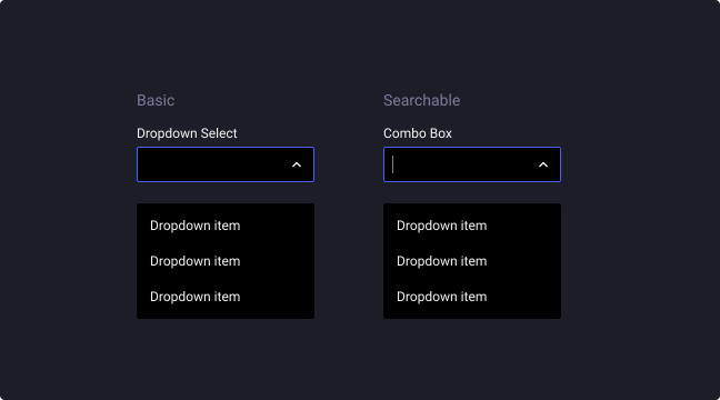
Filterable input
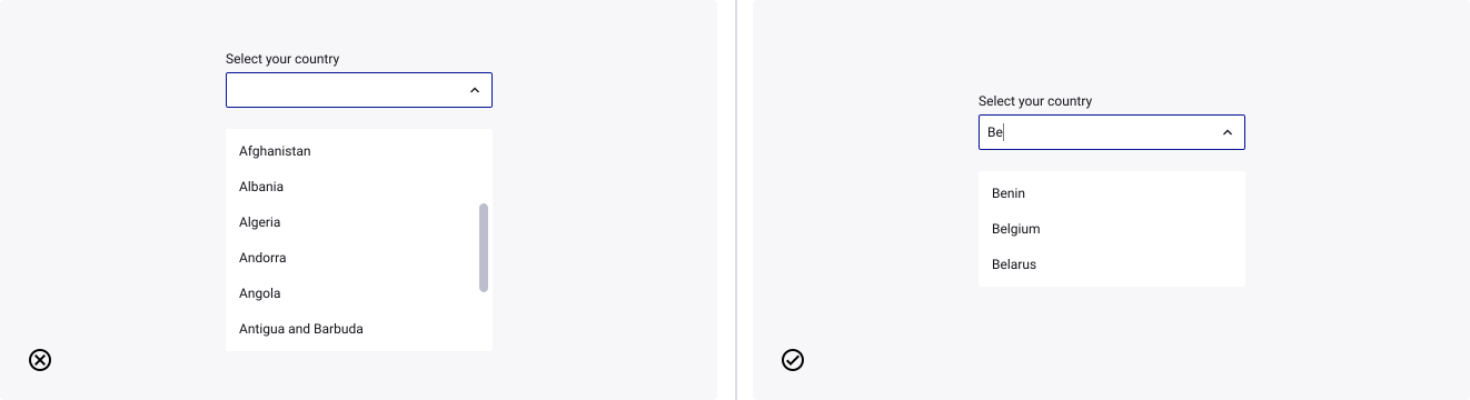
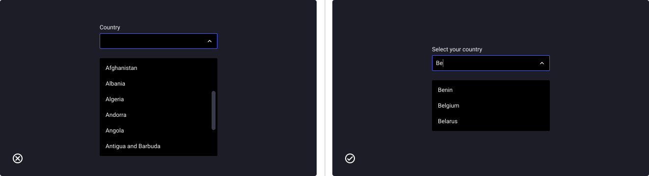
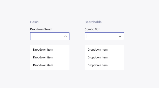
When the dropdown menu gets longer than 10-20 items, a searchable input can allow a user to search items easier through a large list of choices instead of scrolling down.
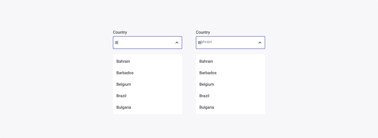
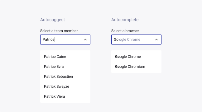
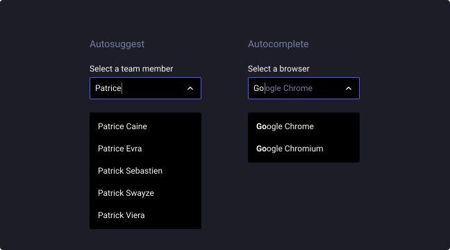
Autosuggest & autocomplete
The two types of selection suggestion should not be confused.
- Autosuggestion: filters through the list of items to give the user a smaller range of options to choose from.
- Autocompletion: when the input field puts forward a way to complete the sentence or the word.
Completed input
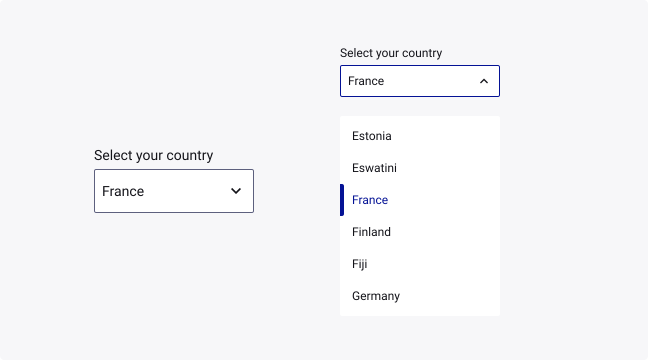
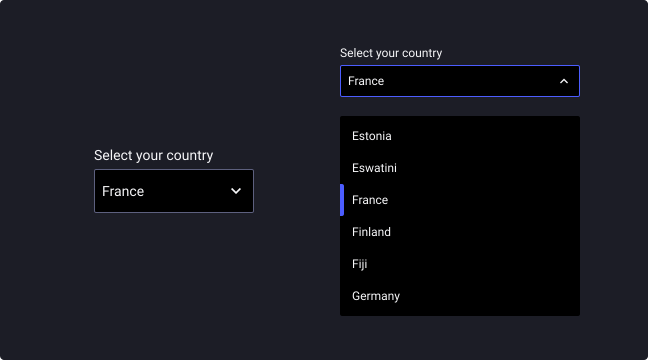
When the user has selected an option, the dropdown should return to the default state with the selection as replacement of the placeholder. This is the “filled” state.
When the user opens back the dropdown, the component should highlight the last selection with the hover/active state as default.
Usage Guidelines
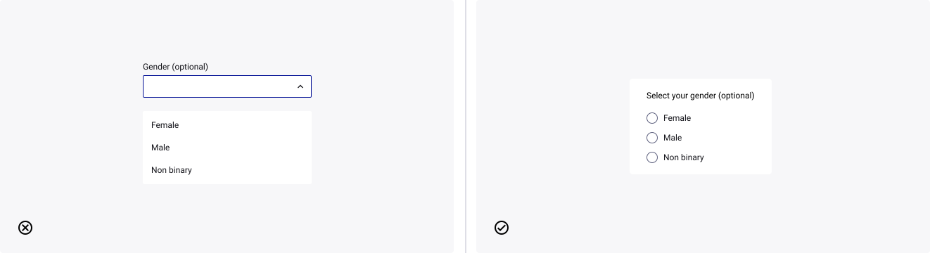
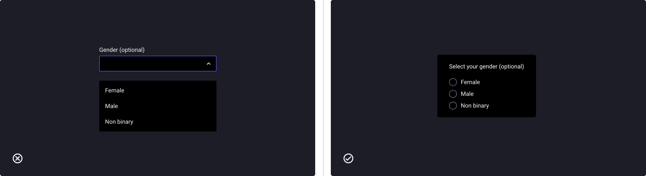
Choosing radio buttons over dropdowns
- Don’t: use dropdowns for 5 options or less.
- Do: use radio buttons instead.
Choosing text inputs over dropdowns
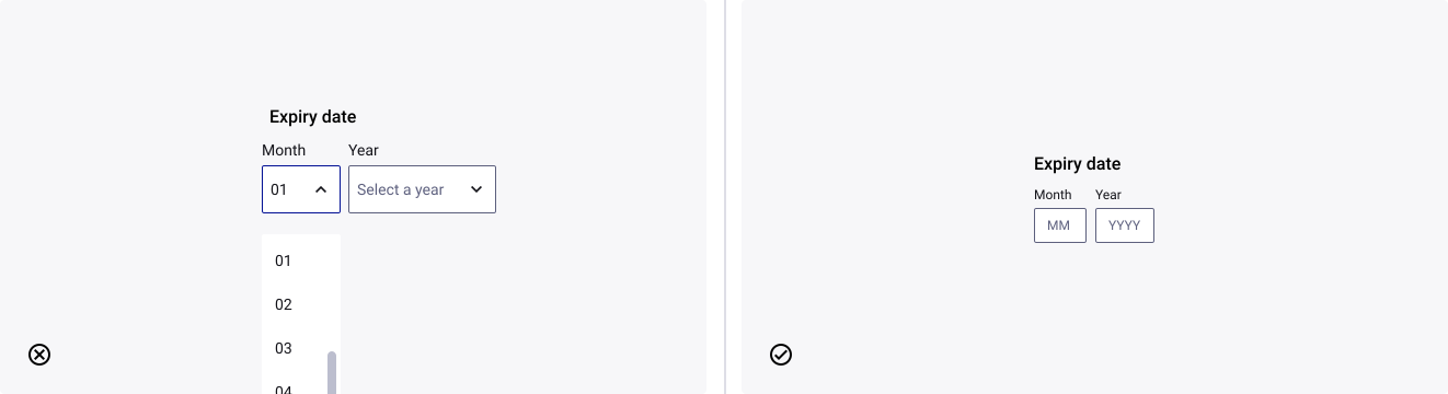
- Don’t: propose a dropdown if selecting an option takes more time than typing.
- Do: use text inputs (for example) instead.
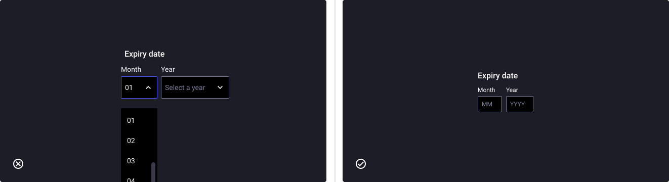
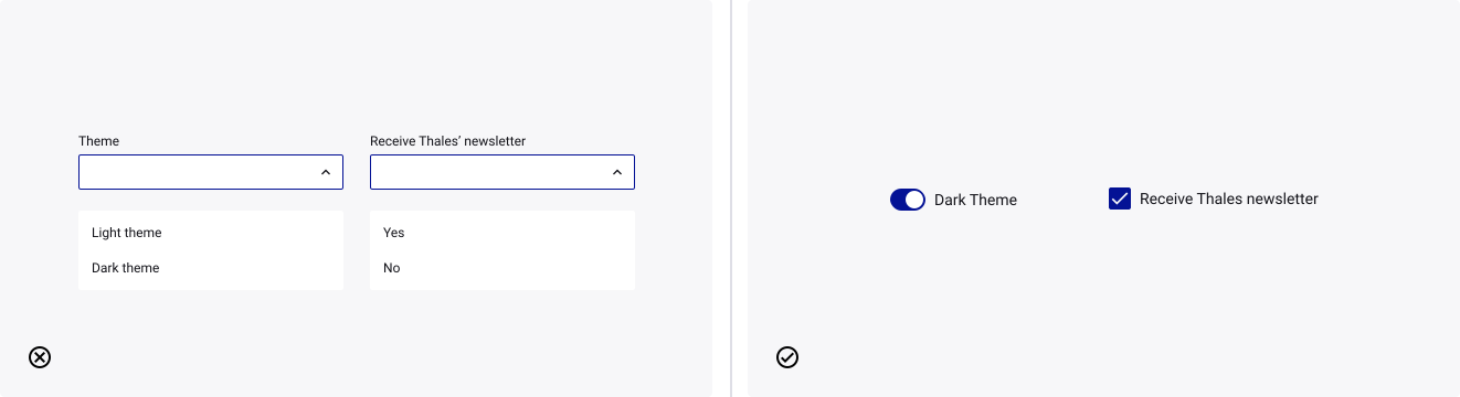
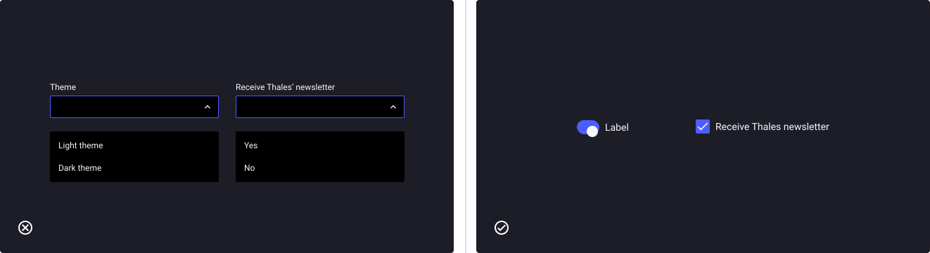
Avoid dropdowns for binary choices (On/Off - Yes/No - …)
- Don’t: make the user select between two binary and opposed options in a list.
- Do: use a toggle switch or a checkbox instead.
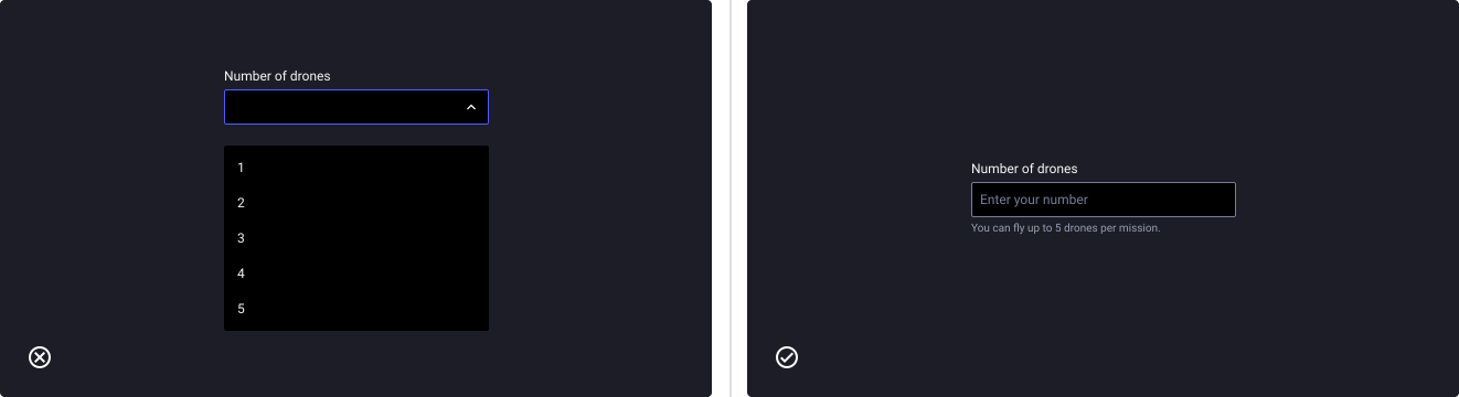
Avoid dropdowns for numeric choices
- Don’t: use a dropdown if the user has to select in a list of numeric items (years, numbers, …)
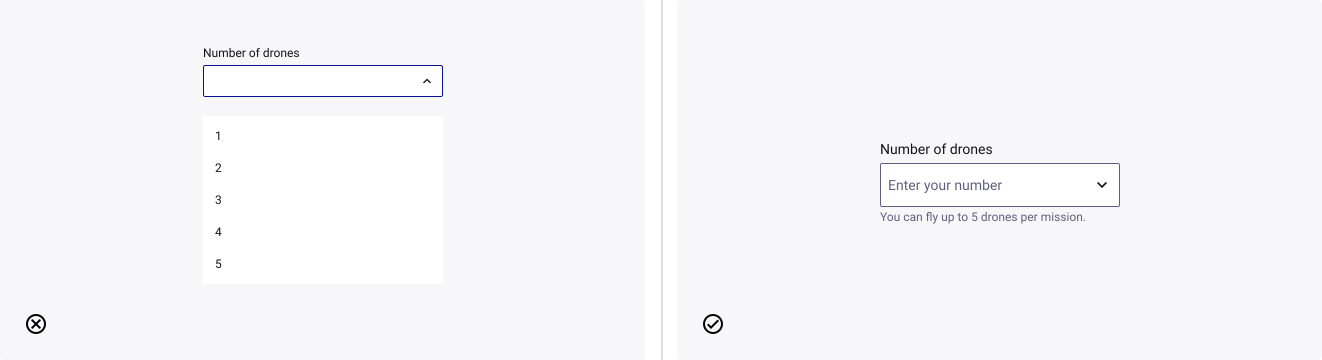
- Don’t: give the user a too long, scrollable list of options to choose from without helping them.
- Do: use a solution like auto-suggest or auto-complete to give them opportunity to search in your list.