Data Table
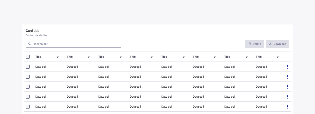
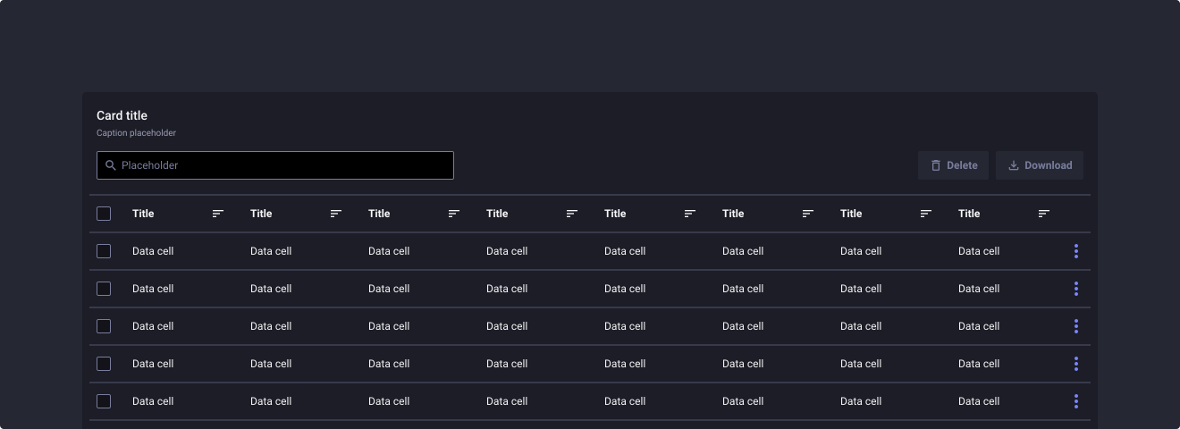
Overview
Information
This version of Data Table is a minimal version of the original component. You can access the Figma | Data Table full version.
Warning
The Data Table component needs strong Figma skills from designers, with the use of auto layout and layer constraints. These skills are needed to customize the component by creating your own assets according to your needs. However, default assets are already created to help you. In addition, due to the complexity of the component, some visual bugs may occur.
Usage
When to use:
- If you have a lot of information to display
- If you want to organize your data in a grid-like format
- If you want to list a bunch of items
When not to use:
- If you have little enough information to display
- If you are constrained with space
Sources
- Data table by Carbon Design System
- Data table by Material Design
Anatomy
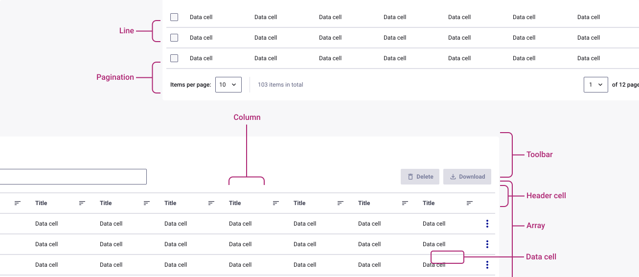
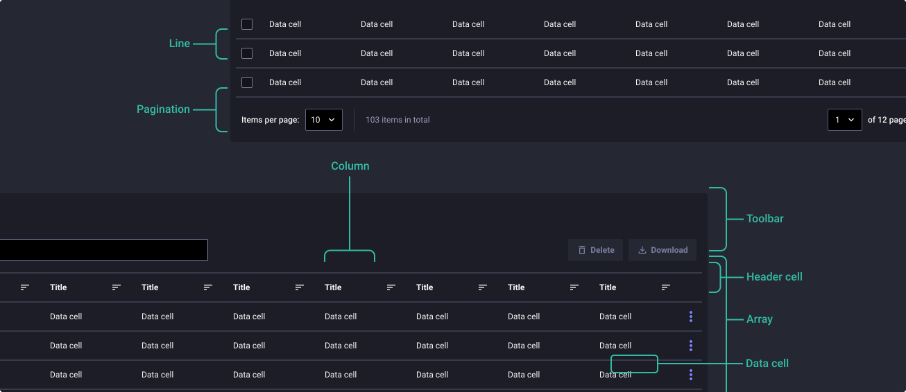
The component anatomy is used to illustrate the general make up of your component, including the spacing and positioning of elements that sit within it.
Properties
From the design point of view, each component has a number of options. These options and their names are platform agnostic, and each implementation should adapt these to fit into their framework. In Figma, these are defined as properties that help define each variant.
Heads up
A star or asterisk symbol (*) can be used as a prefix to some Figma component properties in order to inform that the corresponding property is only used that way on the design side (Figma component libraries).
◇◇◇◇❖ Cell
| Property | Values | Default |
|---|---|---|
| Size | Small / Medium / Large | Medium |
| Margin density | Small / Medium / Large | Medium |
| Sub-item | True / False | False |
| IsVisible? | True / False | False |
◇◇◇❖ Item
| Property | Values | Default |
|---|---|---|
| Size | Small / Medium / Large | Medium |
| Margin density | Small / Medium / Large | Medium |
| Type | Text / Action button / Tag / Icon button / Checkbox / Icon / Custom slot | Text |
◇◇❖ Item list
| Property | Values | Default |
|---|---|---|
| Size | Small / Medium / Large | Medium |
| Margin density | Small / Medium / Large | Medium |
| Type | Text / Action button / Tag / Icon button / Checkbox / Icon / Custom slot | Text |
| Header cell | True / False | True |
| Lines | True / False | True |
◇❖ Array
| Property | Values | Default |
|---|---|---|
| Size | Small / Medium / Large | Medium |
| Margin density | Small / Medium / Large | Medium |
| Style | Lines / Grid / Zebras / Flat | Lines |
❖ Data table
| Property | Values | Default |
|---|---|---|
| Size | Small / Medium / Large | Medium |
| ◇ Toolbar | Nested component | — |
| ◇ Array | Nested component | — |
| ◇ Pagination | Nested component | — |
Behaviour
Component behaviour helps to present the states and use cases that the component might encounter.
Toolbar
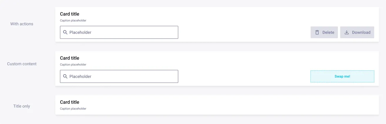
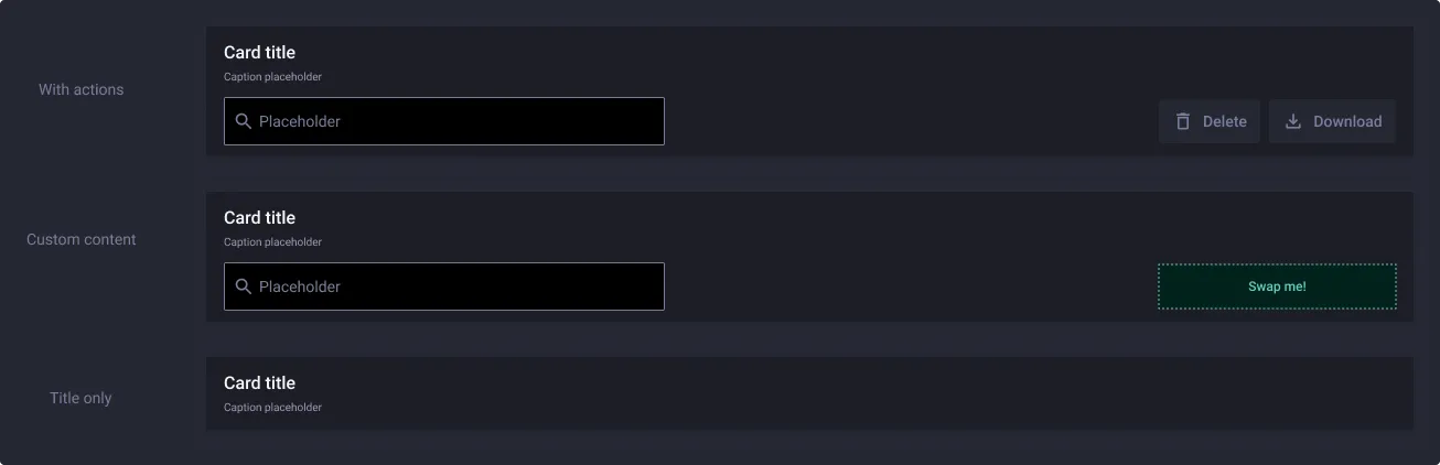
You can customize your toolbar by modifying its content: either actions, or custom content, and support information architecture with title according to your needs. In case you don’t want to display this component, an option is available in the Data Table properties.
Pagination
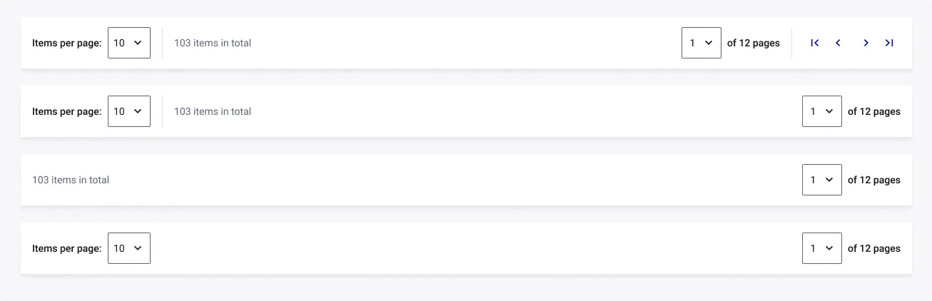
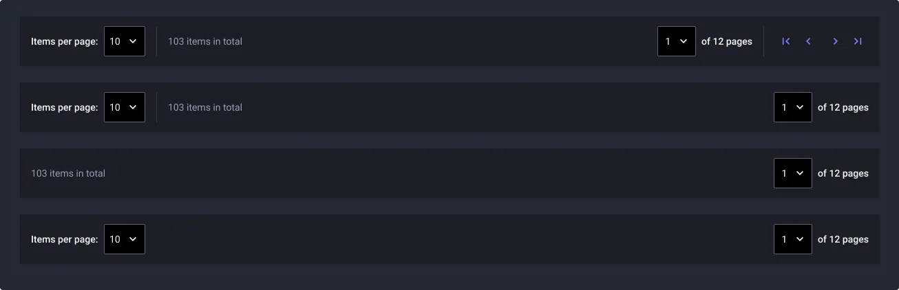
Note: a section dedicated to pagination is available here. The proposed pagination allows you to navigate through multi-page tables quickly. You will be able to navigate between pages, or even reach dedicated pages through the dropdown to instead consult the number of items in the table. In case you don’t want to display this component, an option is available in the Data Table properties.
Size
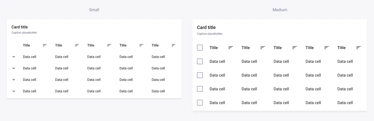
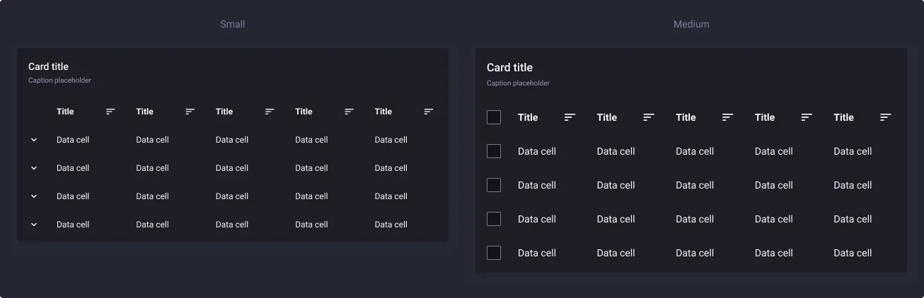
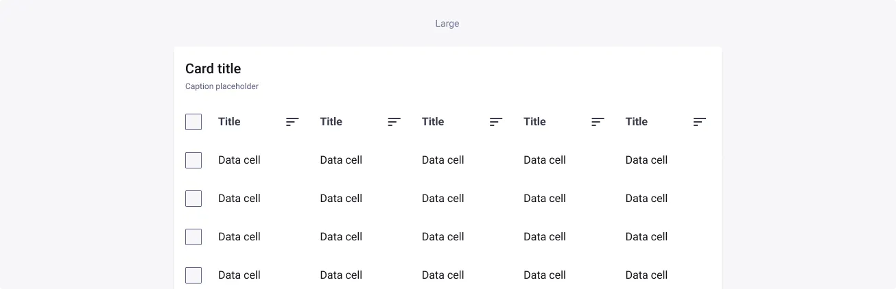
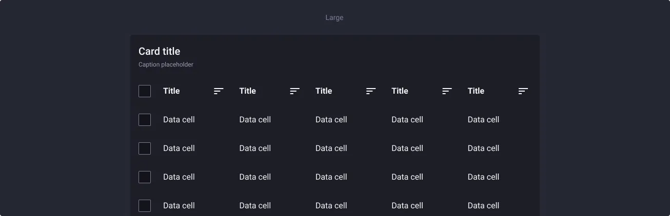
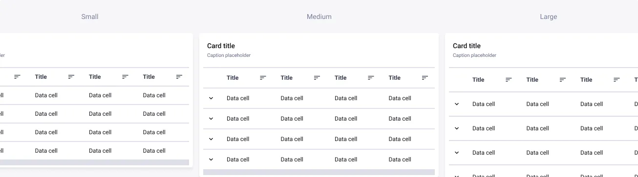
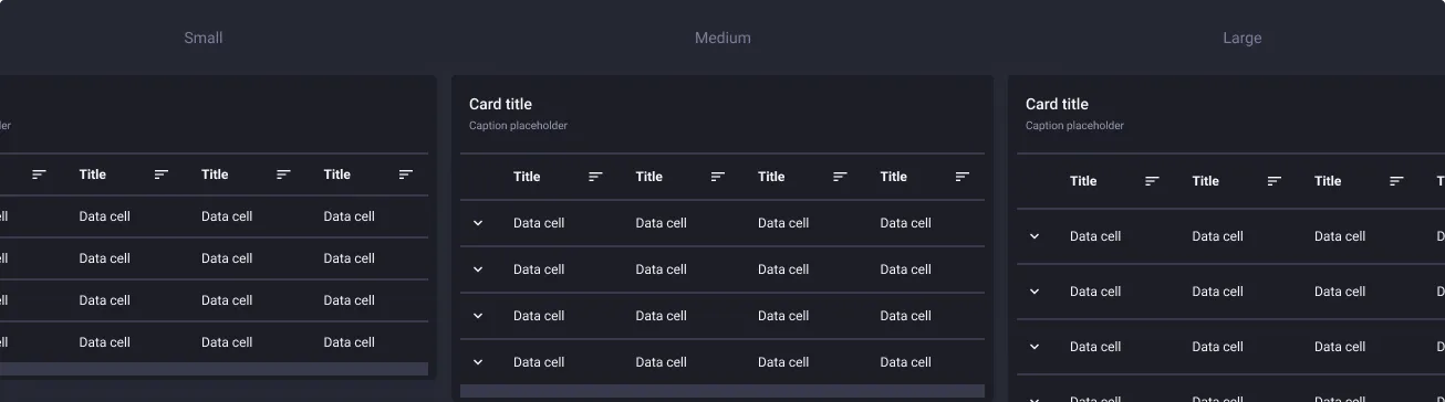
The table is available in 3 sizes: small, medium and large. This refers to the width & height of the items inside, margins and heights of the rows inside the table. The component was designed in an average size of 1076px, which corresponds to desktop-sized usage with a drawer. You can adapt the width to your visuals in order to maintain a comfortable density of information, but we recommend you avoiding table usages with too many columns when the width is too small (like a smartphone).
Margin density
The margin density makes it possible to ventilate more or less a table, according to the available space and the purpose of the table. Indeed, a table presenting a large amount of data will be more relevant with a low density.
Styles
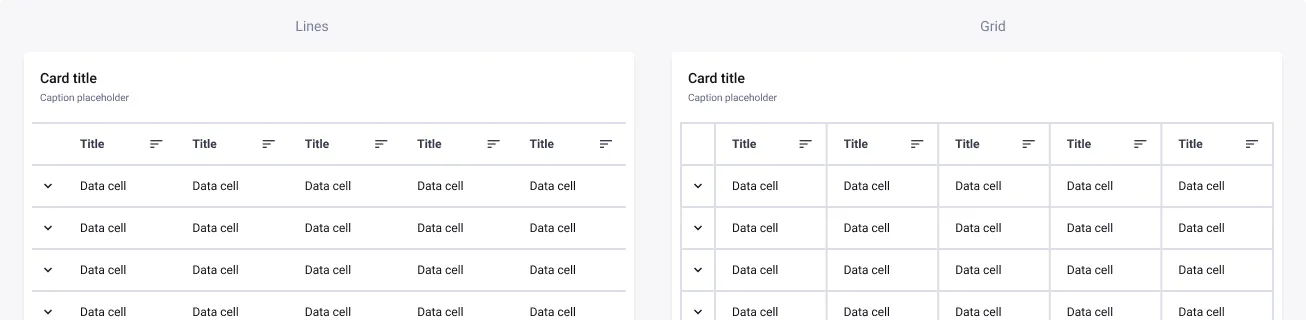
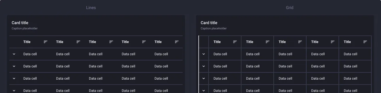
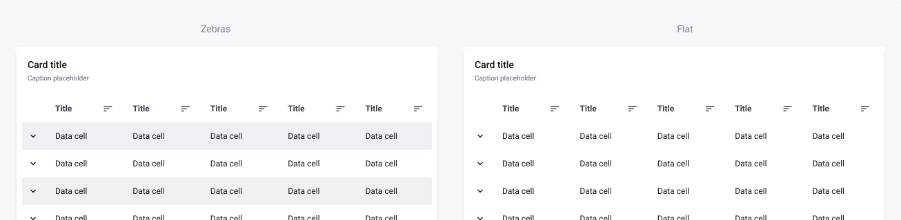
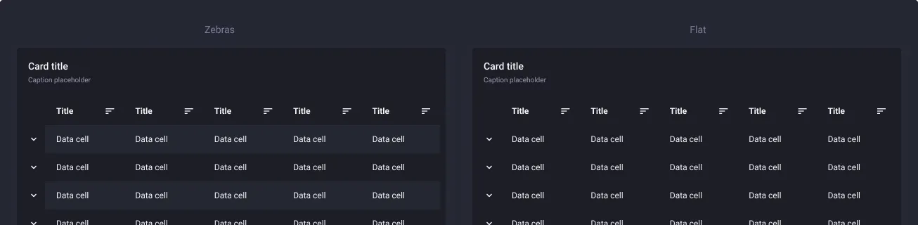
Tables are available in four styles: lines, grid, zebras and flat to help you enhancing the data and ease the reading.
Columns types
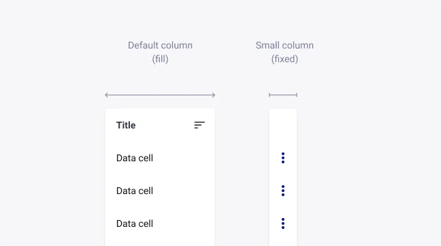
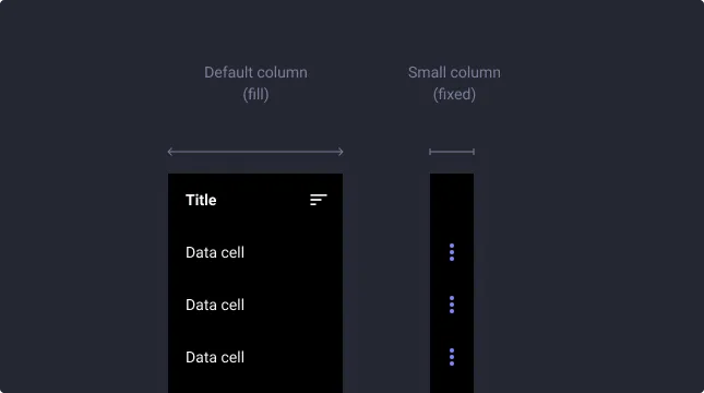
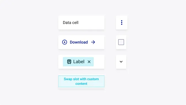
The Data Table is delivered with several cell types such as text area, action button, checkbox, icon etc. To be as flexible as possible these cells are sorted in two categories:
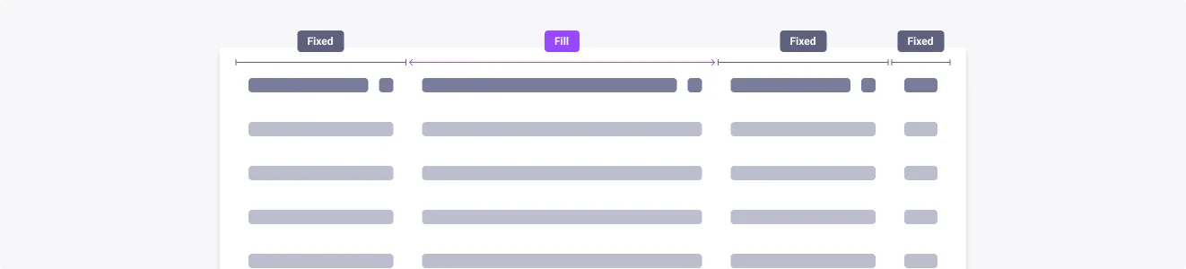
- default size columns for common data and actions: it will fill all the space available
- small columns for icons, icon buttons or checkboxes which has a fixed width to optimize space in your data table
We recommend you to customize the behavior of each column if you have specific needs.
Sub-items
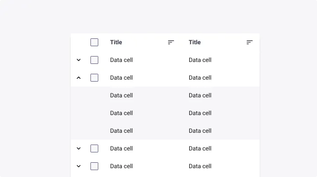
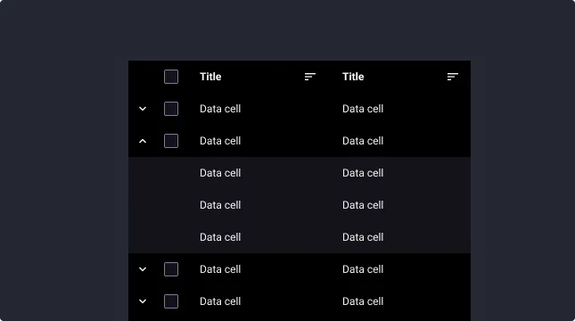
Each line can have sub-items. This can be helpful to display data related to the main item without having too much items shown at the same time.
Header cell style
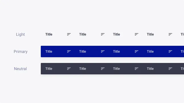
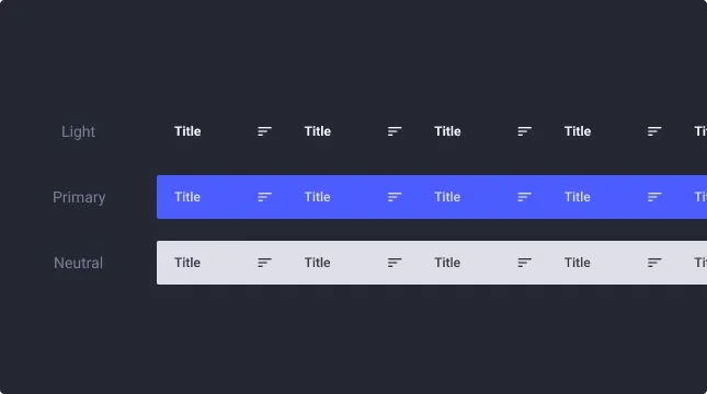
The Header cell is available in different styles to support Data table emphasis. By default, Data tables are emphasized (primary color). Providing a visual prominence.
In case you don’t want to emphasize the Data table component, Light and Neutral styles are more appropriate for visual de-prioritization on the screen.
In Light variant, the background of the Header cell is transparent and adapts to the background of your surface.
Cell types
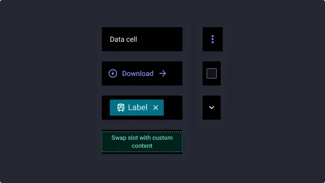
All columns can be switched with many options:
- Text cell: the default cell with left-aligned text. You can adjust it to the data that it will contain. It is also possible to display an icon at the left or right.
- Action button & Icon button: we recommend to use it at the end of the line to gather all the actions related to the lines.
- Tag: it allows to highlight information such as status, contact, documents etc.
- Custom slot: so you can add your own components.
- Checkbox: the checkbox is by default hidden in the sub-items but you can display it if necessary. It is also visible in the Header cell for a “select all” behaviour.
- Icon: as for the checkbox, the icon is by default hidden in the sub-items because we recommend its use in the first column as to signify an expand/collapse of the sub-items.
Cell visibility
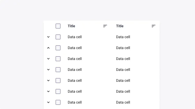
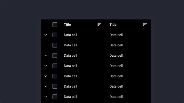
Each cell has a property to show or hide its contents. This can be useful for information that is not presented in all the cells of the same column.
Usage Guidelines
Usage guidelines help depict the best practices when using this component by giving examples of the do’s and don’ts.
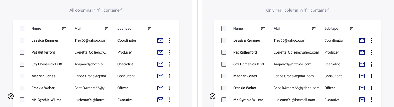
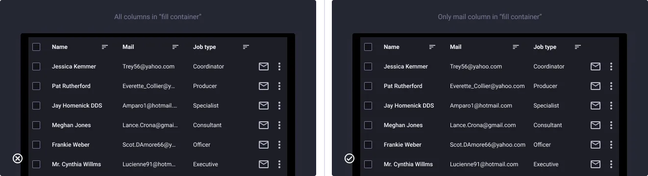
Adapt the width to the data
- Don’t: truncate text if you have more space in other columns
- Do: adapt the width of big columns to their contents
Small screen use case
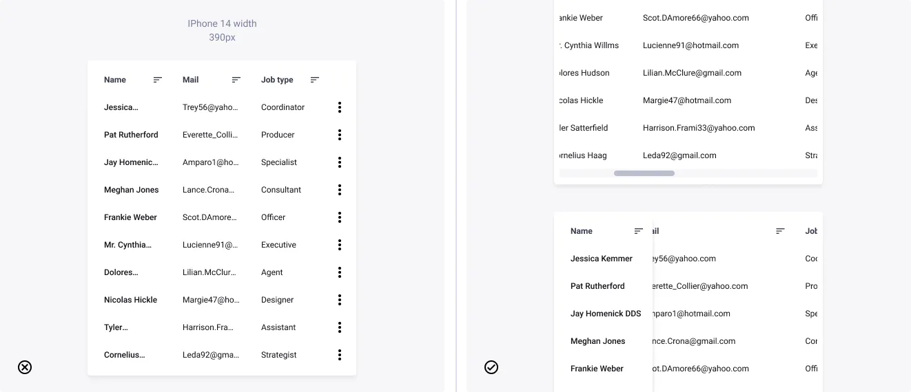
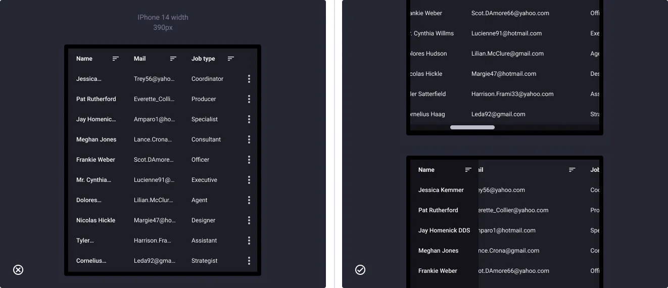
- Don’t: make the columns unreadable for small devices
- Do: use an horizontal scroll with a fixed column if necessary
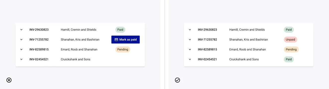
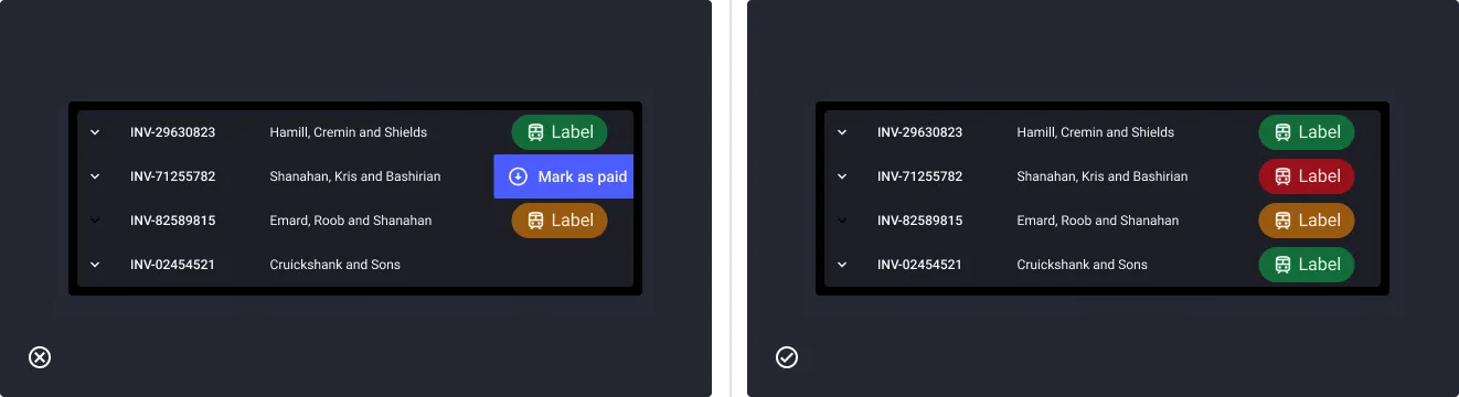
Be consistent with your data
- Don’t: put several cell types in a same column
- Do: be consistent in your column types
Deal with multiple lines
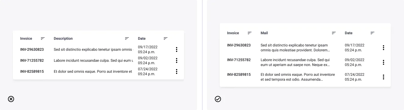
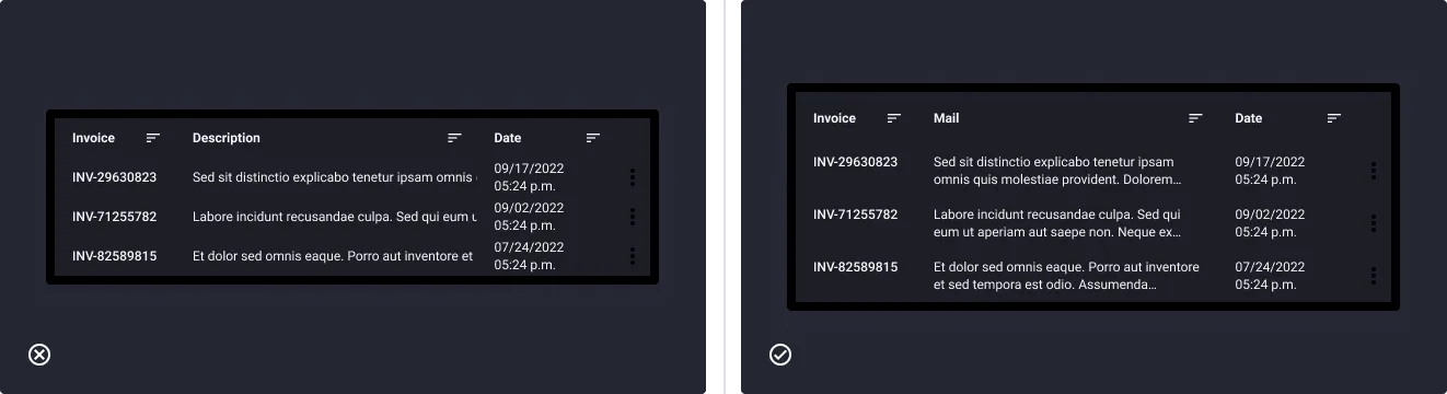
- Don’t: center vertically the data and display various quantities of text according to the column
- Do: set a maximum of 2 lines of text and align lines to the top
Tips & tricks
Data table is a complex component, which is why it is important to know how to handle it.
Structure
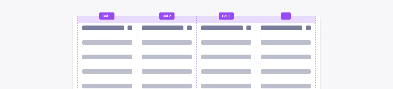
The Data Table has a column-based architecture, which allows you to change its structure quickly without having to go through all the different layers. So when we manipulate the table, we can quickly choose the number of columns to display.
Note: If you delete an item in a component instance, it will be hidden but not deleted. This can be handy if you want to hide an entire line for example.

Resize quickly
If you are in the situation where you need to enlarge certain columns, the fastest and easiest way is to change the behavior of your columns. Select the column to enlarge and check that it is in “fill container”, you can pass the others in “fixed width”. If that’s not enough, you can play with the “hug content” mode but it will depend on the content you want to display.

Hide/Show cell’s content
It is possible to make the content of a cell invisible by disabling its “IsVisible?” at the component level. This can be useful when using sub-items that do not contain all the elements of their parent, for example.