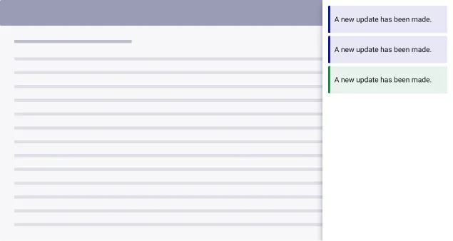
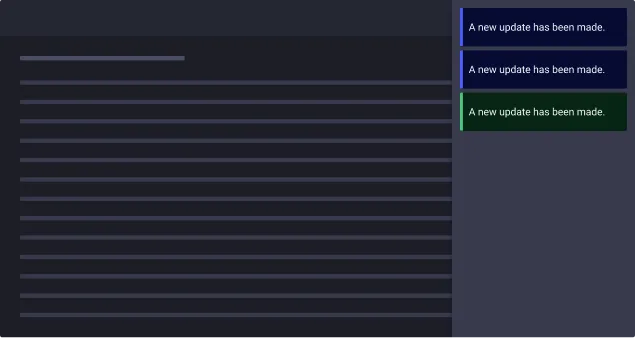
Alert & Toast
Overview
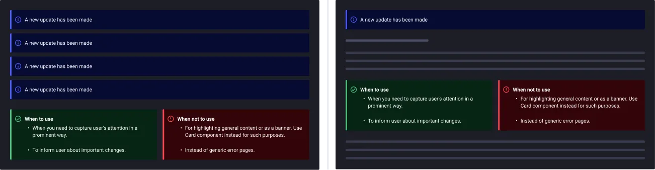
- Alerts inform the user of important information or important action required. They are non-disruptive to a user’s experience and do not require to interrupt the user’s task.
- Toasts are temporary pop-up alerts that displays briefly on the screen to provide feedback or information to the user. Toasts can be closed by the user or can automatically disappear after a set amount of time.
Usage
When to use:
- Use alerts/toasts when displaying a highlight, a message to confirm an action, an error and make someone aware of important information.
- When you do not want to interrupt users while they are performing an action.
When not to use:
- When you need to interrupt users while they are performing an action.
- You want to make sure that users read the message before they leave the page.
Anatomy
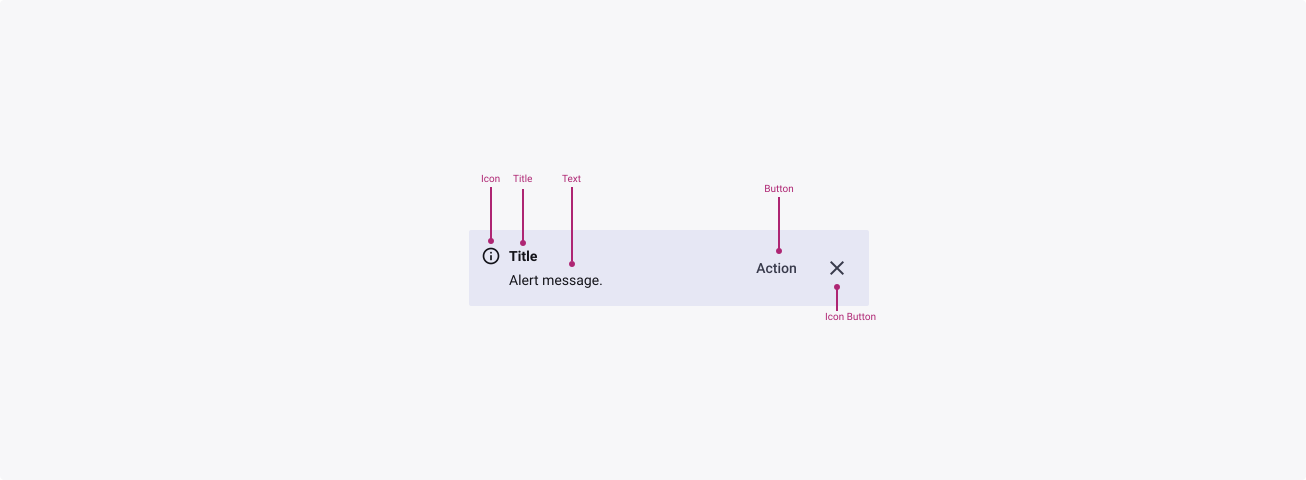

Properties
From the design point of view, each component has a number of options. These options and their names are platform agnostic, and each implementation should adapt these to fit into their framework. In Figma, these are defined as properties that help define each variant.
Heads up
A star or asterisk symbol (*) can be used as a prefix to some Figma component properties in order to inform that the corresponding property is only used that way on the design side (Figma component libraries).
◇◇❖ Alert
| Property | Values | Default |
|---|---|---|
| size | small / medium / large | medium |
| severity | informative / neutral / success / warning / error | informative |
| emphasis | low / medium / high | low |
| leftIcon | instance swap | true |
| informativeIcon | instance swap | info |
| successIcon | instance swap | check_circle |
| warningIcon | boolean | warning_amber |
| errorIcon | instance swap | error_outline |
| hasTitle | boolean | false |
| title | text | title |
| message | text | Alert message. |
| rightActions | boolean | true |
| actionButton | boolean | true |
| dismissible | boolean | true |
❖ Sub-Component: Button
Note: this component is composed of other Quantum elements (Button & Icon Button) and therefore we recommend you refer to the documentation of those components to ensure that you use the component in the most appropriate way.
❖ Sub-Component: Icon Button
Note: this component is composed of other Quantum elements (Button & Icon Button) and therefore we recommend you refer to the documentation of those components to ensure that you use the component in the most appropriate way.
◇❖ Toast
| Property | Values | Default |
|---|---|---|
| slideDirection | none / ↑ / ↓ / ← / → | none |
| dismissible | false / true | true |
| hidden | false / true | false |
| ◇ Alert | → Alert nested properties |
Behaviour
Note: this component is composed of other Quantum elements (Button & Icon Button) and therefore we recommend you refer to the documentation of those components to ensure that you use the component in the most appropriate way.
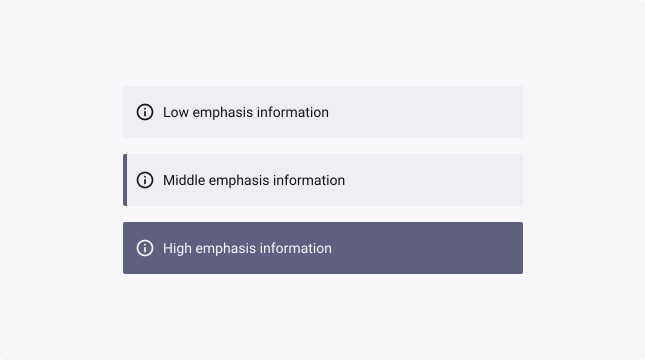
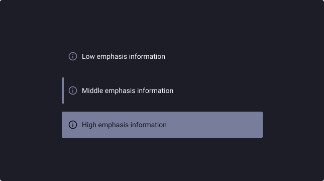
Low / Medium / High emphasis
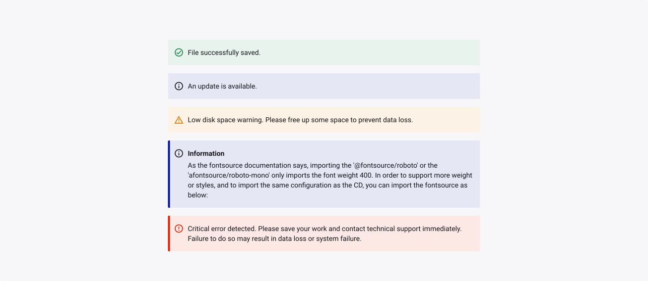
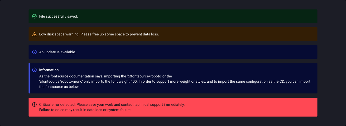
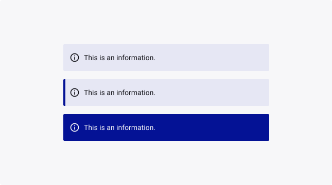
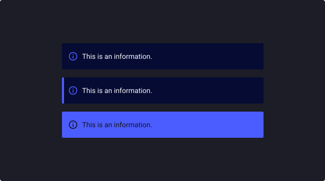
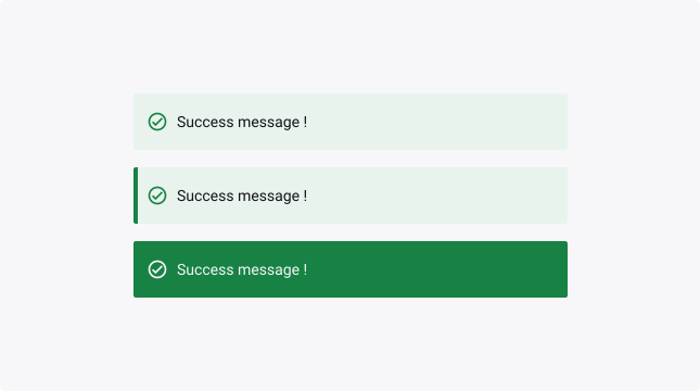
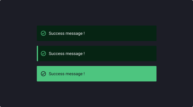
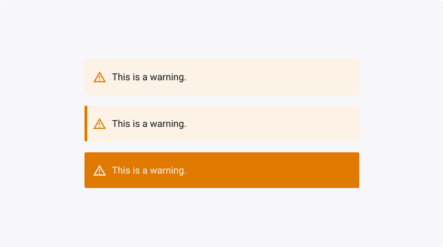
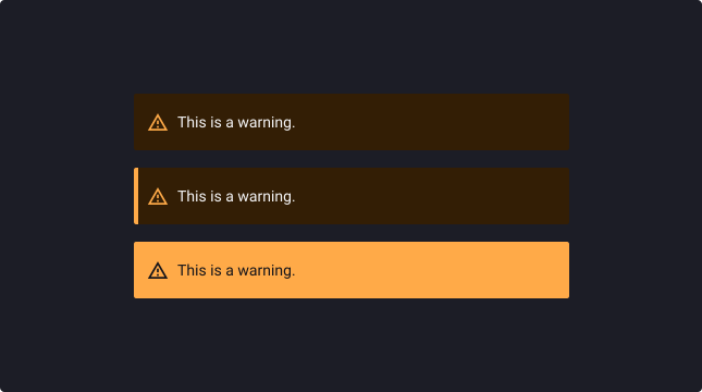
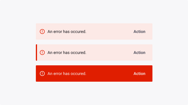
The Quantum supports three levels of emphasis style alerts. High-emphasis alerts are best for critical messaging while low-emphasis and mid-emphasis alerts are less visually disruptive for users.
It’s up to the product team to decide which notification style to use in their product. However, it is important to not mix the styles when they are applied at the same level hierarchy. When in doubt, use low-contrast notifications.
Neutral variant
The neutral variant is the default alert option. It uses the Quantum bluegrey and does not have an icon. This is used when the message is neutral in tone or when its semantics do not fit in any of the other variants.
Note: this variant also uses the general interaction states such as hover, active, focused.
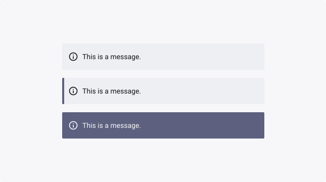
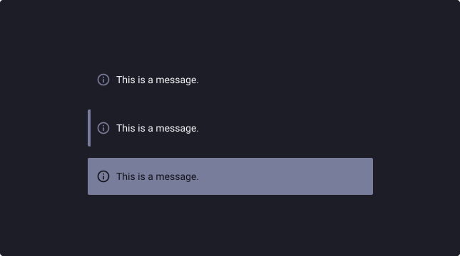
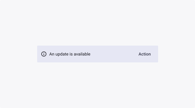
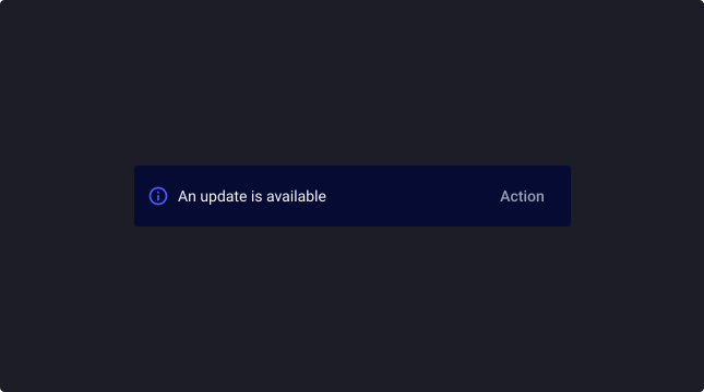
Informative variant
The informative alert uses the informative semantic colour (primary) and has an info icon to help those with colour vision deficiency discern the message tone. Similar to the call to action button, this should be used when the message should call extra attention compared to the neutral variant.
Note: this variant also utilises the general interaction states such as hover, active, focused.
Success variant
The success alert uses the positive semantic colour (green) and has a checkmark icon to help those with colour vision deficiency discern the message tone. This can be used to inform the user of a successful operation.
Note: this variant also utilises the general interaction states such as hover, active, focused.
Warning variant
The warning alert uses the warning semantic colour (orange) and has an warning icon to help those with colour vision deficiency to discern the message tone. This can be used to show an attention point to the user.
Note: this variant also utilises the general interaction states such as hover, active, focused.
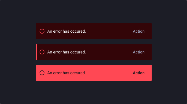
Error variant
The error alert uses the error semantic colour (red) and has an alert icon to help those with colour vision deficiency to discern the message tone. This can be used to show an attention point to the user.
Note: this variant also utilises the general interaction states such as hover, active, focused.
Action
An alert can have up to one button, to ensure consistency and maintain focus on the message being presented to the user. This means that the button can only be used if its action directly relates to the message.
Note: the dismissible button is not considered as an action in the same context, therefore you can have a dismissible button and a single action in one alert.
Links
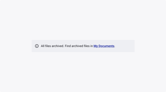
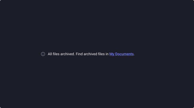
An alert message may also contain a link that directly relates to a file or location in which an action has either successfully or unsuccessfully been achieved. For example:
All files archived. Find archived files in My Documents.
This can only be used if an action is not already in place.
Toast
Slide direction
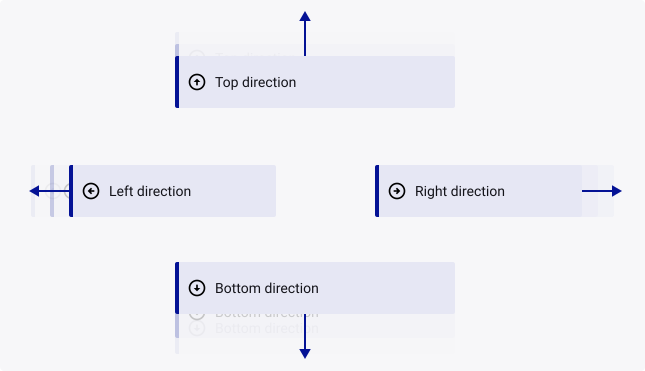
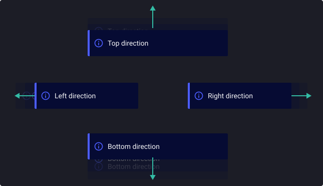
When disappearing, toasts can slide out from different directions, depending on the design requirements and the desired user experience.
It is recommended to use the same slide direction as the position of the toast for avoiding obstruction of the content on the screen when it disappears.
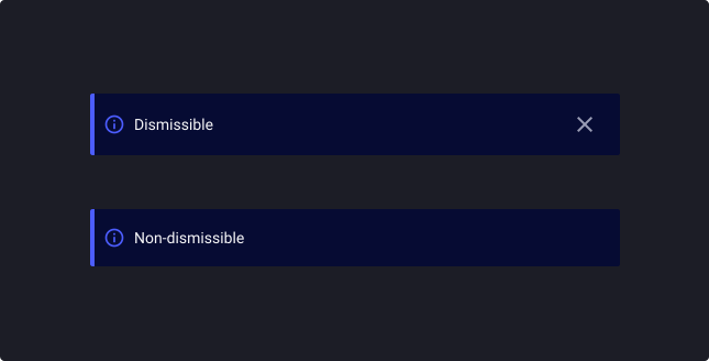
Dismissible / Non-dismissible
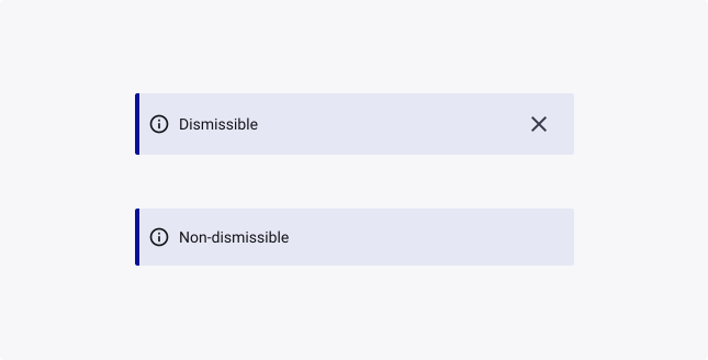
- Dismissible toasts provide a close button or icon for the user to manually dismiss the toast if desired. You can also add a time-out to make it disappear after a set duration of time.
- Non-dismissible toasts automatically disappear after a a set duration of time. They provide a convenient way for the user to quickly view and take into account the message, without having to take any action to dismiss the toast.
Change the toast duration
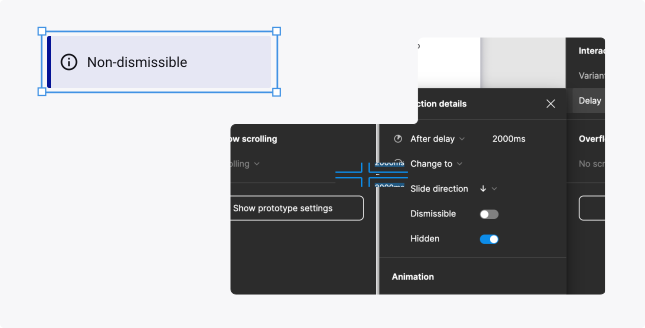
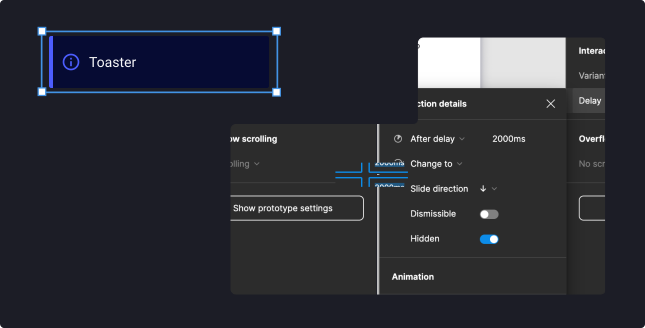
You can change the timer to dismiss the toast after a set amount of time has elapsed :
- Select the toast (Non-dismissible)
- Go to Prototype > Variant interactions > Delay
- Change the “After delay” timer to the desired time-out time
As a general rule, toasts should be displayed for just enough time to allow the user to read the content, but not long enough to become annoying or obstructive.
A common recommendation for the duration of a toast is 3-5 seconds. For toasts that display critical or important information, a longer duration may be appropriate, while for toasts that display simple confirmation messages, a shorter duration may be sufficient.
Usage Guidelines
Alert or Toast?
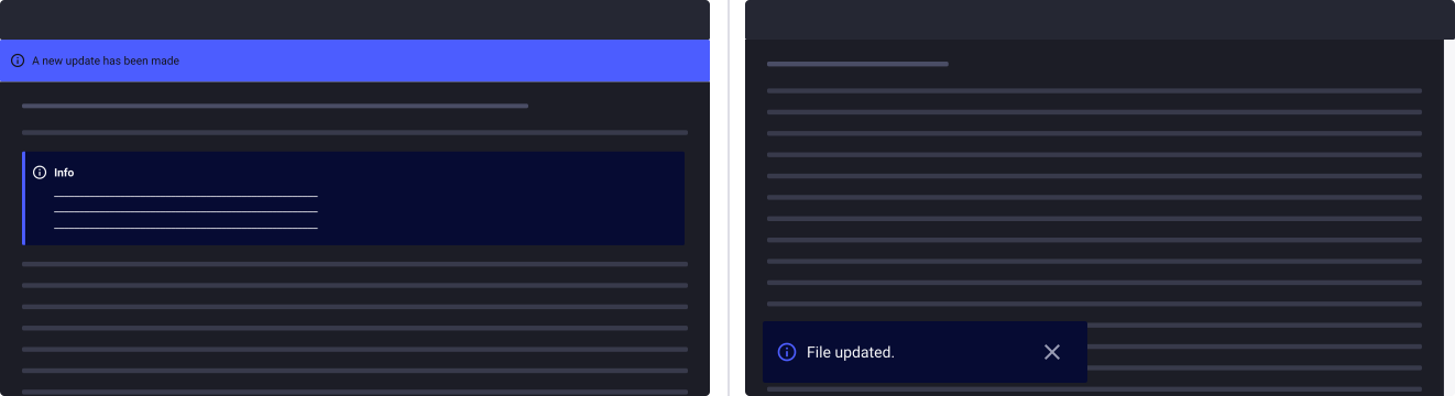
- Alert: Alerts should be used sparingly to highlight important information that requires the user’s attention, without interrupting the user’s current task. These alerts can either remain visible permanently or disappear once the user takes action, such as clicking a button.
- Toast: use Toasts for temporary confirmation, simple notifications, and low-priority alerts that do not need to completely interrupt the user experience. Toasts automatically disappear after a set duration, or can be dismissed by the user by clicking on a button.
Alert or modal dialog?
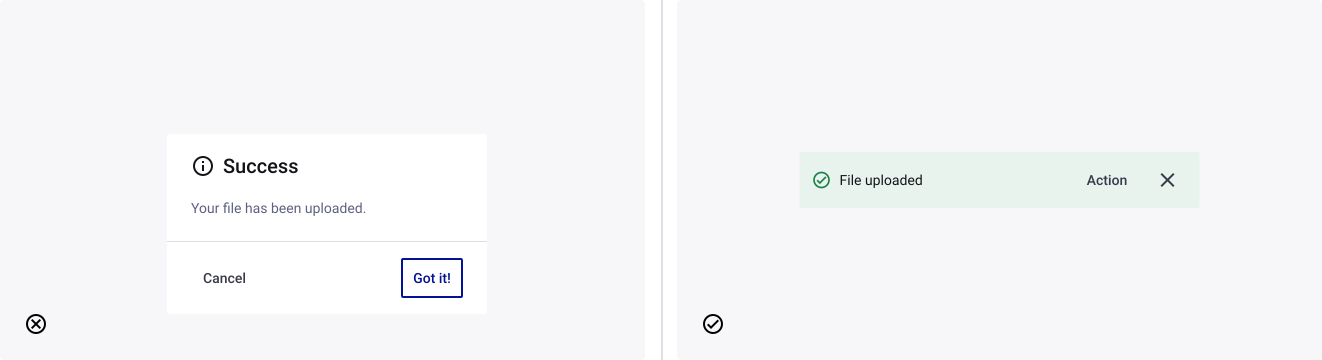
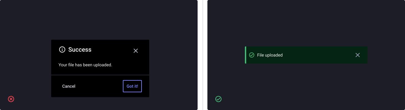
- Don’t: use a Modal Dialog to present a simple notification as it will distract the users attention, interrupting the user experience. Dialog is only ideal when a situation requires the user’s attention, either for displaying important information or prompting for a response.
- Do: use Toasts for confirmation, simple notifications, and low-priority alerts that do not need to completely interrupt the user experience.
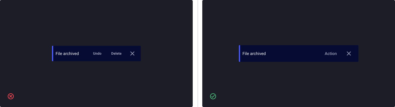
Use one action only
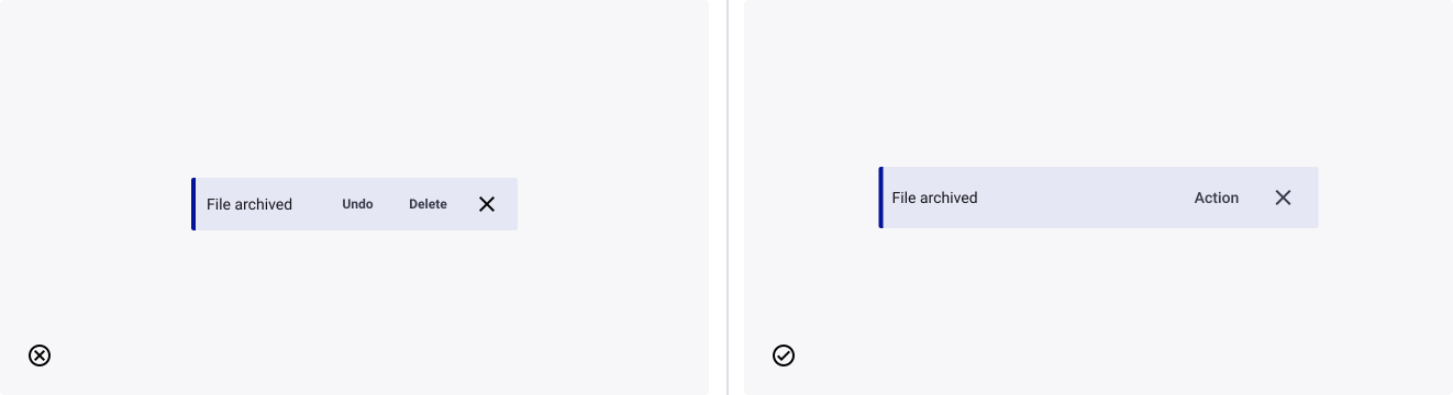
- Don’t: display more than one action in an alert, it can overwhelm and distract the user.
- Do: use only one action to focus the user’s attention on the message in the alert.
Use sentence case
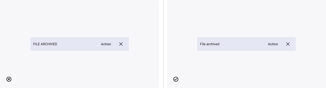
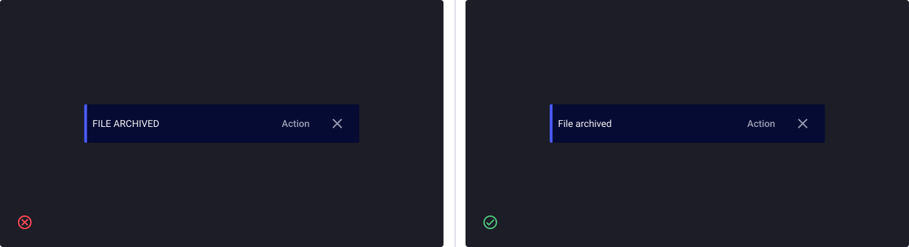
- Don’t: use any other text formatting such as capitalization, as it can affect the users emotional reaction, slows down the reading and can either engage or repel them.
- Do: use sentence case as it is easier to read, and more natural when reading.
Overuse of alerts
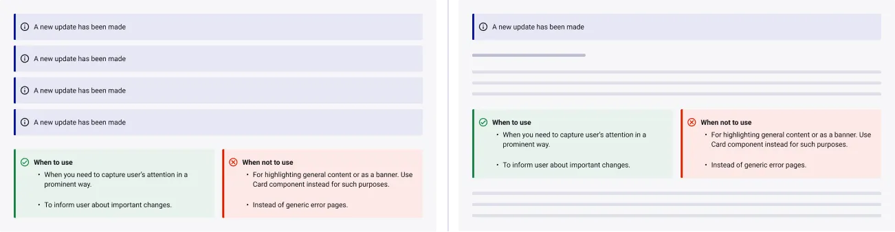
- Don’t: Overuse alerts, too many alerts is annoying and obstructive and can lead users to disregard them.
- Do: Use alerts sparingly and only to highlight information that requires the user’s attention.
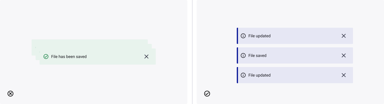
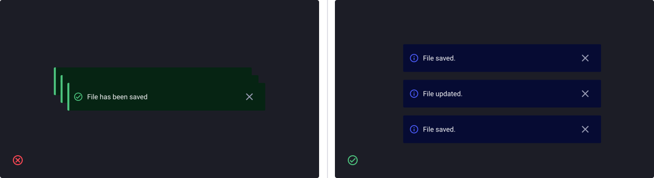
Avoid stacking multiple toasts
Quantum recommends presenting single toasts as opposed to stacking or overlaying. However, we do recognise that sometimes toasts are consecutively or simultaneously triggered and so they must be presented somehow - in this case, we recommend the stacked approach.
Examples of usage
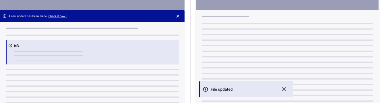
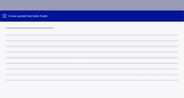
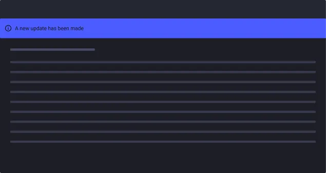
Alerts as a banner
You can use alerts as a banner to display non-critical information or messages that do not require immediate action from the user.
Alerts in notifications
You can use alerts in notifications to inform the user of important information or events that require their attention.