Dropdown Menu
Overview
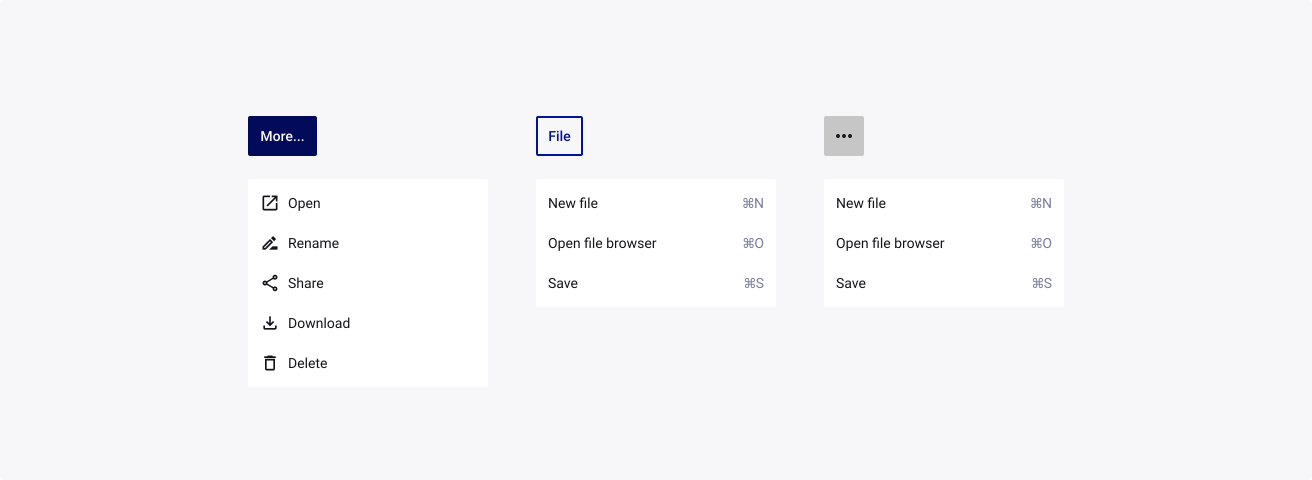
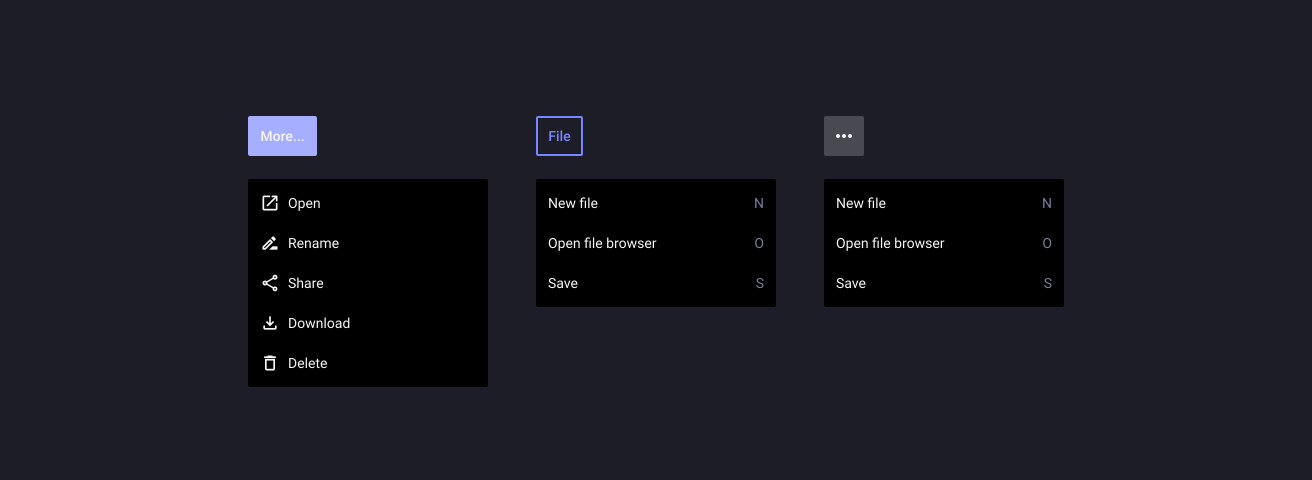
A Dropdown Menu displays a list of actions or options to a user.
Usage
When to use:
- Users need to select one item exclusively from a short list of options (for example, fewer than 12 items).
- The values of the option list contain secondary information that does not need to be displayed right away.
When not to use:
- Users need to select from a list of two options, where one of the options can be implied as on and off or yes and no. Consider using a Toggle Switch control instead.
- Users need to pick one item from a large set of options. In this case, you should consider using the Combo Box instead.
- Your use case requires all available options to be displayed right away, without any user interaction. In this case, consider using Radio Buttons or a Radio Button Group instead.
- Do not nest dropdowns or use them to display overly complex information. Keep option selections as straight forward as possible.
Sources and references
- 10 Ways to Improve Dropdowns in UI & UX Design - UX Design
- Dropdowns - Bootstrap
- Dropdown Menu - Atlassian
- Menus - Material Design
- Popover - Adobe Spectrum
- Popper.js - Popper
- Dropdown - IBM Carbon
- Web components punch list - TPGi
- Alice Bartlett: Burn your select tags - EpicFEL 2014 - YouTube
- Dropdown - Microsoft Fluent UI Web
- Action list - Shopify Polaris
- Combo Box - SAP Design System
Anatomy
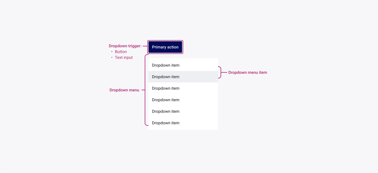
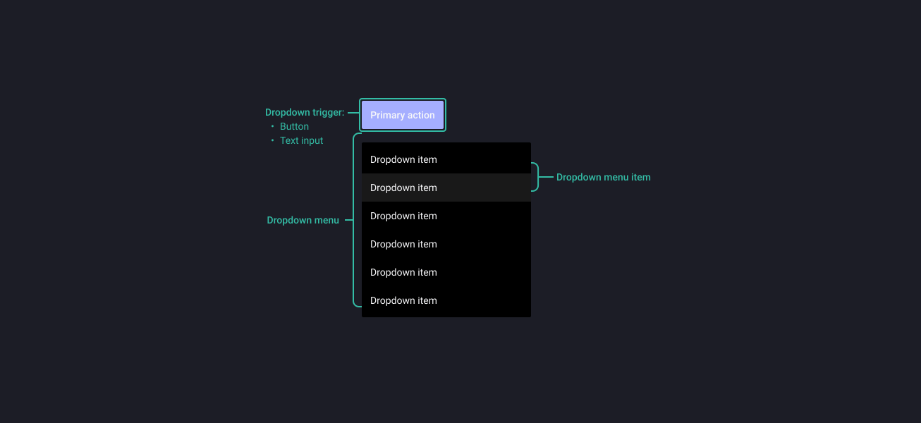
Properties
From the design point of view, each component has a number of options. These options and their names are platform agnostic, and each implementation should adapt these to fit into their framework. In Figma, these are defined as properties that help define each variant.
Heads up
A star or asterisk symbol (*) can be used as a prefix to some Figma component properties in order to inform that the corresponding property is only used that way on the design side (Figma component libraries).
◇❖ Component: Dropdown Menu
| Property | Values | Default |
|---|---|---|
| size | small / medium / large | medium |
| items | 1 / 2 / 3 / 4 / 5 / 6 / 7 / 8 / 9 / 10 / 11 / 12 | 6 |
| scrollable | true / false | false |
❖ Sub-component: Dropdown Menu Item
| Property | Values | Default |
|---|---|---|
| size | small / medium / large | medium |
| state | default / hover / focused / pressed | default |
| active | true / false | false |
| disabled | true / false | false |
| hasCheckbox | boolean | true |
| hasIcon | boolean | true |
| icon | instance swap | person |
| hasLabel | text | “dropdown item” |
| hasCaption | boolean | true |
| caption | text | “caption” |
| rightContent | boolean | true |
Behaviour
Size
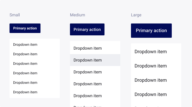
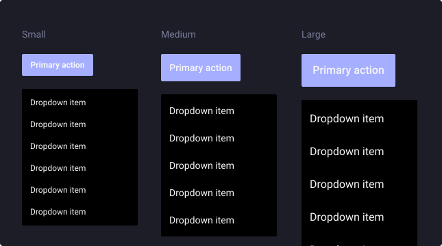
Dropdowns are available in three sizes to cater for the diverse range of use cases and devices that our business uses.
By default, the medium dropdown is typically used for desktop/tablet devices. But for mobile devices, it is advised that you upscale the dropdown, to increase the touch area and make sure you reach the minimum requirements considering your target screen size and density.
For more information about target size, check out W3’s website.
Sorting
Items in a dropdown list should be sorted in the most logical way for the user. The following options are suggested when considering which sorting method to use…
- Logical: sorted into a meaningful order such as days of the week.
- Alphabetical: sort names, and similar content alphabetically.
- Numeric: sort numeric values into a sequential order, with the lowest number first.
- Chronological: sort time-related information into chronological order, with the most recent first.
Text overflow
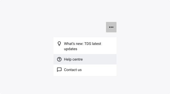
When a dropdown menu item label is too long for the available horizontal space, they wrap to form another line.
The field text itself truncates at the end, but the text can be shown in full in the dropdown menu.
Position
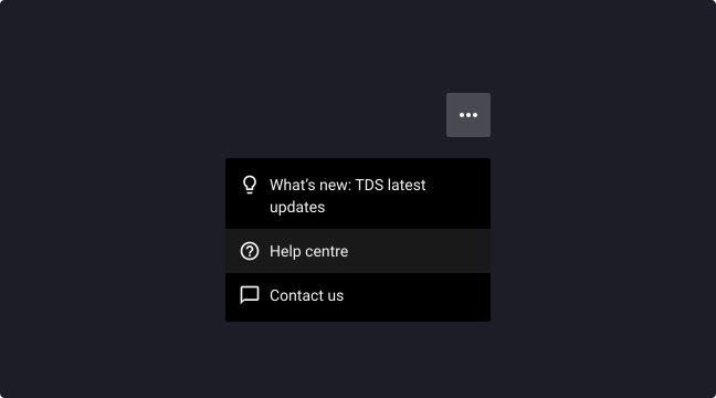
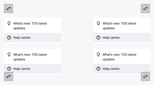
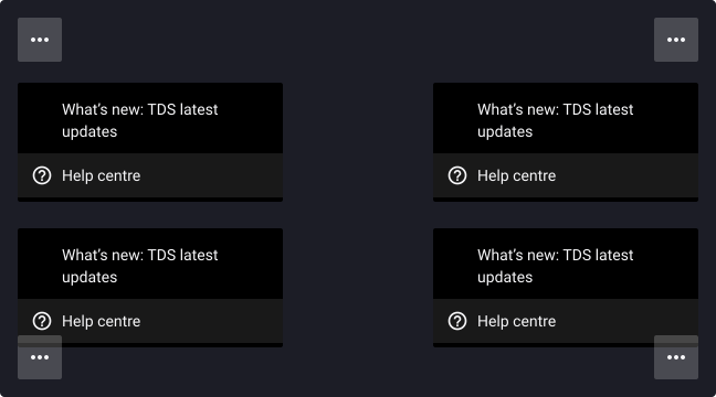
Menus should be positioned relative to the edge of the screen or browser.
They typically appear next to (or in front of) the element that generates them. If they are in a position to be cut off by the browser or screen’s edge, the menu can instead appear to the left, right, or above the element that generates it.
Scrolling
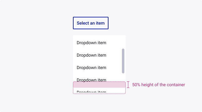
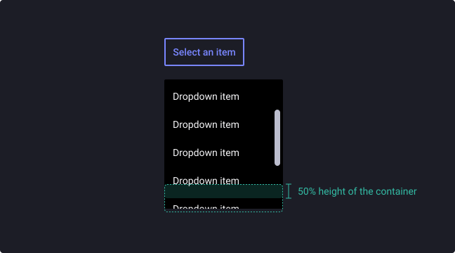
Menus can be scrollable if not all menu items are shown at once. In this state, menus show a persistent scroll bar. However, scroll bars may not always be enabled so we recommend showing 50% of the last item’s container height to indicate there is more to see within the menu.
Usage Guidelines
Keep menu items concise
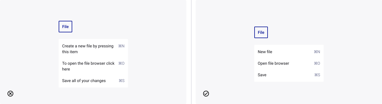
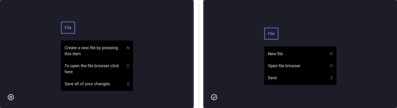
- Don’t: use lots of text to describe the action behind a menu item in the dropdown. It will cause the text to wrap making it difficult for the user to quickly scan the list.
- Do: keep the label in the dropdown menu item short and concise.