Card
Overview
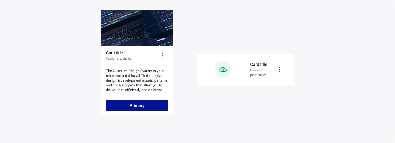
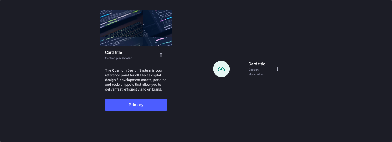
Cards are surfaces that display content and actions on a single topic. They should be easy to scan for relevant and actionable information. Elements, like text and images, should be placed on them in a way that clearly indicates hierarchy.
Warning
The Card component needs strong Figma skills from designers, with the use of auto layout and layer constraints. These skills are needed to customize the create by creating your own assets to suit your needs, but default assets are already created to help you.
Usage
When to use:
- To wrap linked informations into a container.
- To display content and actions on a single topic inside a container.
- To visually separate specific parts of content in a view using a padded background color.
- To show data visualisation.
- Use in groups to link similar items and to show homogeneous or heterogeneous content.
When not to use:
- When you need to capture user’s attention in a prominent way.
- To inform the user about important changes or conditions in the interface.
- When you need to have multiple primary action buttons.
Sources
- Cards: UI-Component Definition by Nielsen Norman Group
- Card UI Examples and Best Practices by eleken
- Card UI design: fundamentals and examples by Justinmind
Anatomy
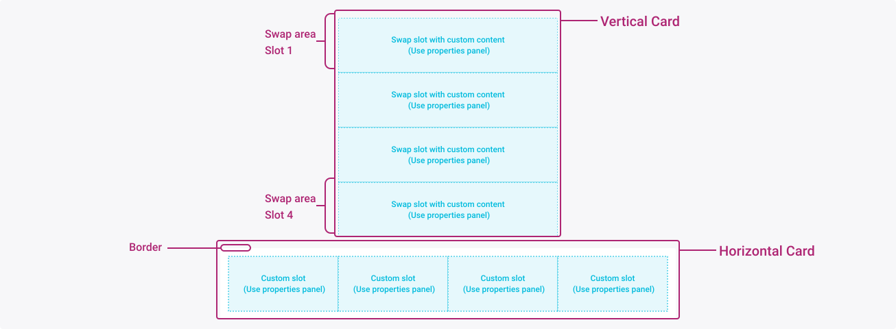
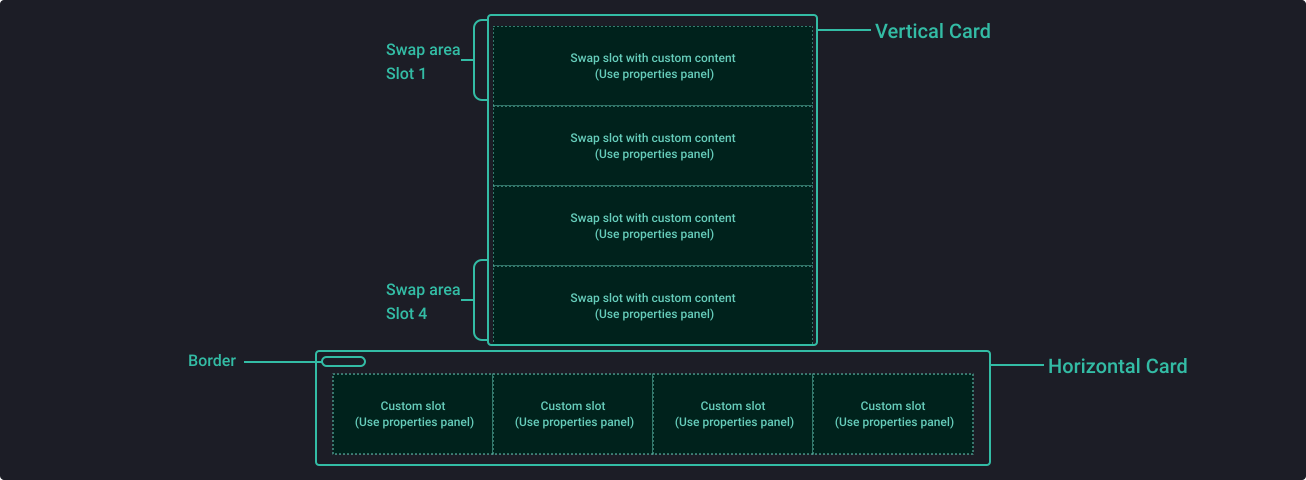
The component anatomy is used to illustrate the general make up of your component, including the spacing and positioning of elements that sit within it.
Properties
From the design point of view, each component has a number of options. These options and their names are platform agnostic, and each implementation should adapt these to fit into their framework. In Figma, these are defined as properties that help define each variant.
Heads up
A star or asterisk symbol (*) can be used as a prefix to some Figma component properties in order to inform that the corresponding property is only used that way on the design side (Figma component libraries).
Component: Card (Horizontal & Vertical)
| Property | Values | Default |
|---|---|---|
| border | false / true | false |
| shadow | false / true | true |
| Slot 1 | false / true | true |
| Slot 1 | instance swap | Layout block |
| Slot 2 | false / true | true |
| Slot 2 | instance swap | Layout block |
| Slot 3 | false / true | true |
| Slot 3 | instance swap | Layout block |
| Slot 4 | false / true | true |
| Slot 4 | instance swap | Layout block |
Sub-component: Custom Slot
| Property | Values | Default |
|---|---|---|
| direction | horizontal / vertical | vertical |
Assets
The assets are the small bricks made available to the designers to easily complete their cards. They are intended to be placed in the blue swap areas. These assets are the foundations on which designers will have to create and add their own assets in order to fit their needs perfectly.
How to create your own asset
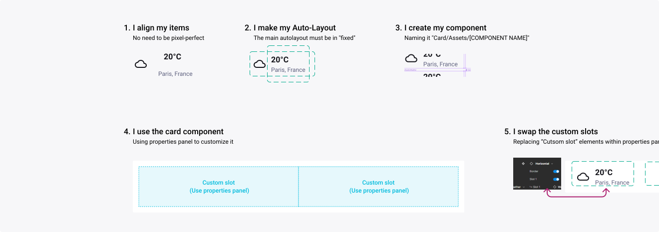
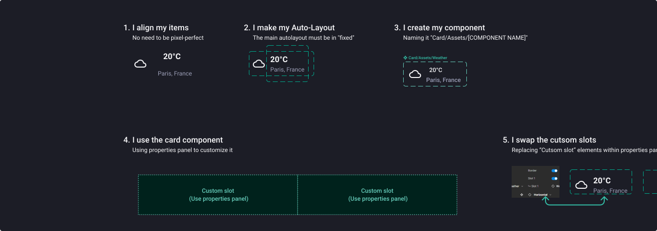
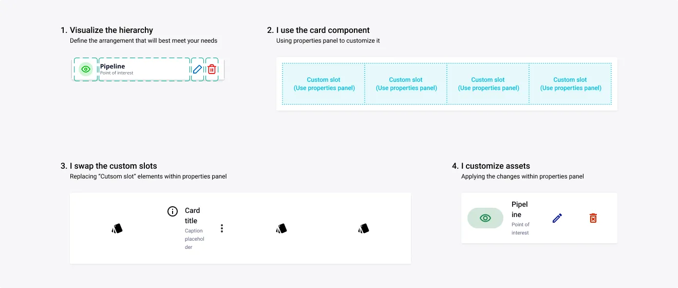
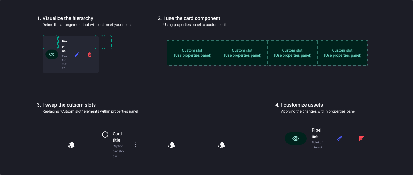
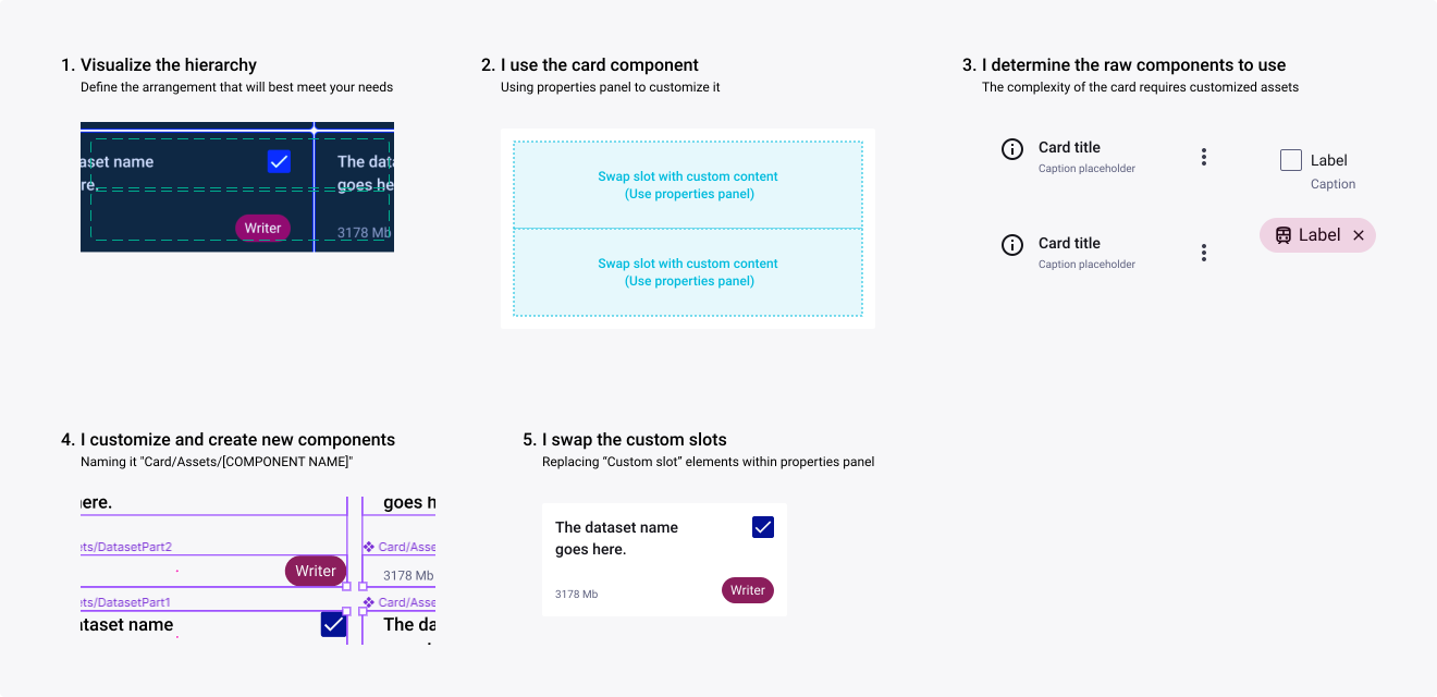
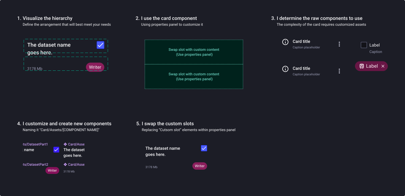
Here is a short tutorial to allow the designer to create custom content.
Tutorial #1
Tutorial #2 - Recreate a horizontal card
Tutorial #3 - Recreate a vertical card
Assets library
Your favourite design system team has prepared a few assets for you in advance, which are available in the “Card/Assets/” folder when swapping a custom slot from the properties panel. It’s your starter pack to get you rolling!
Header
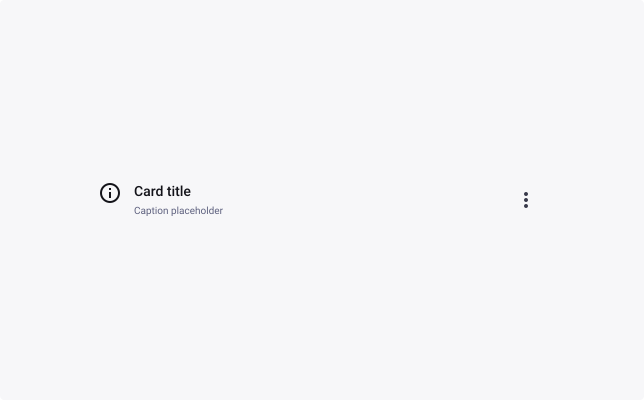
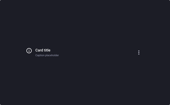
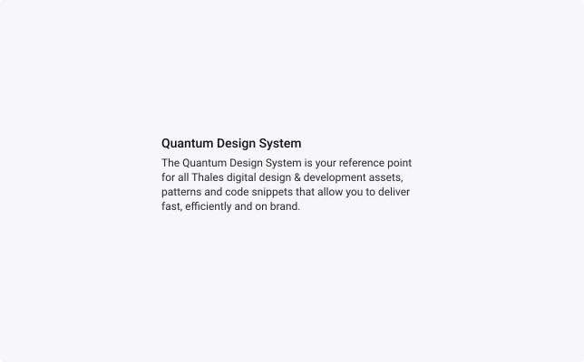
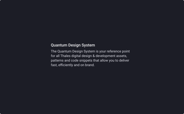
Title with text
Button kit
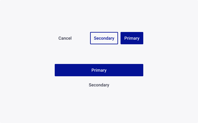
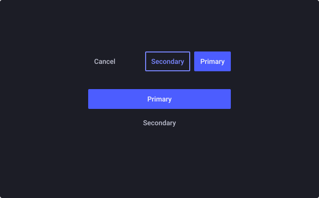
Image and button
Icon

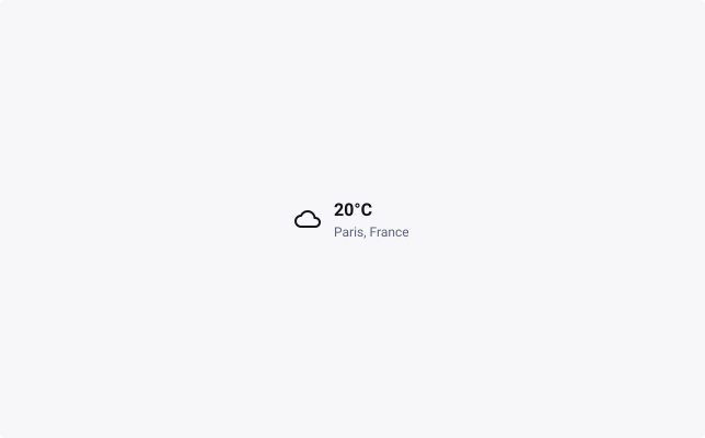
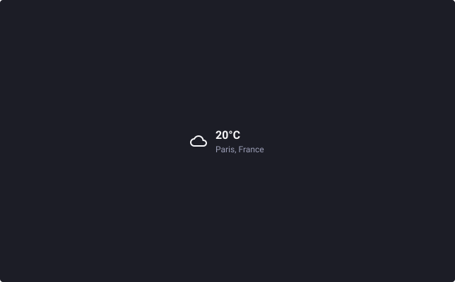
Weather
Templates
Find here some card templates to help make the complexity of the card component more understandable, via the presentation of tangible applications from a end-user perspective.
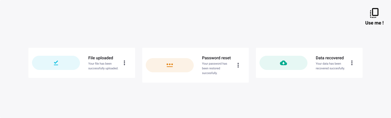
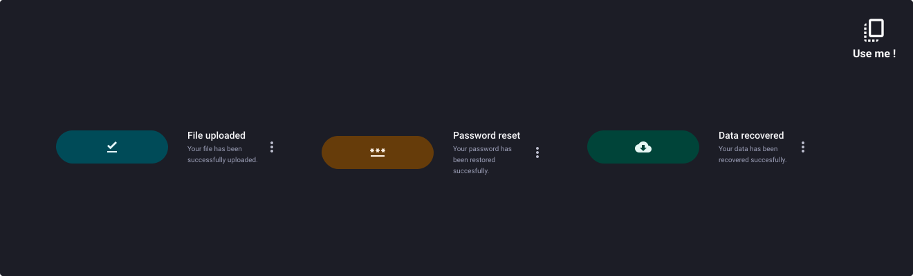
1. Card as contextual indicator
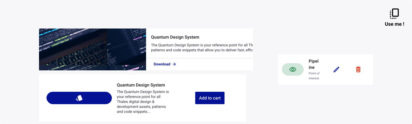
2. Card as an horizontal tile with visual
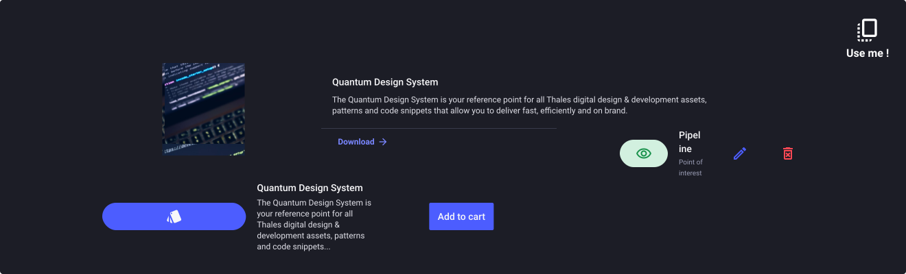
3. Card as a vertical tile with visual
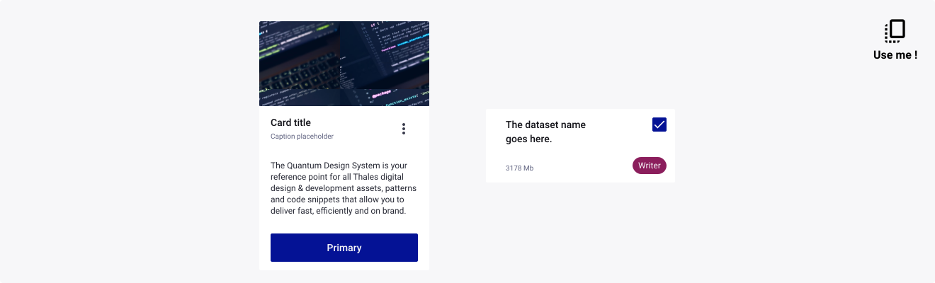
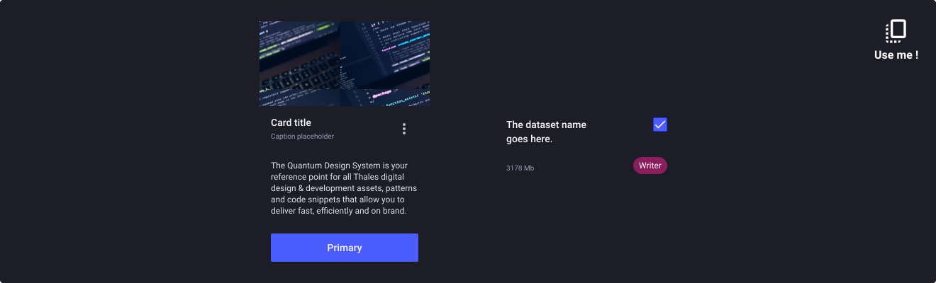
4. Card as a data visualisation


Usage Guidelines
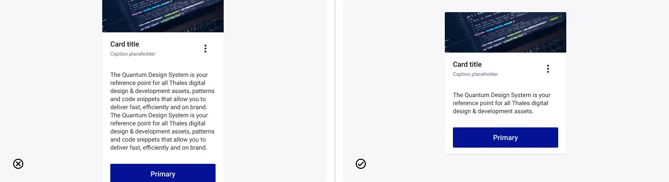
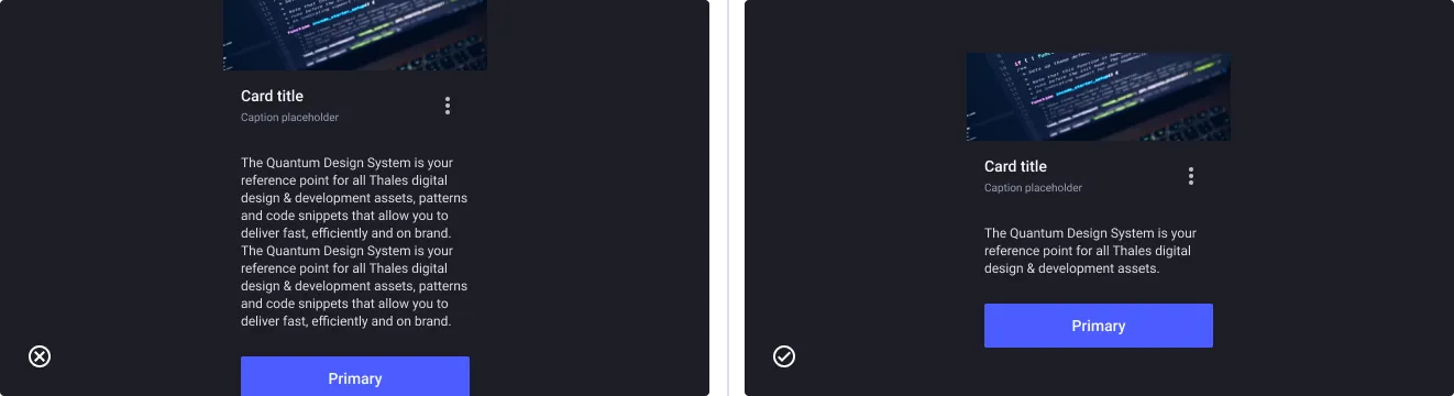
Be concise in the card content
- Don’t: Overwhelm the space with excessive content
- Do: Include essential, summarized information
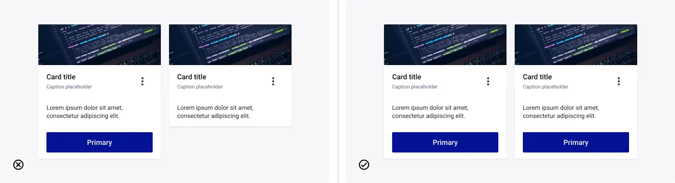
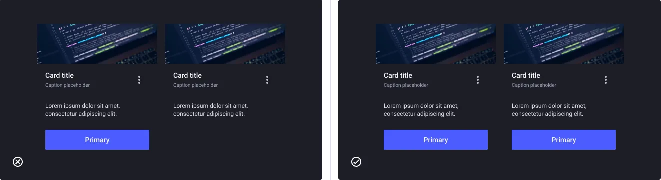
Be consistent in the content of grouped cards
- Don’t: Group different cards that use different elements
- Do: Use consistent elements from card to card to represent clear listing pattern
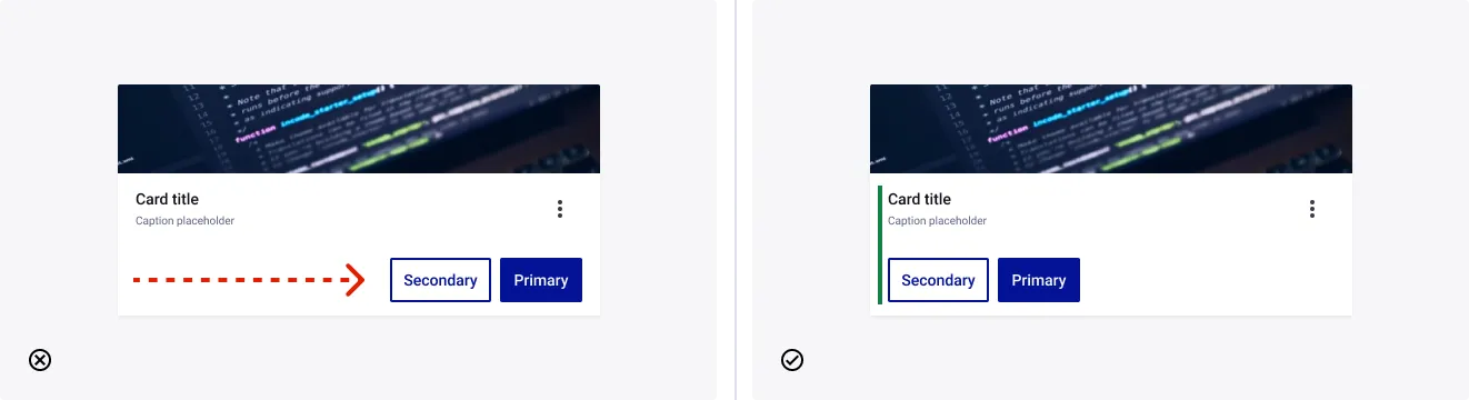
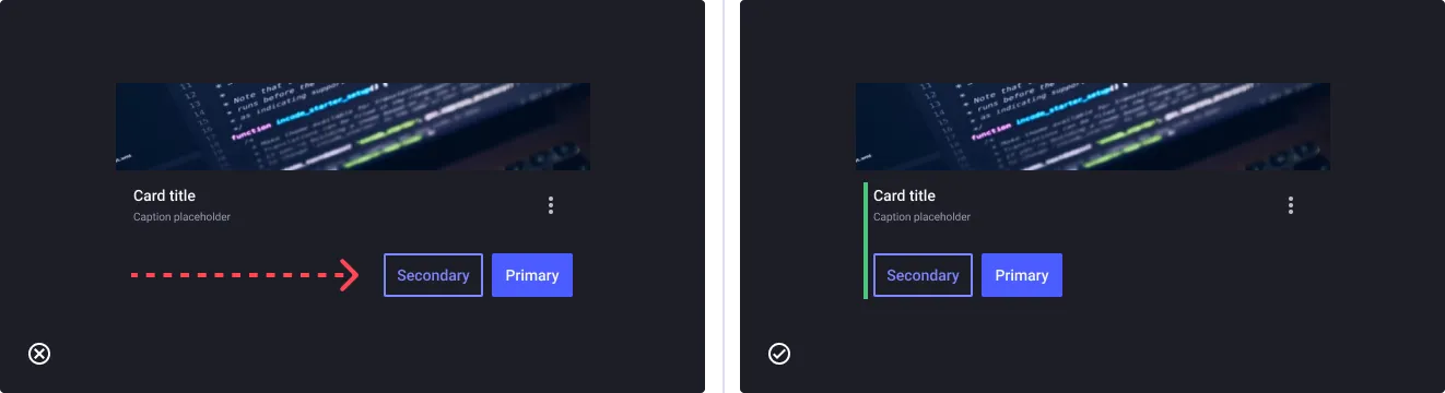
Make cards easy to read
- Don’t: Unaligned elements make the card hardly scannable
- Do: Card correctly aligned make the action buttons easier to use