Date Picker
Overview
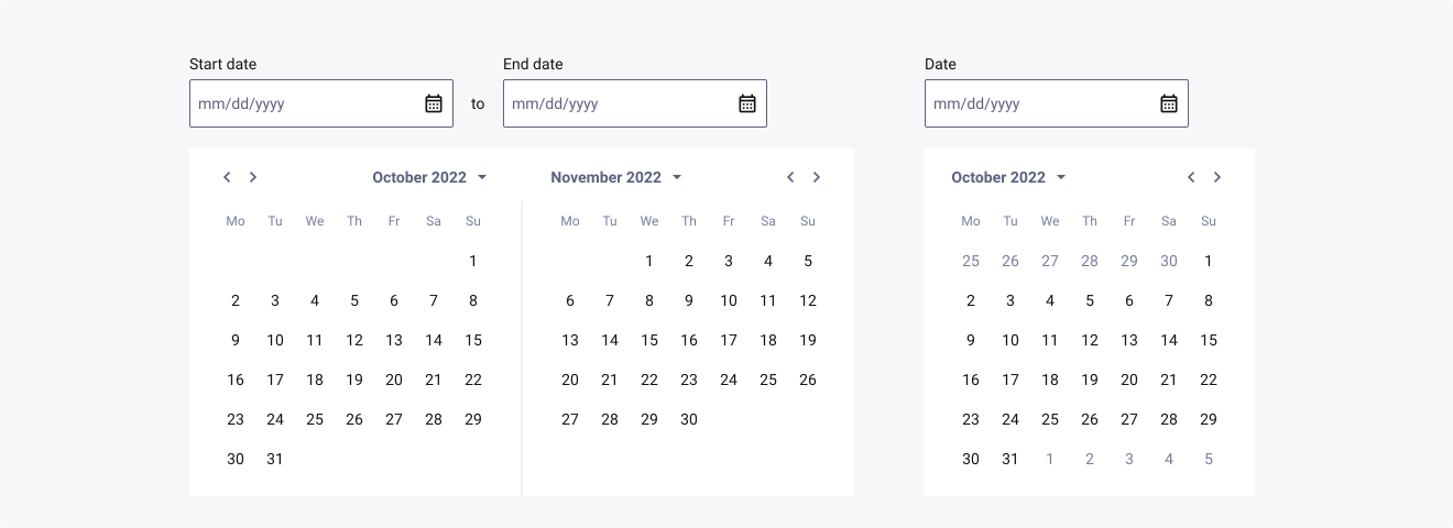
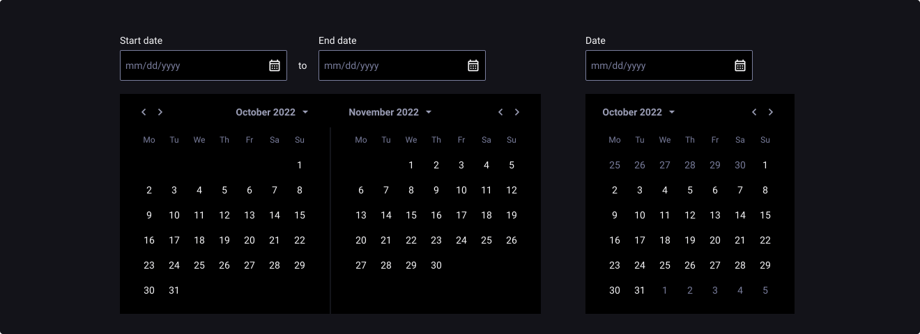
Date Pickers are used when you have to select dates, whether dates are displayed in a calendar view or simply in an input field. They allow you to select a single value from a predetermined set, or a range of values depending on context.
Usage
When to use:
- If you want users to indicate a single date or a range of dates.
When not to use:
- If the dates are really restrictive and could be filled with a predefined list or checkbox.
Sources
- Date-Input Form Fields by Nielsen Norman Group
- Date picker by Carbon Design System
- Date Picker by MUI X
- Datepicker by Material Angular
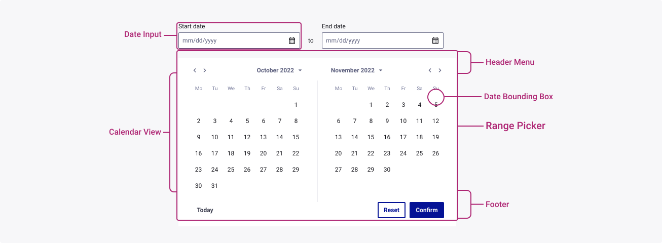
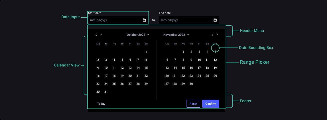
Anatomy
Properties
From the design point of view, each component has a number of options. These options and their names are platform agnostic, and each implementation should adapt these to fit into their framework. In Figma, these are defined as properties that help define each variant.
Heads up
A star or asterisk symbol (*) can be used as a prefix to some Figma component properties in order to inform that the corresponding property is only used that way on the design side (Figma component libraries).
Component: Date Picker
| Property | Values | Default |
|---|---|---|
| size | small / medium / large | medium |
| range | off / on | off |
| state | default / hover / filled | default |
| color | neutral / primary | primary |
| error | false / true | false |
| disabled | false / true | false |
| showCalendar | boolean | true |
| footer | boolean | true |
| caption | boolean | true |
Component: Date Bounding Box
| Property | Values | Default |
|---|---|---|
| size | small / medium / large | medium |
| color | primary / neutral | primary |
| state | default / hover / focused / pressed / in range | default |
| selected | false / true | false |
| disabled | false / true | false |
| label | text | 1 |
| current day | boolean | true |
| first date | boolean | false |
| last date | boolean | false |
Component: Header Menu
| Property | Values | Default |
|---|---|---|
| size | small / medium / large | medium |
| style | single picker / right range picker / left range picker | single picker |
| yearCalendar | false / true | false |
| dropdown | boolean | true |
| label | text | “october 2022” |
Behaviour
Date Picker
Sizes
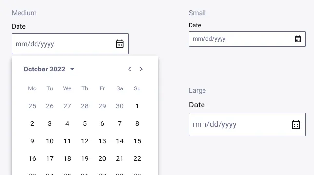
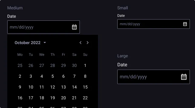
Date Picker exist with 3 different sizes: small, medium and large.
When the calendar is open, each nested component should be the same height as the date input field. Use a consistent size of form components on the same page.
For example, if you are using a medium size dropdown multiselect, also use the same size text inputs, buttons, and so on.
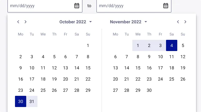
Range Picker
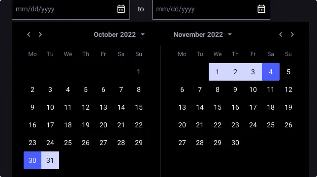
Range Picker should be used when the user is asked to specify a range of dates, for example for the dates of departure and return of a trip.
Range Picker is basically two Date Pickers joined.
First Child and Last Child properties should be used on selected state dates to produce a more realistic prototype.
Calendar
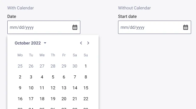
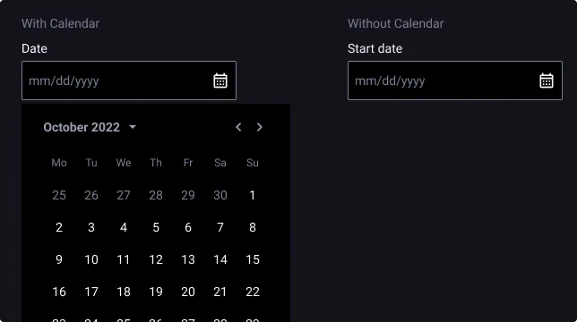
By default, the calendar is visible (On state), but it is possible to hide it and show only the date input label.
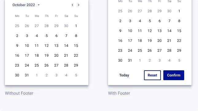
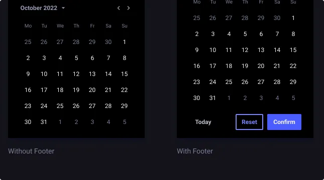
Footer
By default, Footer is not visible (Off state). When activated, it allows the user to control the date picker component with explicit action buttons, primary, secondary and tertiary buttons.
It offers the possibility to confirm or cancel the current selection, and use “Today” shortcut to return to today’s date.
Date Bounding Box
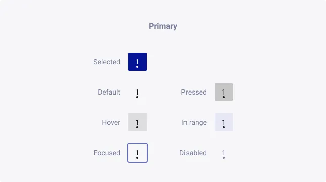
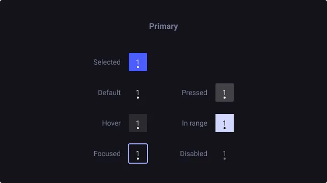
State
States, similar to the Button component are proposed to cover every use case.
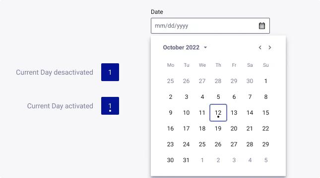
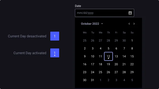
Current Day
By default, current day state is deactivated within a Date Picker component. The indication is materialized by a dot under the day number.
The goal is to allow the user to know the current day from the date picker, to speed up his decision making.
First and Last Date
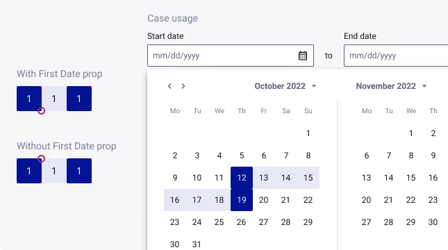
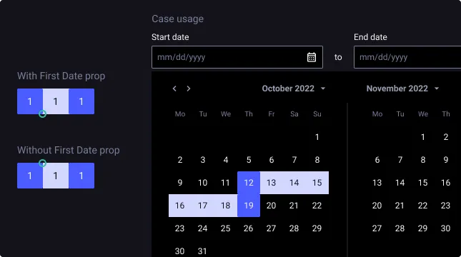
First Date and Last Date are properties only available for Date Bounding Box component with selected state.
It should be used when a date range is indicated, to keep visual consistency between the Selected and In Range states of the Date Bounding Box.
Header Menu
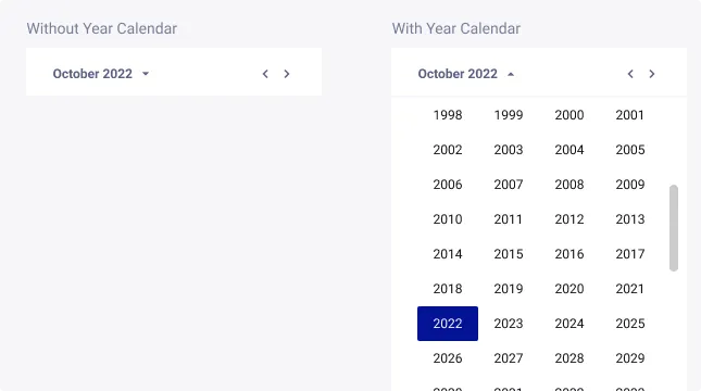
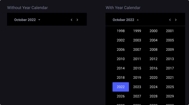
Year Calendar
By default, Year Calendar is not visible (Off state). When activated, it allows the user to select the targeted year efficiently.
States, similar to the Button component are proposed to cover every use case.
Usage Guidelines
Usage guidelines help depict the best practices when using this component by giving examples of the do’s and don’ts.
Never without my Date Input
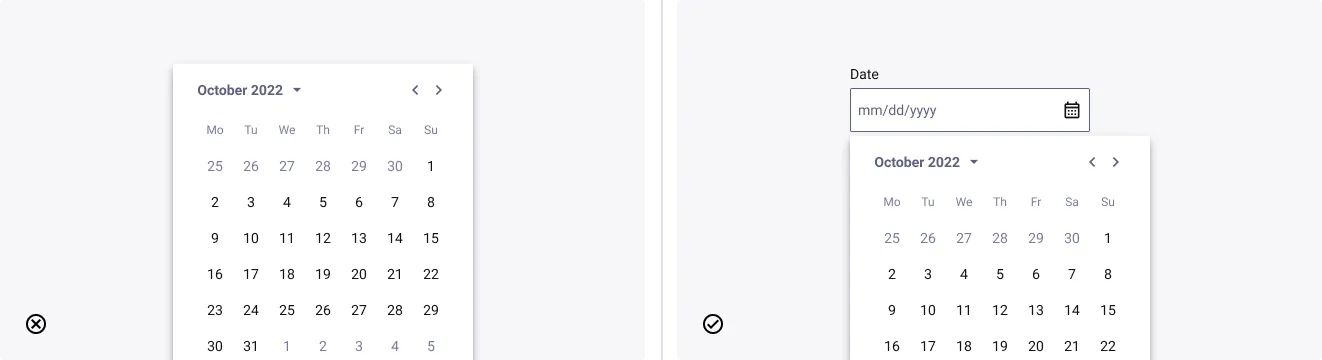
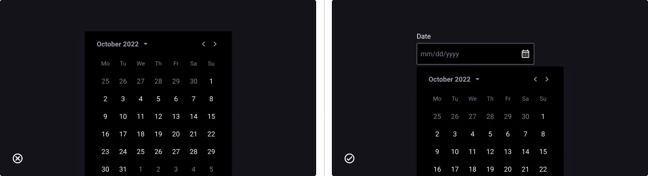
- Don’t: suppress the date input field
- Do: always allow users to type the date
A good Date Input is a personalized one
- Don’t: only use pre-filled date input provided by Quantum
- Do: adapt the input field to the localisation or the need of your user
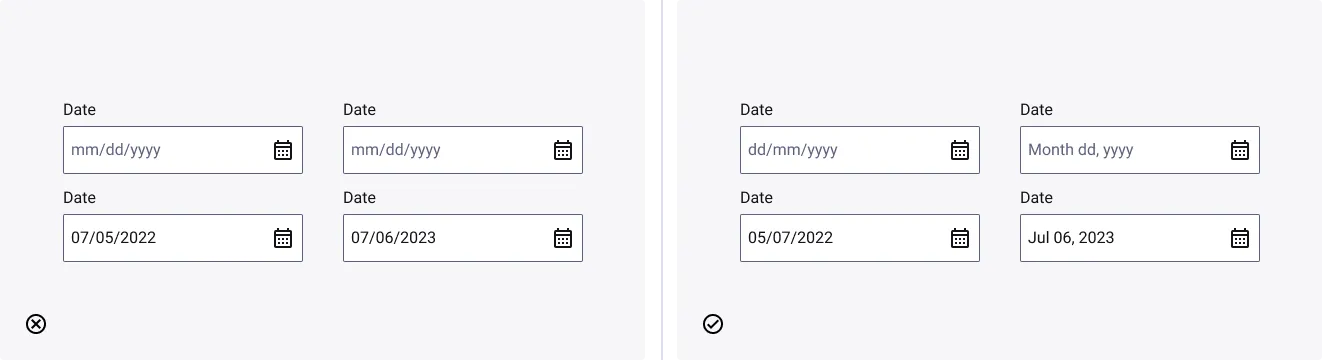
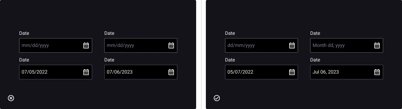
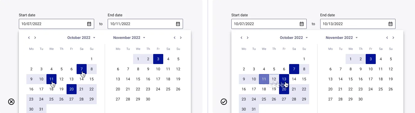
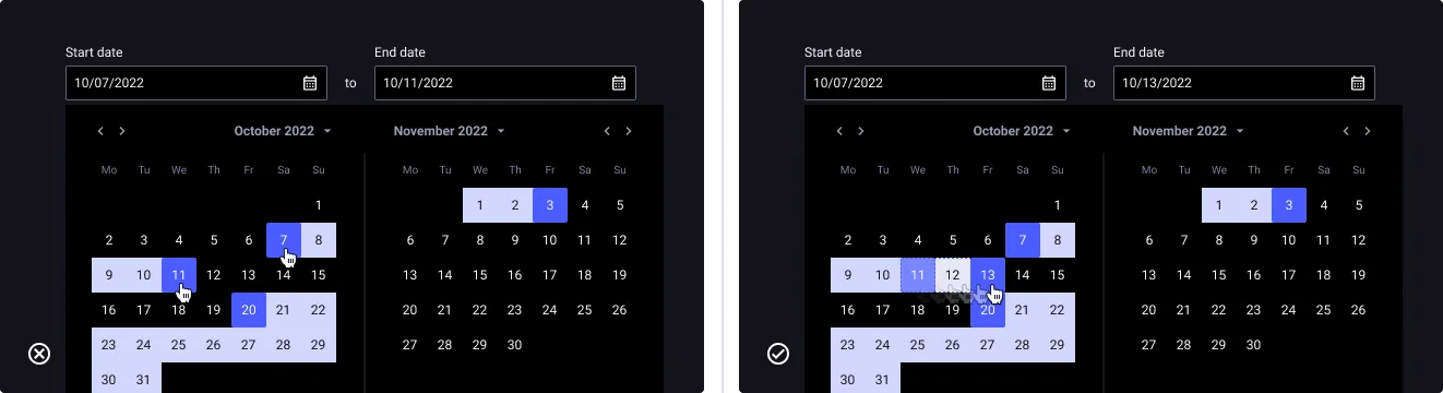
Drag selection behavior
- Don’t: only use click option to select a date range
- Do: propose a drag selection to adapt to user ease
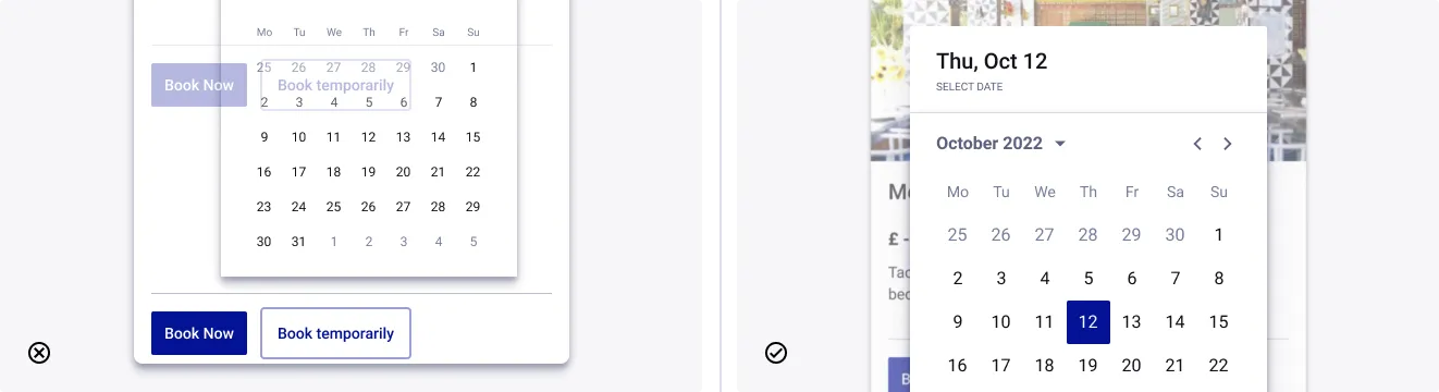
Date Input for a Mobile usage
- Don’t: use date picker as a push
- Do: use date picker as a modal

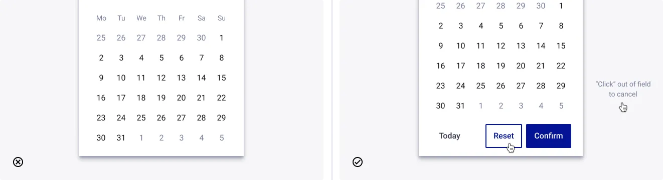
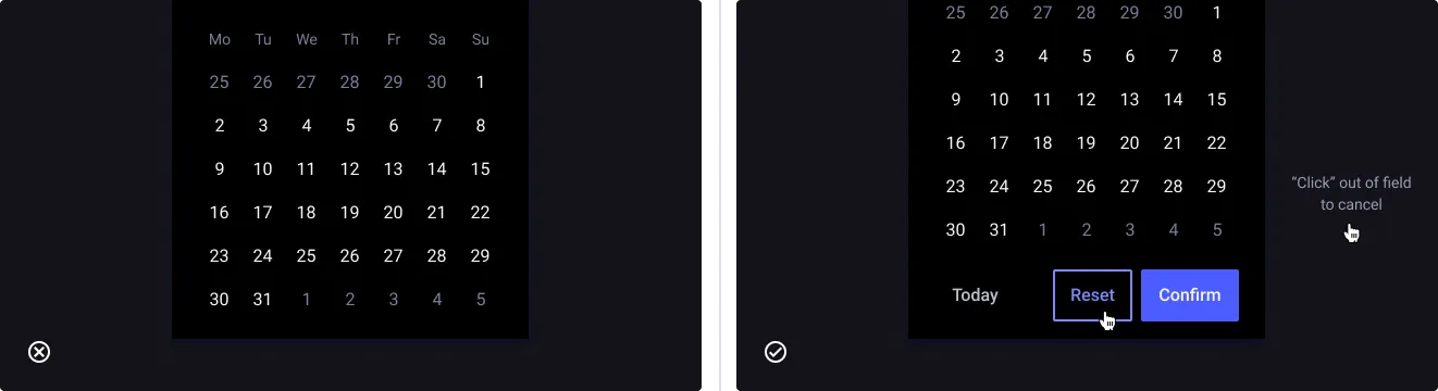
What about the reset feature
- Don’t: prevent the user’s right to error
- Do: express the user’s right to error by displaying the Footer or with click-to-cancel mechanism
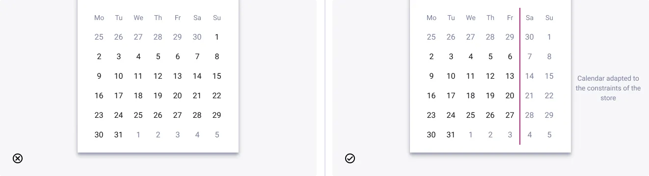
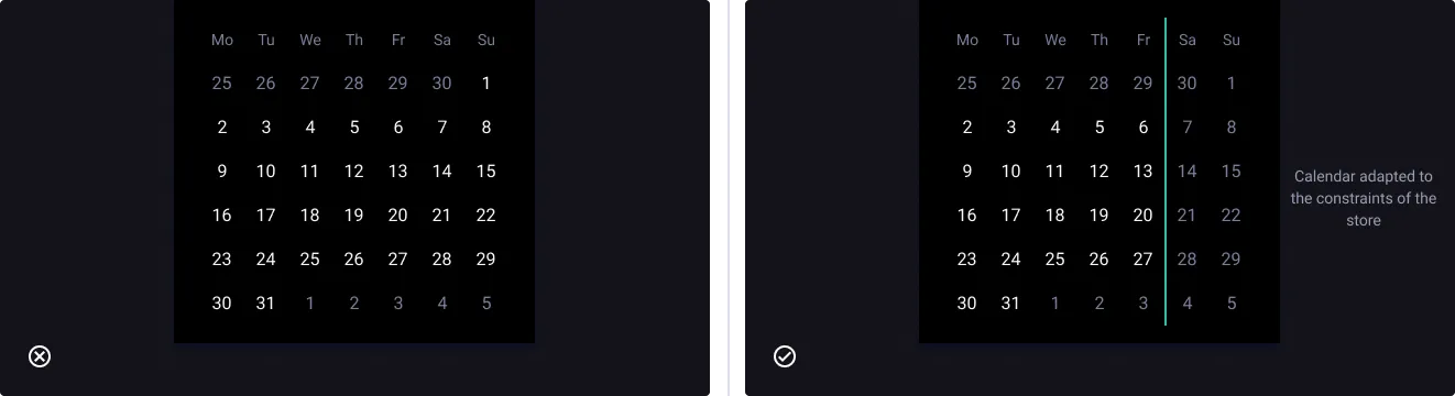
Uses of disable on days
- Don’t: limit yourself to using the default calendar
- Do: use date picker by adapting the days of unavailability to it’s context
Showcase
Showcase of a component - like a usage demonstration - help to make the complexity of a component more understandable, via the presentation of a concrete use by a hypothetical end user.
Date Picker demonstration
Hypothetical goal
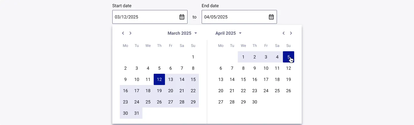
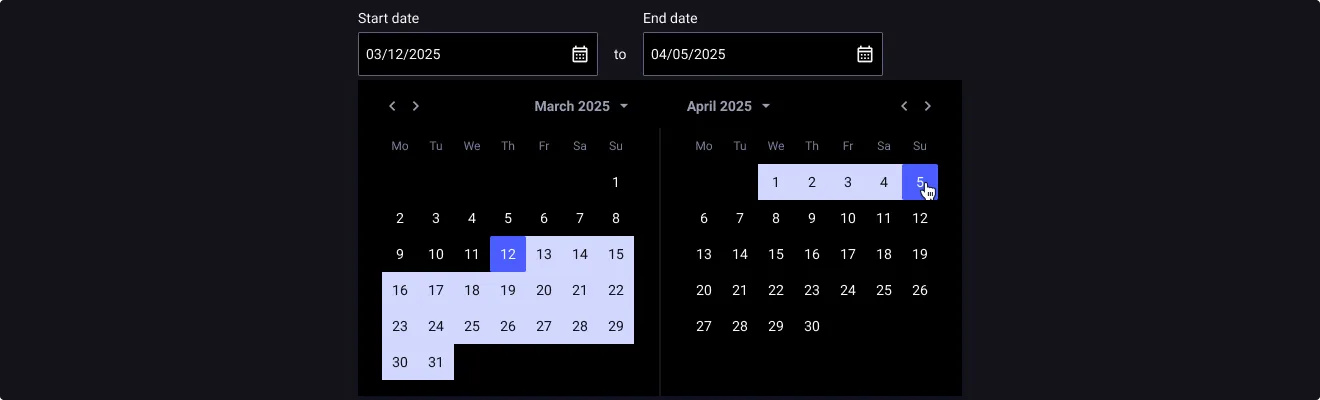
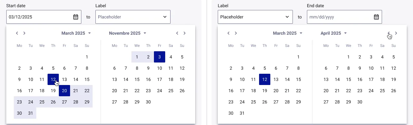
Select your travel dates - March 12, 2025 to April 5, 2025
Steps
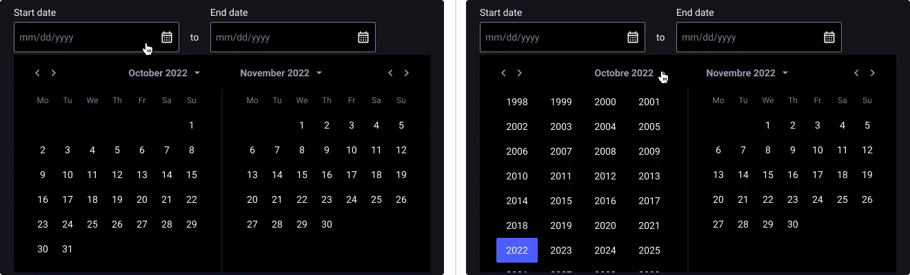
- Use Range Date Picker
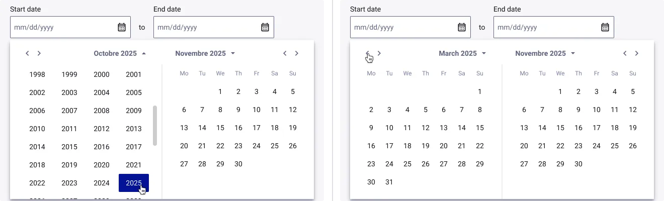
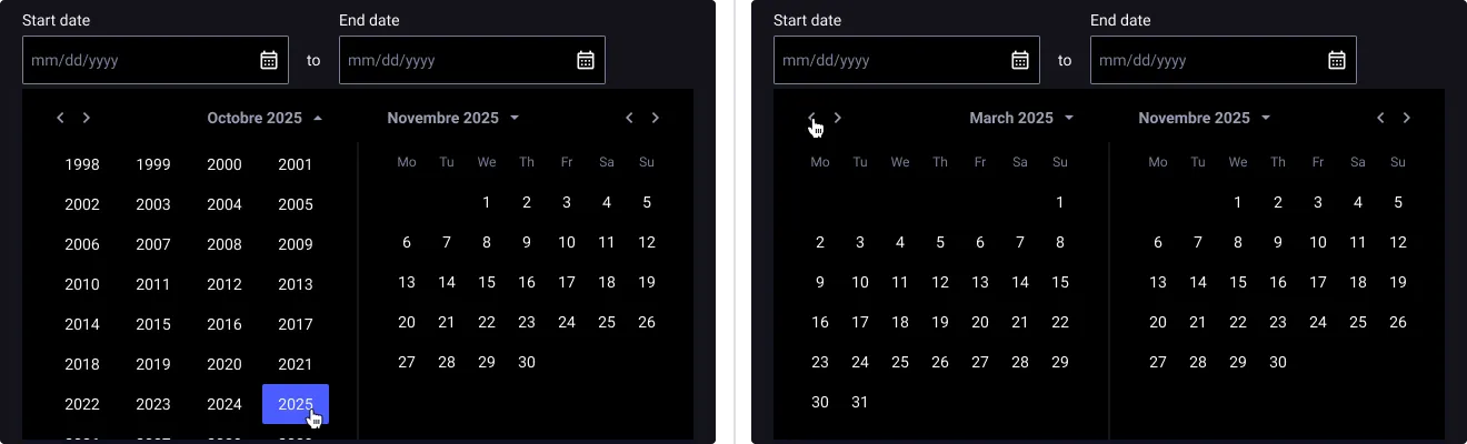
- Change years
- Change months
- Change days
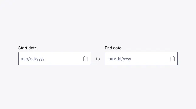
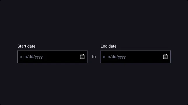
- Open the Range Date Picker by clicking on the Date Input & open the Start date’s Year Picker by clicking on the arrow.
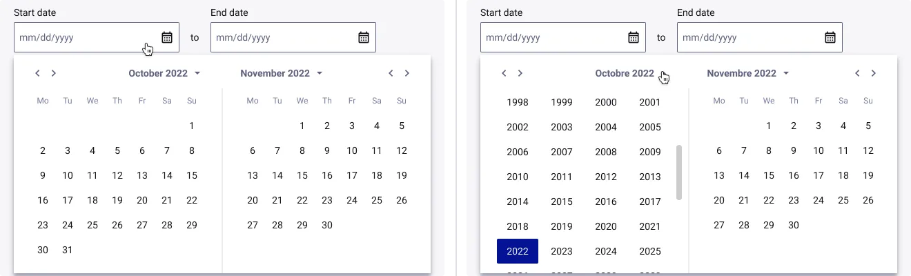
- Select the year & select the month within Header Menu by clicking on the chevron.
- Select the day within Calendar View & repeat the process for the End date.
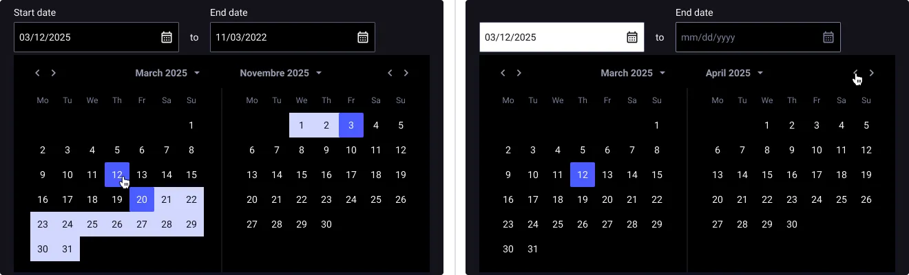
- Enjoy your filled Range Date Picker.