Search
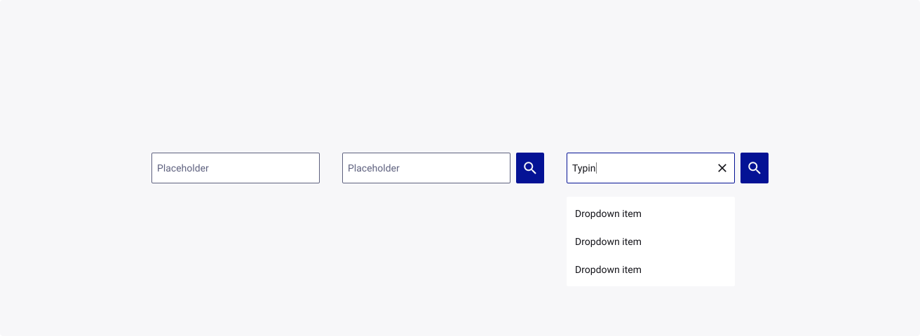
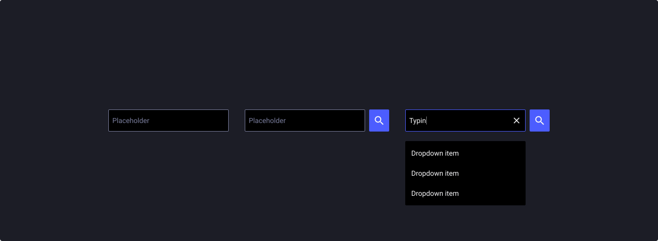
Overview
Search is a text input field specifically designed to help users browse and navigate around a platform.
Sources and references
- Best practices for search - UX Booth
- Search - Material Design
- ARIA Search Landmarks - W3C
- Search Fields - Apple
- Best Practices for Search Results - UX Planet
Anatomy
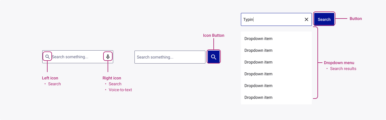
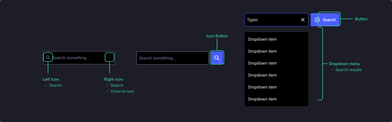
Elements highlighted below can be configurable by you within the component itself. To find out how to customize these elements, please refer yourself to the properties table at the end of this section.
Properties
From the design point of view, each component has a number of options. These options and their names are platform agnostic, and each implementation should adapt these to fit into their framework. In Figma, these are defined as properties that help define each variant.
Heads up
A star or asterisk symbol (*) can be used as a prefix to some Figma component properties in order to inform that the corresponding property is only used that way on the design side (Figma component libraries).
◇◇◇❖ Component: Search
| Property | Values | Default |
|---|---|---|
| size | small / medium / large | medium |
| state | default / hover / filled / active / disabled | default |
| leftIcon | true / false | false |
| showResults | true / false | false |
| button | none / iconButton / button | none |
Composition
Note: this component is composed of other TDS elements (Dropdown Menu, Text Input & Button and therefore we recommend you refer to the documentation of those components to ensure that you use the component in the most appropriate way.
❖ Sub-component: Text input
❖ Sub-component: Dropdown menu
❖ Sub-component: Buttons
Behaviour
Manual search
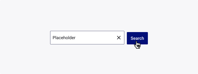
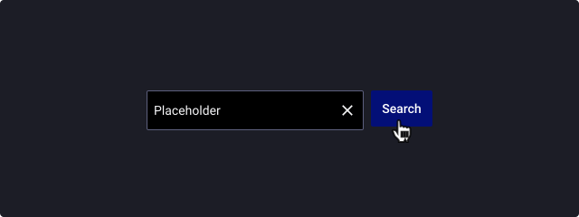
Manual search is triggered explicitly after the user enters text in the search field and clicks the Search button or presses the Enter key.
Live search
Also known as “incremental search” or “search-as-you-type”, the live searching capability is triggered by each character that is entered/deleted by the user.
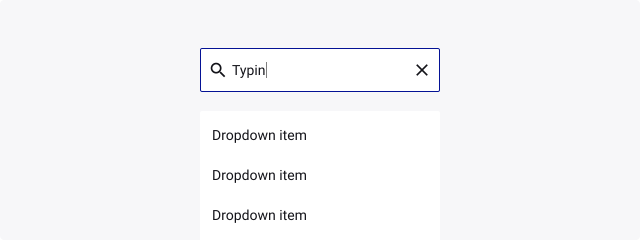
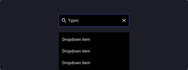
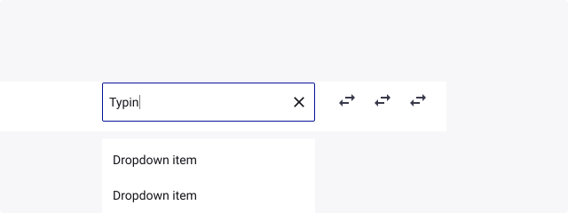
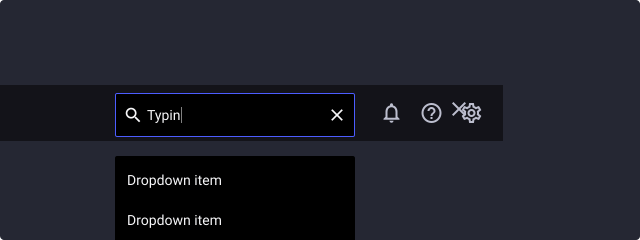
Persistent search
Use persistent search when it is a primary focal point for your application. The persistent search is always available to users and typically used as a global search.
Expandable search
Use expandable search when search is not the primary focus of your app. Expandable search displays a search icon in the toolbar, instead of an open search text box.

Usage Guidelines
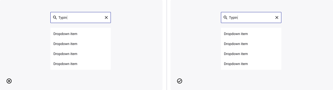
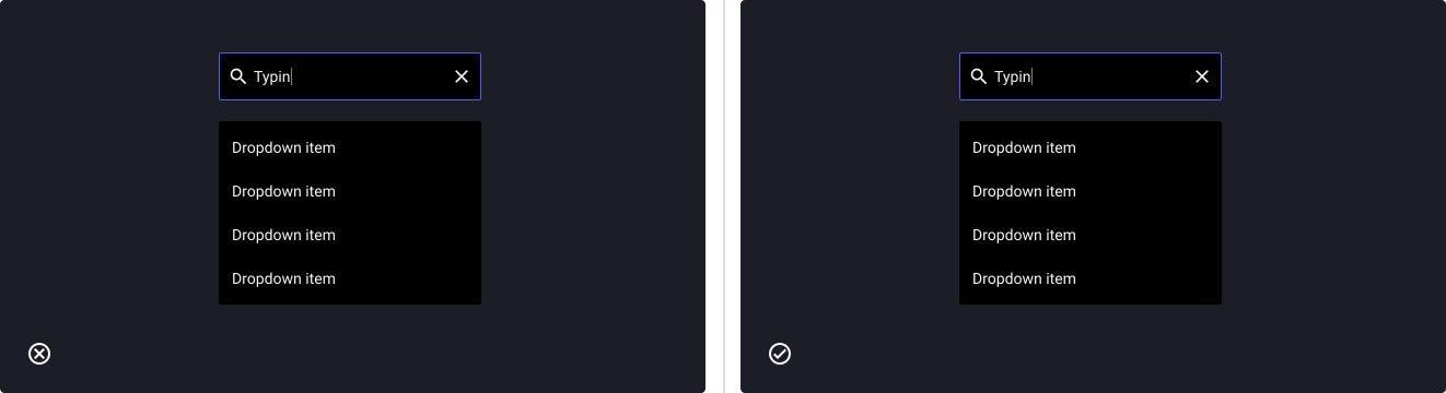
Use effective autosuggest
- Don’t: mix all the results visually to avoid confusion from the users.
- Do: help users speed up the search process by keeping them on-task toward conversion.
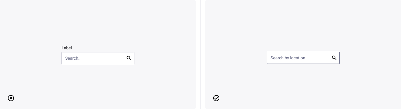
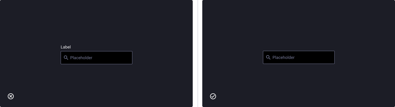
Don’t include a label
- Don’t: mix top label and placeholder label in the same form.
- Do: make the one choice that fit the most your product.