
Button
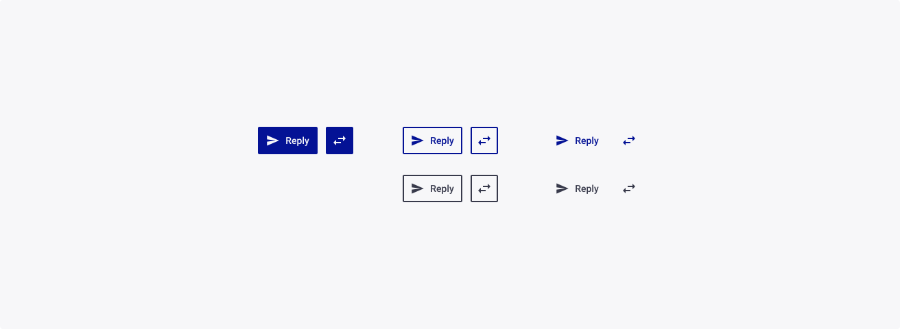
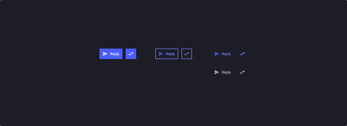
Overview
Buttons should be used to trigger an action by guiding users to achieve the desired actions of a page. Depending on the need and the context, several buttons types and variants are available to help you build meaningful interfaces and prevent mistakes.
Note: Buttons should never be used for an alternative purpose to what it was initially intended for. Avoid using buttons for navigational purposes (menus, tabs, etc.) or clickable elements within sentences. Instead, please refer to the dedicated component available in the TDS.
Usage
When to use:
- To offer a default action as well as the possibility of choosing a different action by selecting from a set of alternatives.
- In complex applications, to not visually overwhelm users with too much cognitive load.
- For repeat-use interfaces with a large number of commands that need to be consolidated.
When not to use:
- If default action and alternatives don’t have a strong relationship.
- Proposing too much alternatives and struggling with choice paralysis.
- Using split buttons for navigation menus on websites.
Sources
- Split Buttons: Definition by Nielsen Norman Group
- Split Buttons: Documentation by ArcGIS Developer
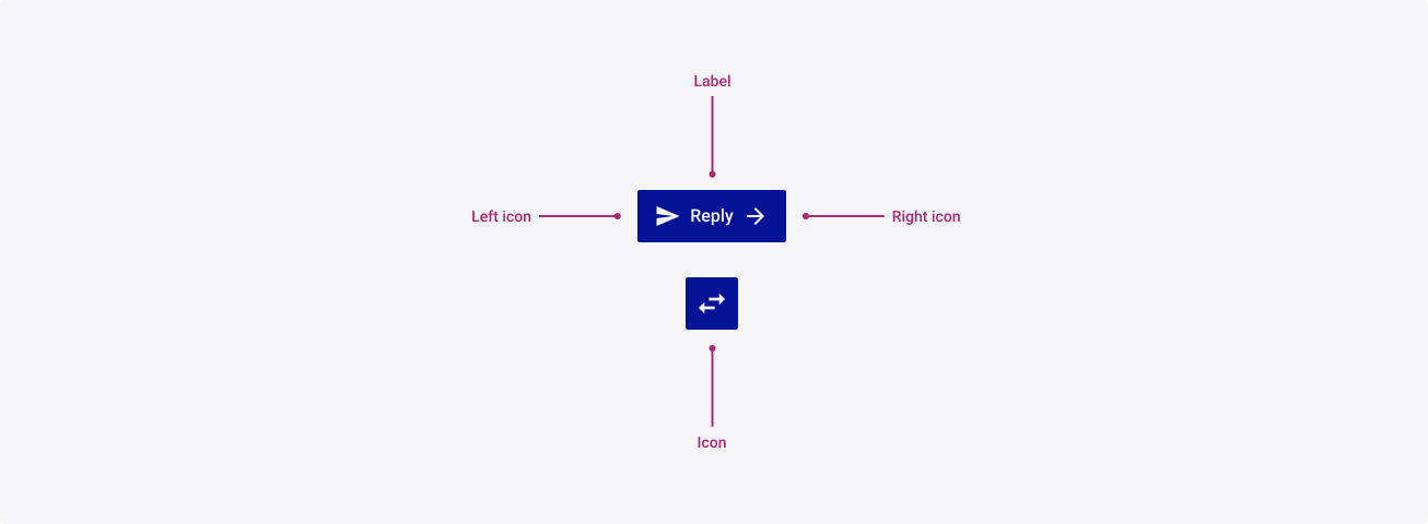
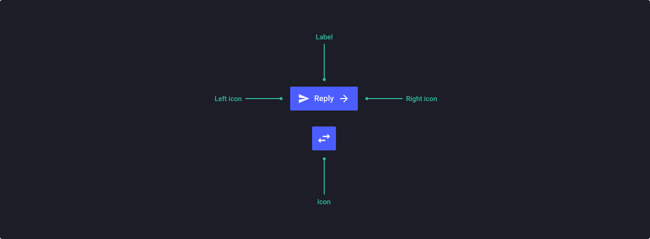
Anatomy
Properties
From the design point of view, each component has a number of options. These options and their names are platform agnostic, and each implementation should adapt these to fit into their framework. In Figma, these are defined as properties that help define each variant.
Heads up
A star or asterisk symbol (*) can be used as a prefix to some Figma component properties in order to inform that the corresponding property is only used that way on the design side (Figma component libraries).
❖ Component: Button
| Property | Values | Default |
|---|---|---|
| size | small / medium / large / xlarge | medium |
| color | primary / success / warning / danger / neutral / white | primary |
| *state | default / hover / focused / pressed / loading | default |
| disabled | false / true | false |
| *manualSize | false / true | false |
| label | text | “Download” |
| *hasLeftIcon | boolean | true |
| leftIcon | instance swap | arrow_circle_down |
| *hasRightIcon | boolean | true |
| rightIcon | instance swap | arrow_forward |
❖ Component: Icon Button
| Property | Values | Default |
|---|---|---|
| size | small / medium / large / xlarge | medium |
| *state | default / hover / focused / pressed / loading | default |
| disabled | false / true | false |
| icon | instance swap | swap_horizontal |
Behaviour
Sizes
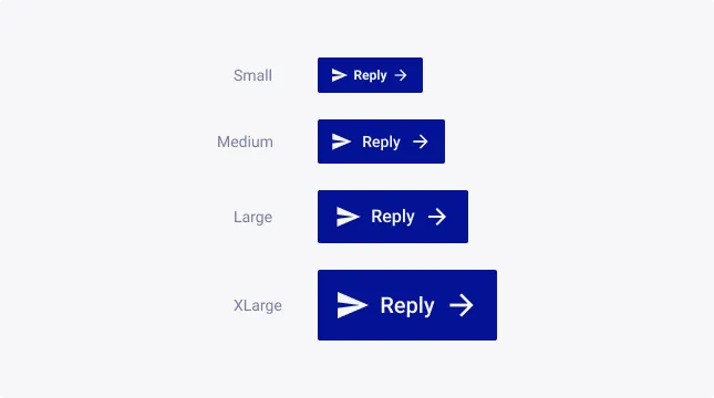
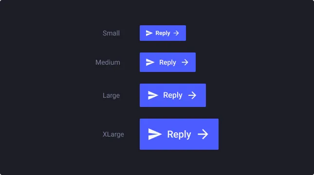
Buttons support four sizes:
- Small (S) for very small layouts
- Medium (M) as default for desktop devices
- Large (L) as default for tablet and mobile devices
- Extra large (XL) for emphasized actions
These buttons have been specially designed with accessibility in-mind, backed by industry standard practices from Google’s Material Design and Apple’s Human Interface Guidelines.
Variants
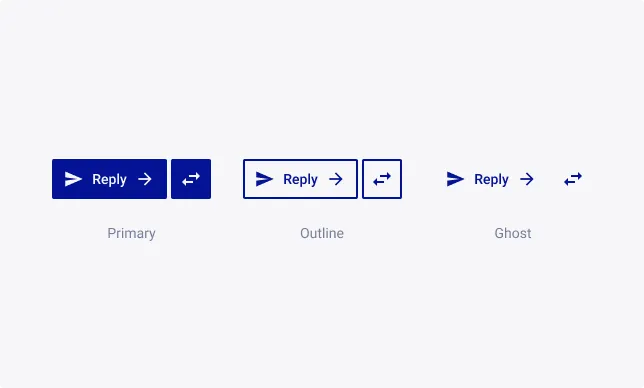
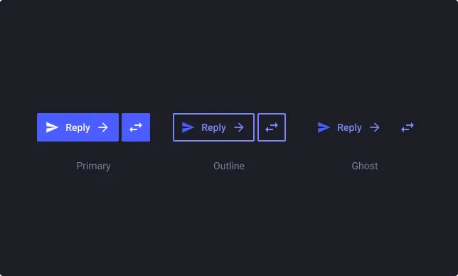
Primary buttons are the main call to action on any page. It is advised that a primary button is only used once on a single page. This avoids drawing the user’s attention away from the primary action you intended for the page.
Outline buttons are for secondary call to actions on any page. Often the secondary button is the alternative we give users to the primary action. Multiple secondary buttons can be used on a single page, however it is advised that you ensure the content of your page is balanced. Too many calls to action can make it hard for users to know what to do next.
Ghost buttons are for miscellaneous actions on any page. Multiple tertiary buttons can be used on a single page, however it is advised that you ensure the content of your page is balanced. Too many calls to action can make it hard for users to know what to do next.
Severity
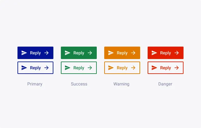
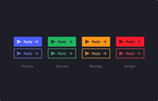
Primary buttons represent the main action or primary call to action on a page. It should be used sparingly to draw attention to important actions.
Success buttons represent successful actions or completion of a task. This could include actions that result in a successful operation or confirmation message.
Warning buttons represent potentially harmful or irreversible actions. This could include actions that delete data or cancel a process, or that require additional caution and confirmation.
Danger buttons represent potential issues or warnings. This could include actions that require additional confirmation or that might result in data loss or other negative consequences.
Left & Right icons
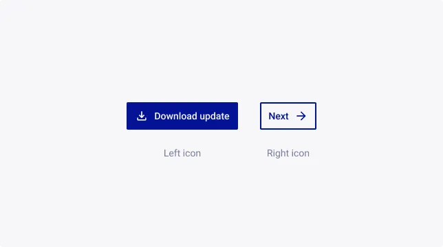
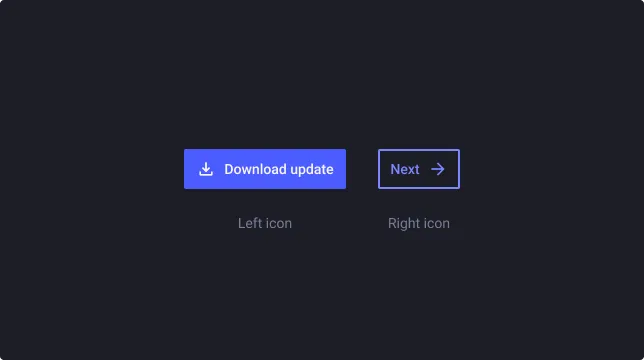
Usage of Left or Right icons depends on the context, the usage and the goal of the button.
Left icons feel visually anchored and more consistent with the left-alignment of the text. Moreover, it’s the more common pattern among other applications, and being consistent is a positive behavior for users - Jakob’s Law. Last but not least, large menu width do not impact the comprehension of the button and the left of the button can be used for counters.
Right icons can be used to keep text from different button aligns. It also adds a rightward movement because text demands more cognitive load than icons. A consideration is that it can visually trapped space, between the icons and the menu title spaces, and create unpleasant reading.
Auto layout & manual resize
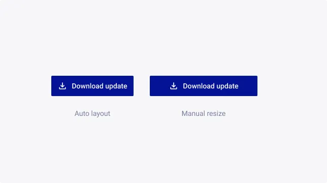
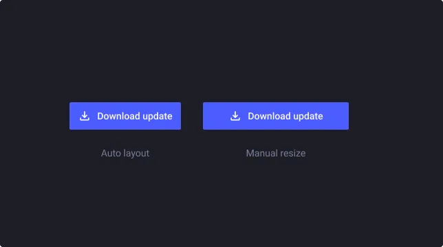
By default, the button has an automatic horizontal sizing based on its content. It will grow depending on the length of the label inside of it.
To manually adjust the size, for full width buttons for example, you need to apply a “Fill container” sizing setting to the “Base Button” layer
Usage Guidelines
Labelling
Buttons labels describe the action that will occur when the user uses it. It is important to choose the right words to make the action clear for the user, and facilitate its decisions. Using the wrong words on button labels can create confusion, more work, and slower task times for the users.
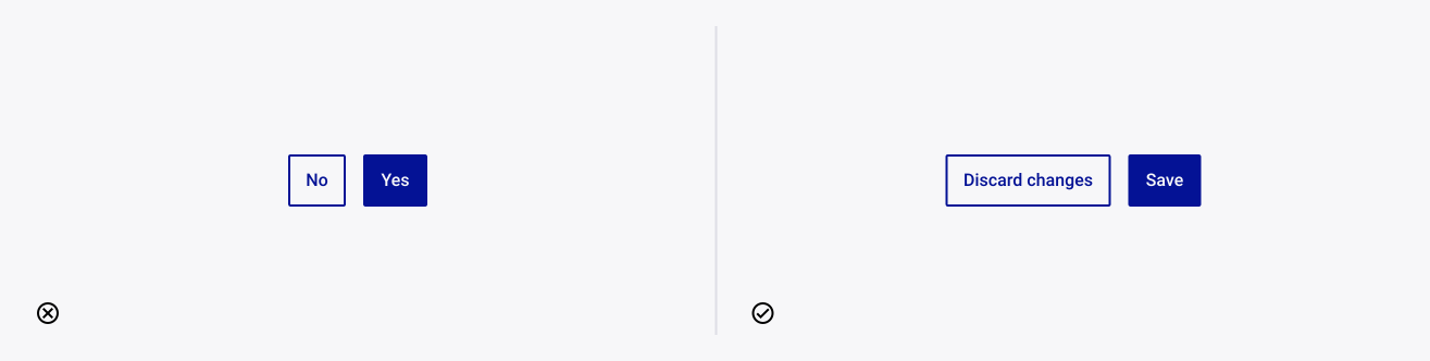
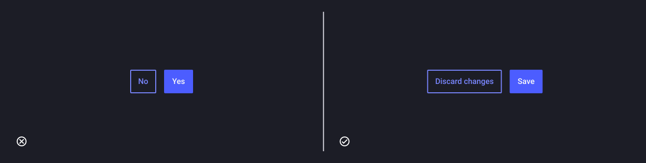
Prefer action verbs than generic terms
Words should describe the action or result of pressing/clicking the button. According to some studies, (e.g. Paradox of the Active User) most people avoid reading whenever it is possible. That is is why naming a button with “Ok” or “Yes/No” won’t help them in any way. Instead, use action verbs to encourage users to take action without necessarily read the dialog.
Choose precise and specific words
Each action verb can have a specific connotation. Using imprecise diction can make users misinterpret the button. Moreover, a vague and generic label can cause uncertainty in users, who won’t be sure of the result of their actions.
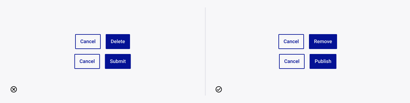
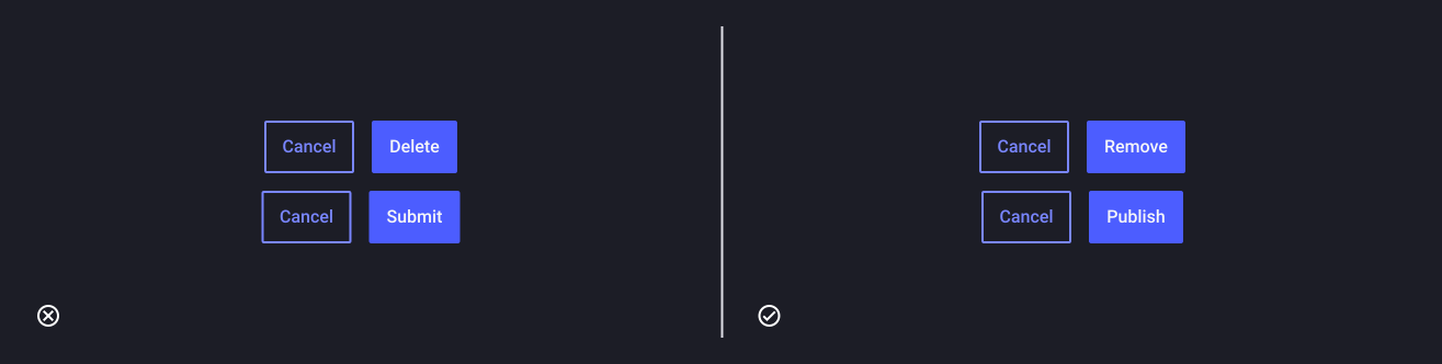
- For example, “delete” and “remove” are similar in meaning, but can have a different connotation. “Delete” implies that the button will erase something from the system while “remove” implies that the button will separate something from a group. Using these words in the wrong context can cause users concern when they want to press the button.
- “Submit” can be used for many contexts and make the action vague and unclear. In contrast the word “publish” is specific to online publishing, so users will be sure that their post will be posted after they press the button.
Text format
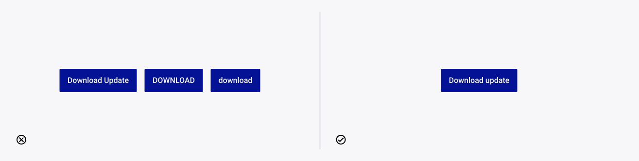
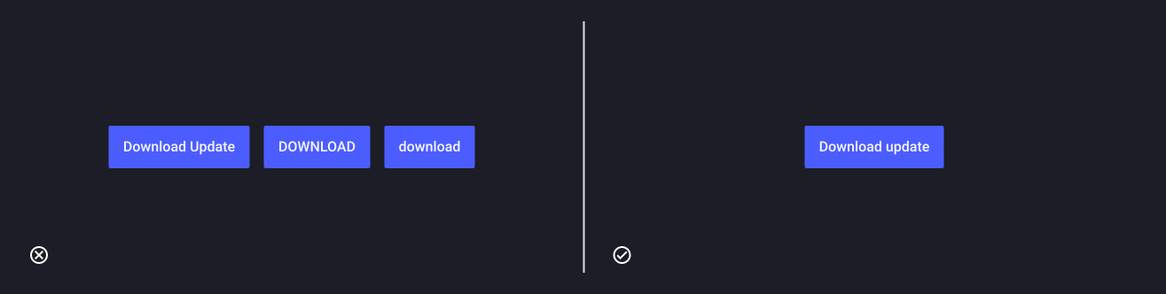
Capitalization style of the button affects the emotional reaction and can either engage or repel them. TDS Foundations recommends that all buttons use sentence case. Sentence cases make the button easier to read, and natural.
In contrast, title-style capitalization has a more impersonal tone, while all-uppercase style decrease readability and conveys a loud and strict tone. Finally, all-lower case style conveys a casual and lazy tone, with a lack of professionalism and trust.
Icons
Icons in buttons can make information easier to find and scan. We recommend to place the icon on the left of the label so users can see it first. Putting the icon to the right of the label won’t help the users scan the button. However, right icon can be set for right-to-left reading usages.
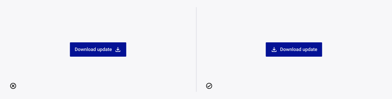
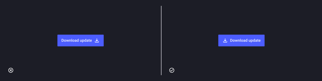
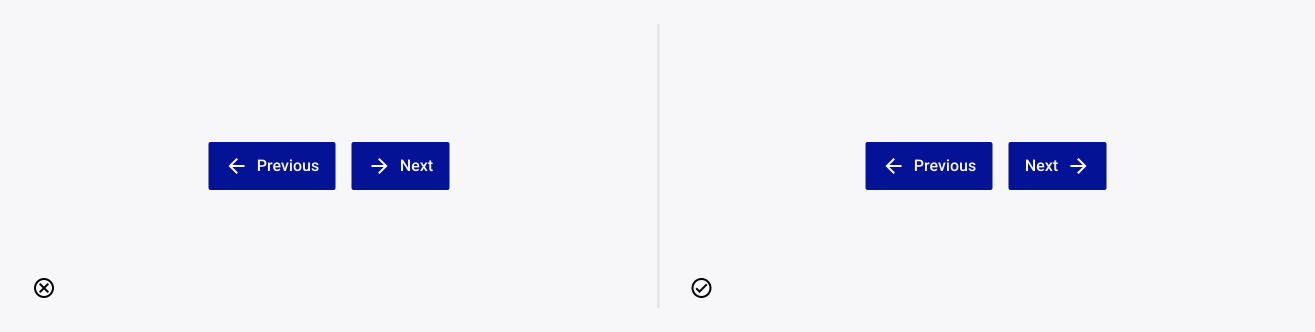
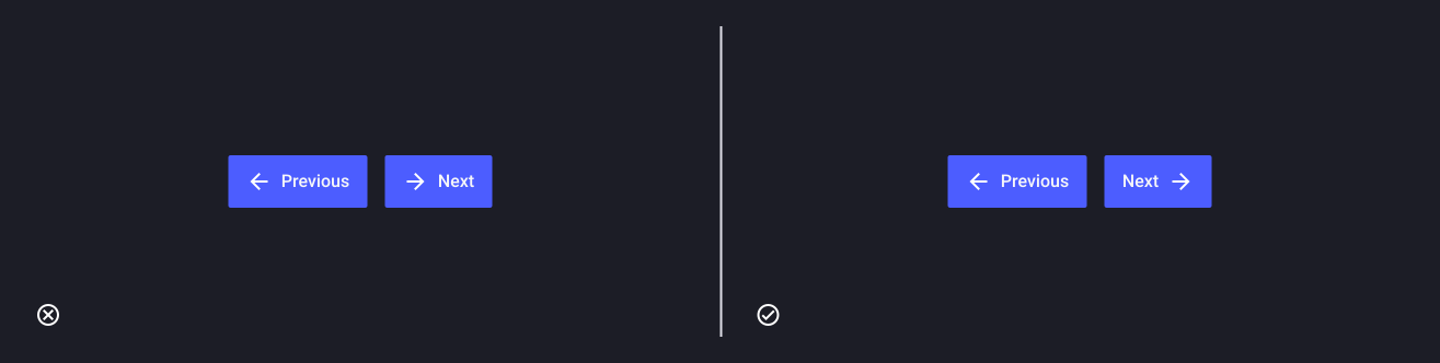
An exception to this is directional call to actions, where it is more appropriate to place the icon in the correct direction of travel for the user on the page (e.g. in order for a user to progress to the next step, in a left-to-right country, they will anticipate an arrow pointing right on the right-hand side of the button).
Icon buttons
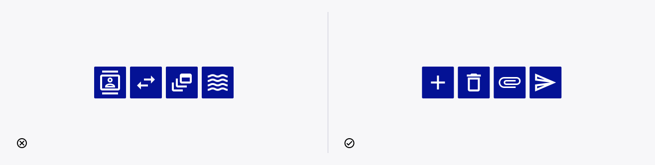
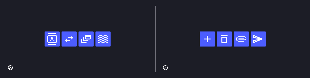
Icon buttons are buttons without visible text labels by default. They are used to perform a quick action on an object (e.g. add, delete, add an item, send…) or trigger a new element to appear on the page (e.g. open a modal, reveal a menu…)
Since icon buttons don’t display an explicit labelling, it is important to use a clear visual representation of the action it will trigger.
Use the 5-second rule
Icons should always communicate meaning. Don’t overuse them or use them for decoration.
When you are trying to come up with your design for icon, consider adopting the five-second rule. “If you take more than 5 seconds to come up with that object that will represent that idea or concept, then it is less likely that your users can see that design and associate it with that object.”