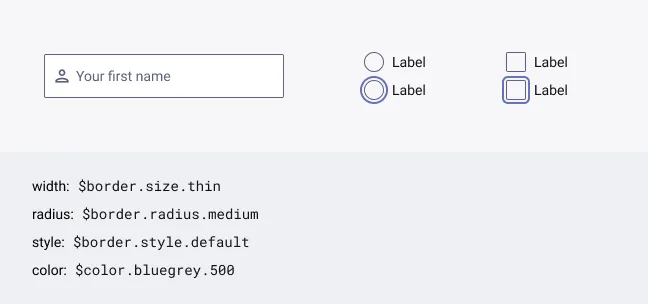
Borders
Borders are used across composition elements to visually contain, separate or highlight some part of the interface. In combination to space and size hierarchy, borders strengthen the visual flow of an interface and offer discrete visual hints to help the user scan through the content and get their bearings.
Borders are made of a set of properties:
- Size (width)
- Radius
- Style
- Color
In the last section below, you’ll find some examples of borders combining those properties and also presets that are approved in the Quantum design system.
Specifications
Border size
The size of a Border refers to its thickness. Why the term “size” has been favoured against the term “width” is explained later in the documentation below.
| Asset | Token name | Raw value | Rem value | Usage |
|---|---|---|---|---|
| $border.size.none | 0px | 0rem | Equivalent to no border (border: none) | |
| $border.size.thin | 1px | 0.0625rem | Used for dividers and form inputs | |
| $border.size.medium | 2px | 0.125rem | Used as the default value | |
| $border.size.thick | 4px | 0.25rem | Used for active indicators |
Border radius
The radius of a Border refers to the roundness of any of its angles.
| Asset | Token name | Raw value | Rem value | Usage |
|---|---|---|---|---|
| $border.radius.none | 0px | 0rem | Equivalent to sharp borders (border-radius: none) | |
| $border.radius.medium | 2px | 0.125rem | Used as the default value | |
| $border.radius.large | 4px | 0.25rem | Used for focus rings | |
| $border.radius.full | 1000px | 62.5rem | Used to get a full rounded style effect | |
| $border.radius.circle | 50% | - | For developer usage only |
Border style
The style of a Border refers to its appearance. Different border styles exist but only the solid style is allowed in Quantum for now.
| Asset | Token name | Value | Usage |
|---|---|---|---|
| $border.style.default | solid | Used as the default value |
Border color
See the semantic colors in Quantum Foundations to know which color to apply on a Border.
Application
The use and application of border token values is pretty straightforward but can be hijacked in some use cases where it visually appears as a border but is, in reality, a container element.
Examples
No border is still border
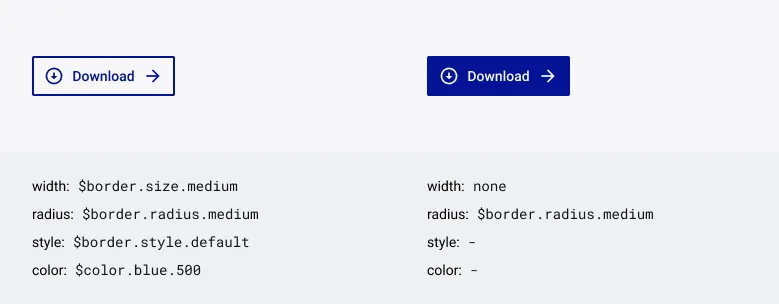
For example, with the Button component. The Button outline variant has a clear visual border but the Button filled variant, even if no visual border is visible, still has border properties applied to it.
Full rounded Vs. Circle
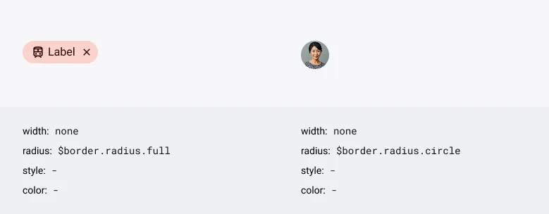
Even if the visual end result can be similar in some setups, there is a difference between the full rounded radius and the circle radius. Full rounded radius is used when the shape does not require to be a circle. Circle radius has to be used when the shape must be a circle. For designers in Figma, there is no difference between the two because a % value is not allowed. You have to use a large pixel value like 1000px so whatever the size of your element will be you can guarantee that the visual end result is full rounded. For the developers however, the circle value is better suited when you need a circle shape like an avatar (see example on the right).
Indicator & Separator
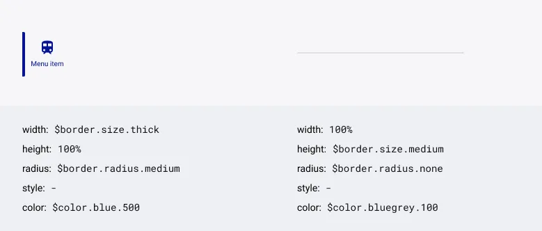
Some visual elements look like borders but in reality are container elements with height and width. For example an active Tab indicator or a section separator. In this case, border guidelines are adapted to a container element. The container element width is used as the border width and the block background color as the border color.
As stroke/outline/border lookalike, they must use the specific tokens for borders.
This also explain why the term “size” has been favoured against “width” to name the tokens for borders.
Regular border presets
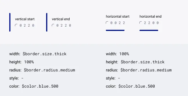
Active indicator
- Is a container element
- Always use a thick size in width or height
- Always use a medium radius on relevant corners
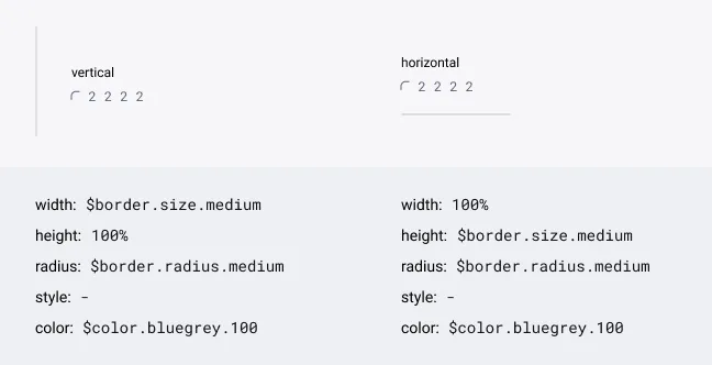
Divider line
- Is a container element
- Always use a medium size in width or height
- Always use a medium radius on all corners
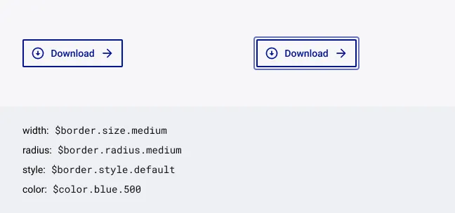
Button
- Is the border of the component container
- Always use a medium border size for Button outline
- Always use a medium border radius
- Use the large border radius for the focus ring
Input
- Is the border of the component container
- Always use a thin border size
- Always use a medium border radius
- If not a circle, use the large border radius for the focus ring