Data Tables
Tables are containers for displaying information. They allow users to quickly scan, sort, compare, and take action on large amounts of data.
Problem
When reviewing table components across the Thales organisation, the Core Team recognised that the tables were inconsistent - they had a diverse range of competing UX decisions. The sizing placement of links and CTAs, filtering, sorting and pagination were all over the place.
We needed to define a pattern in Quantum that could universally serve all use cases across all digital products and serve future products and features.
Purpose
In order to define the patterns that shape the Quantum Table component, it is important to establish the purpose of the component. Hence, the following statements have been agreed to describe the purpose of the table component:
- To browse large amounts of information at once, such as assessing showing multiple items and their statuses.
- To determine and execute actions quickly, such as deleting or moving multiple items.
- To compare information, such as how many items are completed versus how many are in progress
Options
The Table component needs to cater for a variety of user needs across the business lines and therefore, a diverse range of options to build your table must be available. These are outlined below:
Types
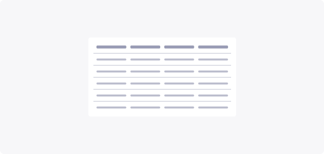
Standard table
Simple data tables are intended to define a list of values of data types that have a simple structure.
Expandable table
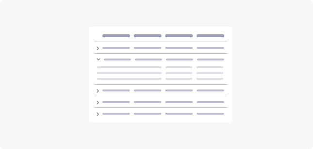
Expanded view enables the users to expand and collapse the row for an optimum use of the display. This means they can instantly expand to view more details and collapse when not necessary.
Layout
Density
Data tables support three densities:
- Small (S) for condensed amount of data
- Medium (M) as default
- Large (L)
When users view and interact with large amounts of information, high density components can improve the experience.
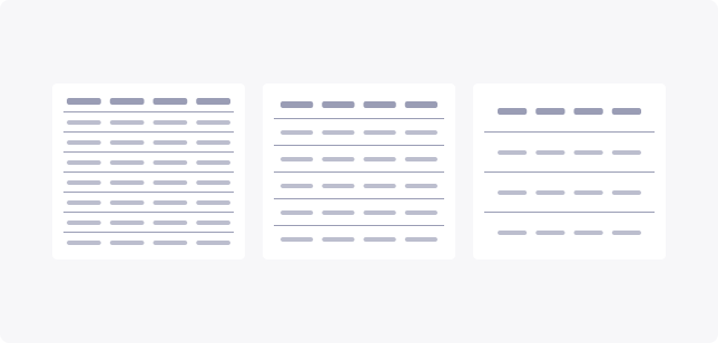
Table Style
The style of a row can be a big factor in how easy it is for users to scan and read when looking to find data quickly. So, when designing a table element, you should also try to choose the row style that best suits the overall style of your platform.
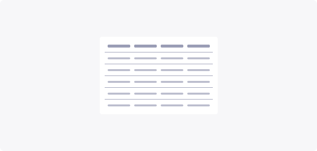
Horizontal lines (Dividers)
Only showing horizontal lines reduces the visual noise of a full grid. This style includes plenty of white space while still helping the user keep their place while reading.
This style is the most common and recommended for all data set sizes.
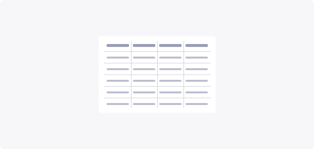
Grids
Including both horizontal and vertical lines provides the most separation between data points, but the excess visual noise can be distracting.
This spreadsheet-style is recommended for dense, data heavy tables.
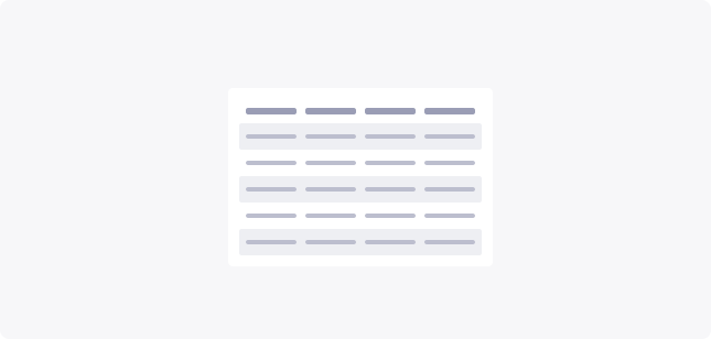
Zebra stripes
Alternating different color backgrounds for each row is another good way to help users keep their place while reading.
This style is recommended for larger data sets where the alternating pattern will be clear and not cause confusion that a particular row is highlighted.
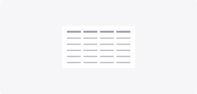
Free forms
With no horizontal or vertical dividers, this style of row is effective in reducing visual noise and can also produce a very minimalistic look.
This style is appropriate for small amounts of information, where users don’t need too much assistance when following the information.
Row Behaviour
Depending on the importance of the table and the information provided in each row, it is necessary to provide varying levels of abstraction within the row of a table.
Single row
Single rows are used to present primary information.

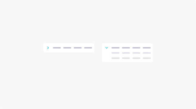
Expandable row
The expandable row is useful for displaying secondary information about an item, without having to navigate to a new page.
Not only does this maintain the abstract information of the item, but it provides an expandable/collapsible option that is triggered by a chevron icon.
Multi expandable row
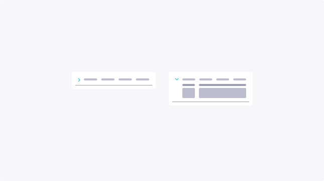
Multiple expanded rows are used when there is a list of sub-items within a row item.
The columns within a Multiple Expanded Row can follow different column headers than the main table.
Utilities
Table utilities are best described as the “tools” that help customise the level of information that is presented to the user. Whether that be filtering a list of items or sorting them to improve scannability.
Total entries
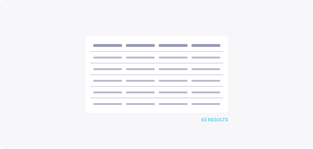
Displaying number of data entries is recommended to help the user consider the quantity of data they are dealing with. Especially when using search and filtering features.
Toolbar
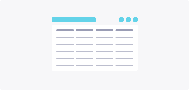
Some data tables require advanced features like search, settings, filtering… In these specific cases, you should create a dedicated toolbar for your data table to include these capacities.
Pagination
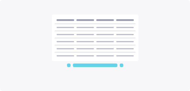
It is often recommanded to break long tables into several pages. When doing so, make sure to include a pagination system. Users need to understand on which page they are at the moment, and be able to navigate to other pages.
When doing pagination, consider giving the users the freedom to choose how many rows they want to be displayed.
Behaviour
Resizing
The data table component should provide two types of horizontal resizing methods: Fixed or Fluid.
Fixed

Fluid

Sticky header & column
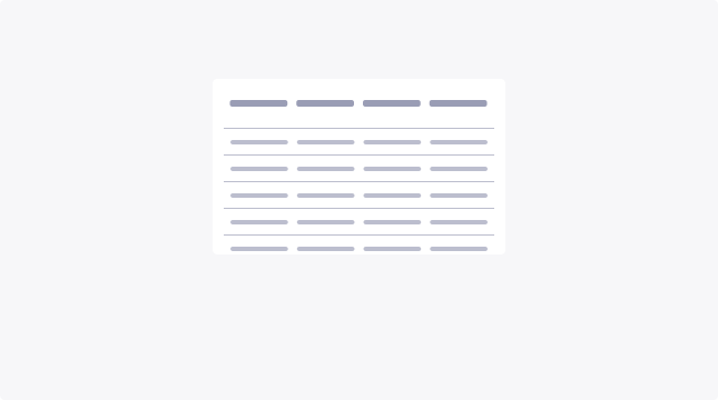
Sticky header
A sticky header allows the end user to always be aware of the data type they are looking at thanks to the header. It is very helpful in a very long data table situation or when you need to create scroll zones.
Sticky column
Sticky columns are used to emphasize on a certain type of data, allowing the user to quickly create a functional or logical link with the rest of the data. Also, very helpful when the data table is very wide or you have restricted space and need to create a scroll zone.
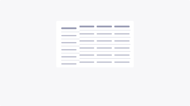
Table interactions
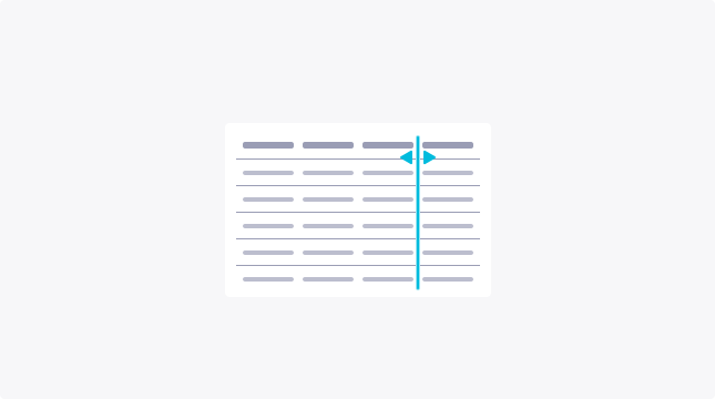
Resizing columns
To optimize readability on the end user side, and when you have a cluttered amount of columns, it might be smart to consider giving the capacity to resize the columns as they need.
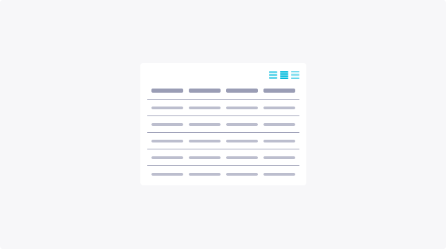
Toggle density
You can include toggle buttons to let the user switch between densities (Small, medium, large) depending on their preferences.
Filtering data
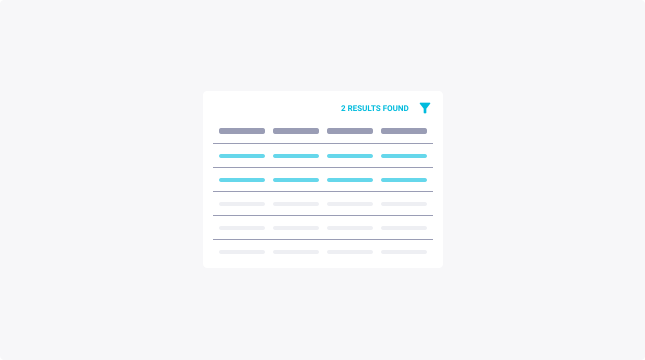
Include filtering capability to allow users to apply specific parameters in order to see only filtered data. This can be applied at the table level globally in the toolbar, or filter at a specific data type level in the header.
When displaying filtered data, consider displaying the number of results.
Row interactions
More actions
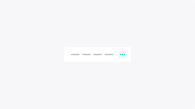
Allow the user to access multiple actions on the same row with a “More actions” button. This will save a lot of space and reduce information overload.
Hover actions
Presenting additional actions when a user hovers, helps to reduce visual clutter. However, it can cause discoverability issues because the user needs to interact with the table to expose the presentation of actions.
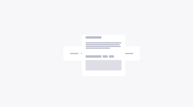
Row details: modal
To apply modifications, updates or actions on a row, you can allow the user to click on it to scale it up in a modal view. It can also allow you to display more information about the row (i.e full truncated texts, images, …)
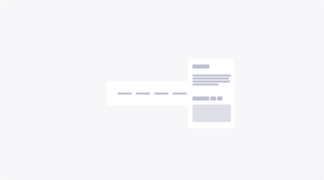
Row details: side panel
The side panel has the same interest as the modal but doesn’t prevent the end user from interacting with the rest of the table, whereas the modal does.
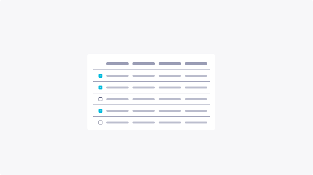
Multi-select & bulk actions
Allow the user to select multiple items and update/edit them at the same time. Once the user has selected rows, actions in the header or above the table should have a common impact on them. This helps the users save a lot of time.
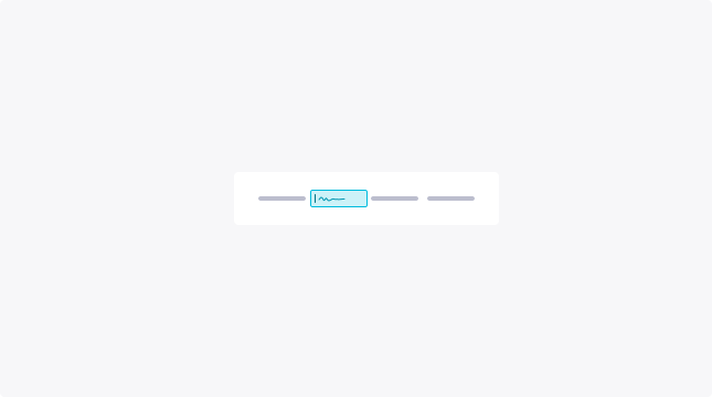
Editing data
Single cell edition
Allow your users to edit a single data cell by providing a data input field when the user clicks (or press the Enter key if focused) on the cell or on the edit button.
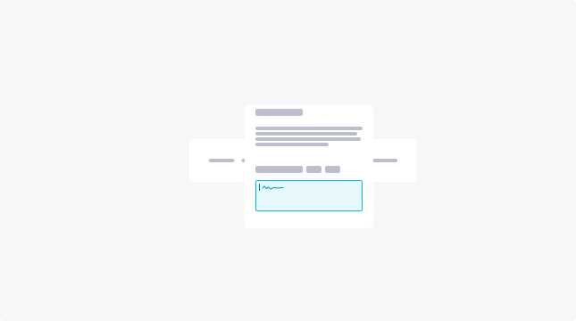
Modal
Allow your users to edit the data when the users open the row details in a modal view.
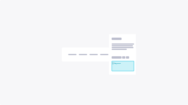
Side panel
Allow your users to edit the data when they open the row details in a side panel view.
Usage Guidelines
Readability and discoverability
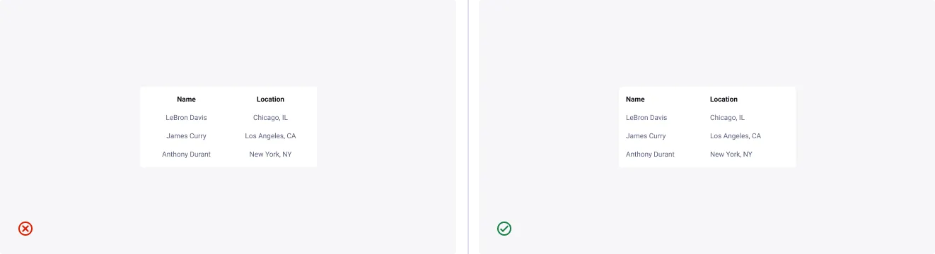
Left align textual data
Textual data is always left-aligned within a table to improve scannability. Column headers follow the alignment of the data and therefore will too be left aligned.
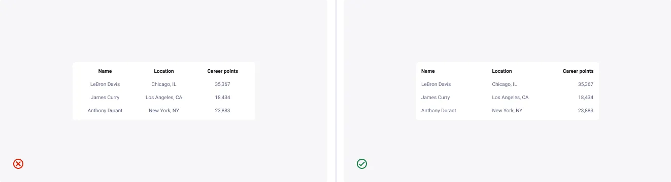
Right align numerical data
Numerical data should generally be right-aligned for the ease of scanning and comparing.
However, numerical data can be left aligned if the numbers are arbitrary identifiers, also known as “nominal numbers,” which means they can’t be compared or combined arithmetically (e.g., postcodes, IP addresses, phone numbers). Column headers follow the alignment of the data.
Units of measure
Numerical data will sometimes require units of measure to help indicate to the user what data is necessary to communicate values of that physical quantity.
It is recommended that units are presented alongside the data within the cell, for clear and consistent readability.
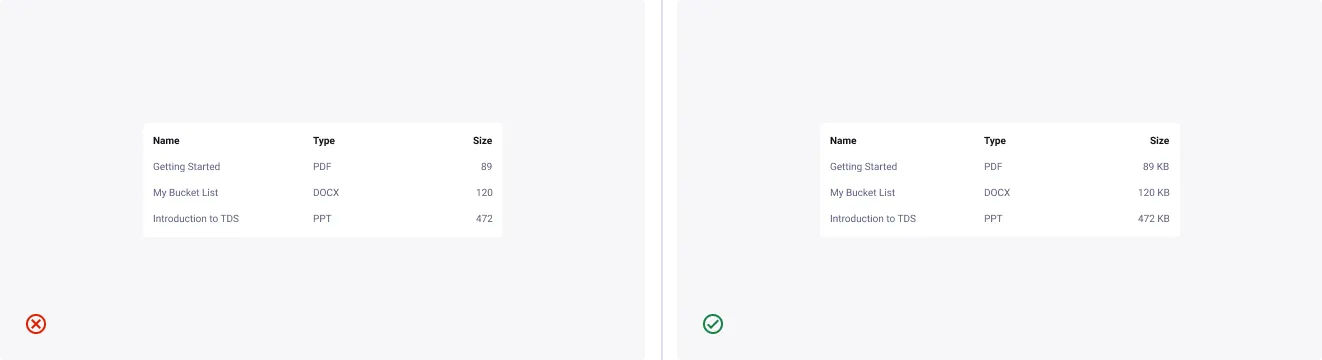
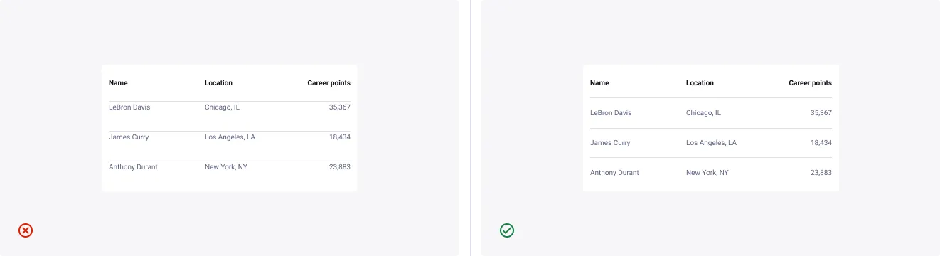
All data should be centred vertically
By vertically centring all data, the table offers a sense of visual balance regardless of the complexity of its contents.
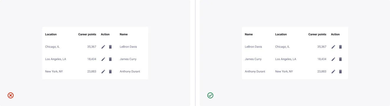
Arrange columns in order of importance from left to right
- Don’t: put secondary information on the far left, it will imply to the user that it is most important.
- Do: present columns in a logical order for the user.
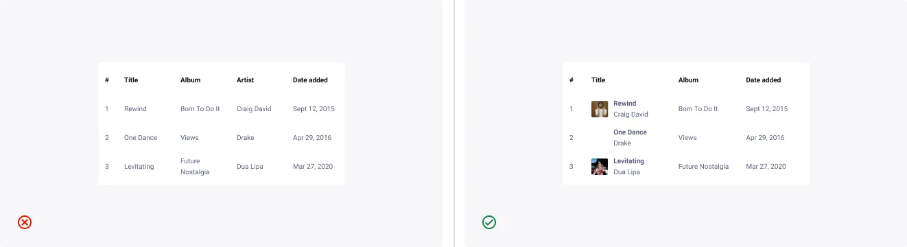
Use imagery where appropriate
- Don’t: simplify the table with purely textual and numeric data if there is a more accessible opportunity to present information.
- Do: use relevant imagery to elevate your data, and create a more obvious trigger for your users.
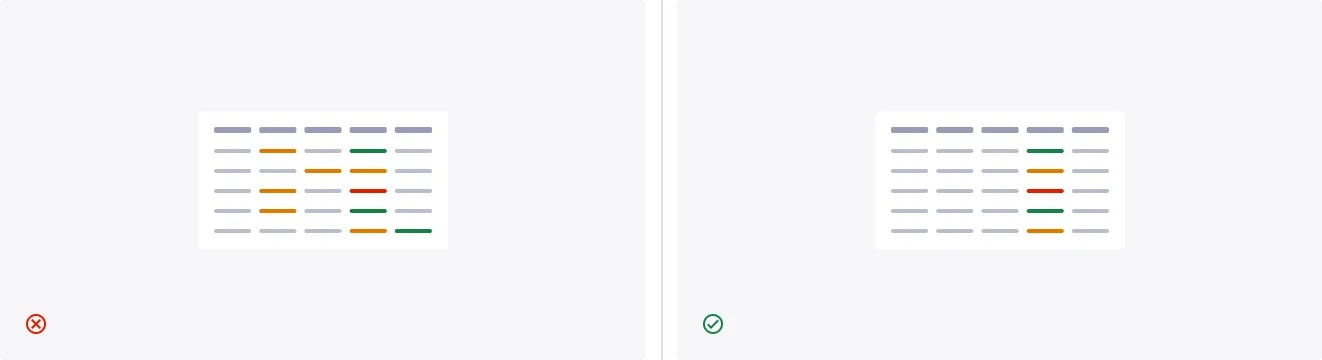
Avoid using too many colors
- Don’t: overcrowd the table with numerous states and visual indicators. It will confuse users and make the information difficult at the beginning.
- Do: minimise the use of visual signs, providing clarity on the important pieces of information.
Truncation
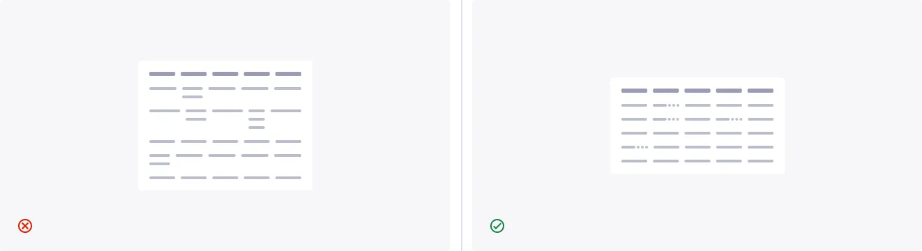
- Don’t: use inconsistent row heights to cater for text wrapping, this makes the table harder to scan.
- Do: use truncation for consistency and scannability, while maintaining visual balance in row height.