news
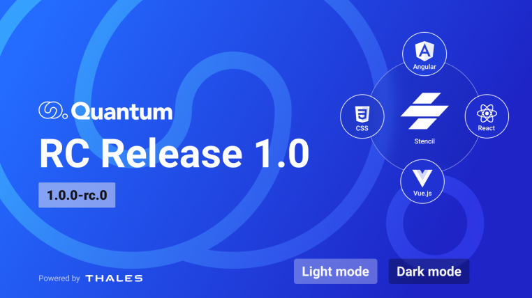
July 7, 2023Quantum Design System RC Release 1.0
Quantum RC Release 1.0 milestone achieved (as Release Candidate for next Stable Release). Discover what’s in the box, packages details and release note.
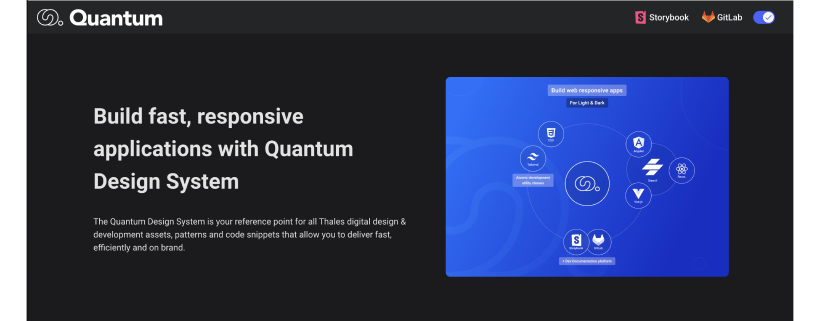
A Significant Milestone
After 26 months of development & refinement based on Thales developers users feedbacks, the Quantum Core team finally published the first Release Candidate 1.0.0-rc.0 (2023-07-05). This step is key in our journey to deliver a Stable Release by the end of year for the Dev packages of the Design System.
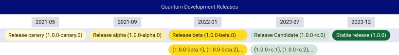
In this stage of product stabilization, all Quantum development packages have been designed, coded, and tested through 30 beta cycles and more than 200 next versions with no known showstopper-class bugs. A RC release means that we flag the version as “final” (no new feature adding and no interfaces editing). Note that the version might have some remaining bugs and will be fixed by the Core team before going to Stable Release.
Help us to consolidate the RC release before publishing the stable one. We need as manny developer users as possible until the end of year to use the Quantum packages and while also raising bugs on GitLab Issues by clicking HERE
For this release the following assets are covered:
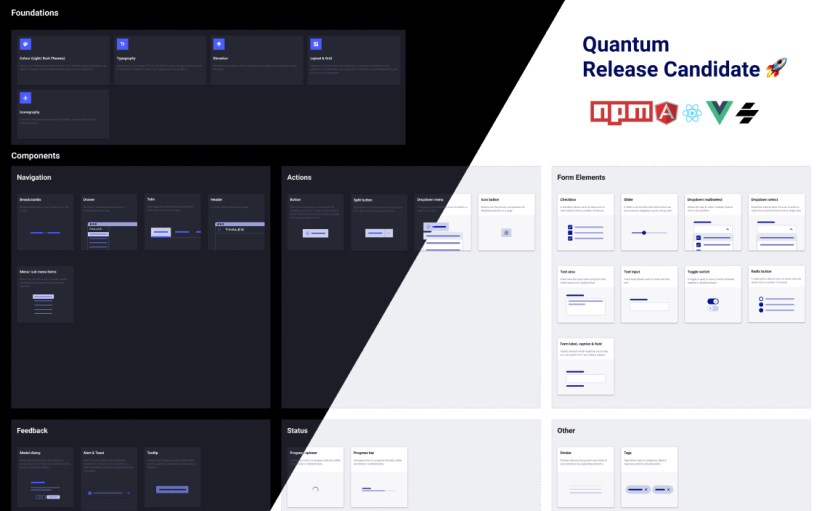
Assets
- Alert
- Breadcrumb
- Button (filled, outline and ghost, with primary, neutral, success, warning, danger and inverted color variants)
- Divider
- Drawer
- Grid
- Header
- Icon
- Menu/sub menu
- Modal
- Progress bar
- Progress circle
- Split button
- Tabs
- Tag
- Tooltip
- Typography
- Checkbox/ checkbox group
- Dropdown select
- Form caption
- Form field
- Form label
- Multi select
- Radio button/ radio group
- Slider (1 handle, 2 handles)
- Text input
- Text area
- Toggle switch
- and all Quantum styles (colors, typo, shadows...) as css utilities
Bug Fixes
- button: button outline border must not visible under a dropdown overlay
- button: click event binded to the button element
- button: fix outline pressed background color
- button: update disabled tokens
- dropdown-select: dropdown select width equal to 100% of its container
- examples: add fonts and icons to angular v13 tailwind example
Other Features
- button: a semantic button in a dropdown should have a pressed style when a dropdown is visible
- button: add semantic colors success/warning/danger for filled and outline buttons in css
- button: label color for success/warning/danger should be bluegrey-900 in darkmode
- button: rename qtm-btn class by qtm-button
- button: replace white color by inverted for ghost button
- button: sementic colors danger/warning/success implementation for react/vue/angular and web components + update storybooks
- button: support props attribute as a stringified object
- tokens: new button tokens for success/warning/danger colors
Where to Start?
If you want to start using Quantum Development packages in your solution? Your teams can access the Quantum Developer Documentation, by clicking HERE