
Finished
supervised_user_circle LAS
QDS Dark theme
Discover how a collaboration between the QDS core team, Quantum Guild and LAS led to a Quantum Dark Theme suited to Thales' complex needs.
QDS Dark theme
Contribute to the Quantum Design System by exploring business Dark theme pattern needs. Succeed in defining the relevant Dark mode for businesses that require enlightened & hard Design decisions; find the right balance between accessibility standards, right level of luminance and brightness for dealing with user’s sight, and still providing a wide colour range. Find out more in this case study.
As the Thales business covers a large portfolio, the QDS Dark theme must be more than what we can find on the market. It must be co-designed closely with operational teams to fit the needs. In 2021, a long journey of collaboration was conducted, starting with the capture of insights from the QDS Guild members and deep dives with the LAS GBU to run a full Dark mode analysis (inc. colours & shades) based on LAS business-oriented use cases.
Quantum project
Scope
Introducing a Dark theme into the QDS is a key cornerstone of the design system. Dark surfaces reduce luminance and provide safety in dark environments, they minimise eye strain and play an important role in deafferenting the visual hierarchy and increasing the layers stack capability in comparison to the light theme.
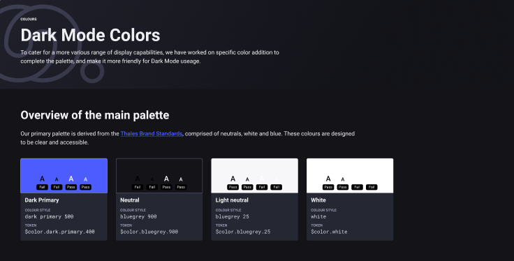
Since early 2021, based on the Thales brand standards, the QDS core team considered foundation colours which were accessibility checked and compatible with both, light and dark modes. After continuing to build the rest of the QDS foundations, initially focusing on the elevation (shadow) patterns, design decisions were consistent for light mode and became challenging for dark mode implementation. In dark mode, the elevations, and subsequently, the dividing layers were not emphasised enough to support the intended visual hierarchy.
Although Design industry standards provided some answers on how to provide dark mode, it was obvious that the Thales needs went beyond the implementation of a basic dark mode.
The collective knowledge, insights and experience of the guild was needed to face this challenge. In mid 2021, a workshop was scheduled where guild members presented their dark and light layout patterns, design choices and rationale. The team explored common palettes, shades for dark mode, and how to maintain accessibility when adapting colours while switching between light and dark mode. This workshop was an important step in defining a baseline inventory of needs as a basis for development of the QDS Dark mode.
In parallel, a complementary study was launched in the last quarter of 2021, where LAS provided valuable expertise based on their experience of implementing business-orientated and complex Dark surfaces within the GBU. Based on this, the LAS Team helped to drive a full Dark mode analysis, leading to the contribution and definition of proper Dark colours and shades.
From this basis, the case study proceeded with the following objectives:
- Apply Quantum foundations colours on 3 LAS dark theme-based use cases and identify points of friction regarding the primary, secondary, tertiary, semantic, layouts and elevation colours
- Provide business constraints and expectation recommendations to build the Quantum dark theme compatible with business dark theme needs
- Provide the complementary and required colours & shades in order to extend the QDS palette
- Challenge the QDS new palette with LAS IAS/ AMS design teams in order to review and validate the new proposal with pairs
- Provide the estimated migration cost to update the colours on LAS ATM products with the new Quantum colours styles
Outcomes
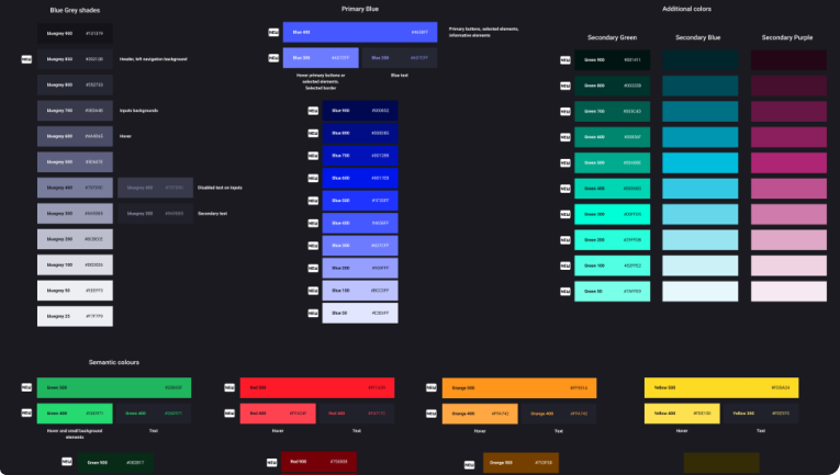
This project allowed us to explore several leads for the Dark primary selection and more. The Thales primary light blue colour was not coherent with the ecosystem and required too much rework in the text colours to be harmoniously implemented. A test of the Royal Blue was too bright and introduced a lack of visibility on a screen, plus key shades were missing for the elevation surface. After many experiments, a new lighter shade blue has been created as the primary blue for Dark mode. New variants of the semantic colours have also been created and the lack of a grey shade has been addressed.
The finalised QDS extended foundation colours were submitted for pair review at a workshop where the LAS IAS and AMS design teams incorporated the outcomes of the exploration into their products. The idea was to test the usage of the QDS colours with designers who were not part of the analysis, nor familiar with the QDS, thus enabling the collection of minimally biased feedback.
Today, the QDS has been extended with a diversified and consistent range of new colours and shades that are aligned with the Thales brand and adhere to accessibility standards, and with luminance and brightness levels that are adapted to the Thales portfolio. This case study is a great success story. It demonstrates the power of collaboration inside Thales and highlights the skills and expertise we have across the company. We are proud of the achievements, especially as only a few of the well-known Design Systems have produced a Dark mode that supports complex business cases.
Migration
With a QDS Dark Mode now a reality, the LAS team assessed the migration costs of updating their products with the new colours and shades. The migration was estimated to require 1 day of effort, meaning LAS products could easily be aligned to the QDS with minimal effort.
Deliveries
- QDS foundations extended with colors & shades for Dark mode
- Published into the QDS foundations and fully documented on-line
