
Rethinking the Material 3 Color Preview for Better Legibility

When our Design System team needed to create a Material 3 theme based on our specific design tokens, we naturally started with the official suite of tools provided by the Material team:
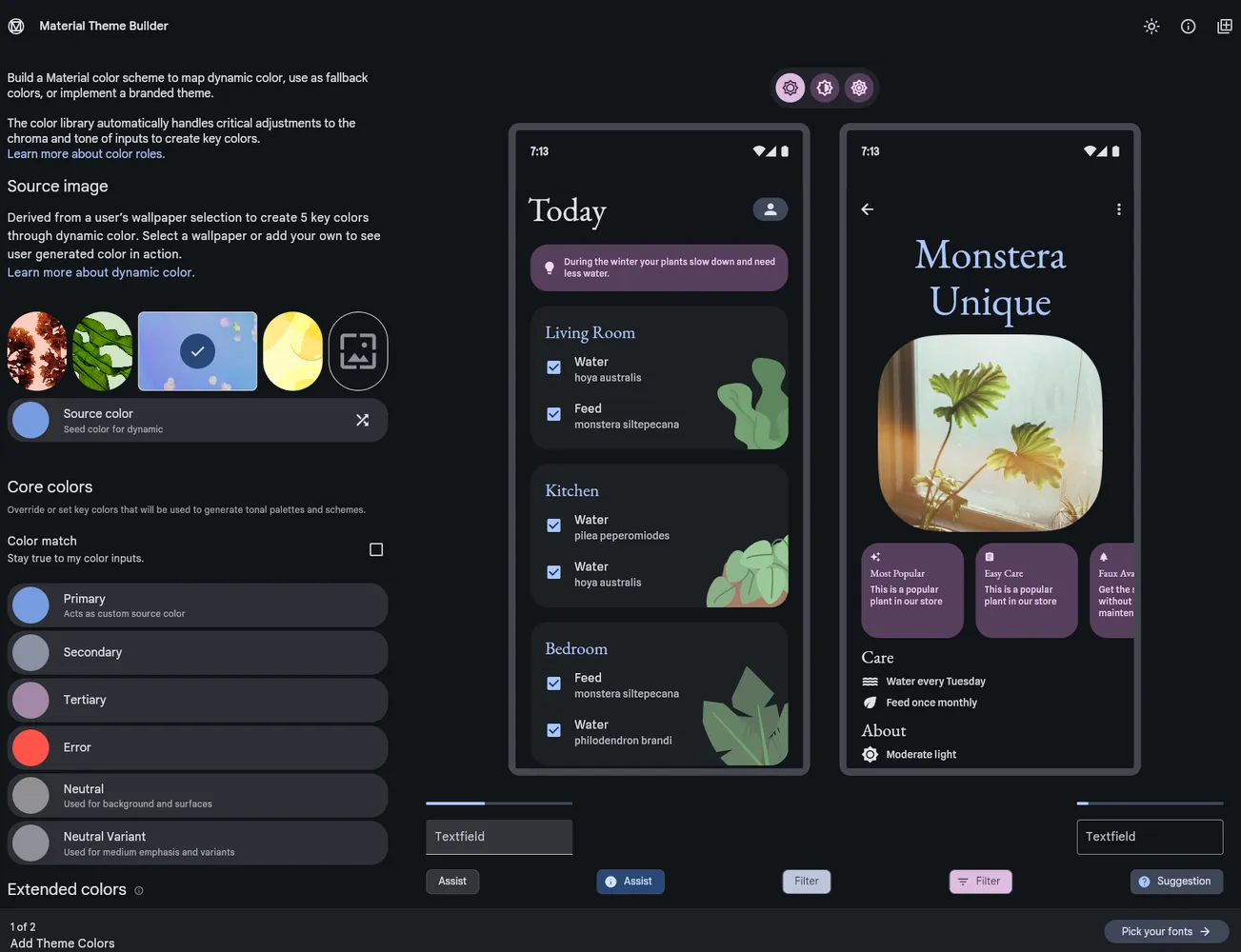
These official tools are excellently crafted. They allow you to select a source color or set core seeds and instantly see the rendering across different views. However, we quickly ran into limitations regarding our specific workflow: we wanted to explicitly define every single color token ourselves. Unless we missed a hidden feature, the official tools seemed primarily focused on generating primitive palettes from seed colors and programmatically mapping those primitives to the right semantic variables, rather than allowing granular overrides at the individual token level.
Since we needed a functional theme on a tight deadline, Edgar Lechaudel vibe-coded a custom editor that gives us full control. While the underlying code is ugly as hell, it serves its purpose perfectly as it was never meant to be a polished consumer product, just a powerful internal tool.
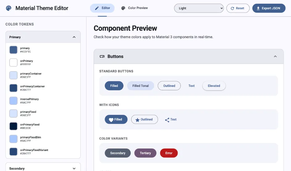
Our custom tool allows us to tweak individual color tokens, toggle between color modes, reset settings, and export the final theme as a JSON file.
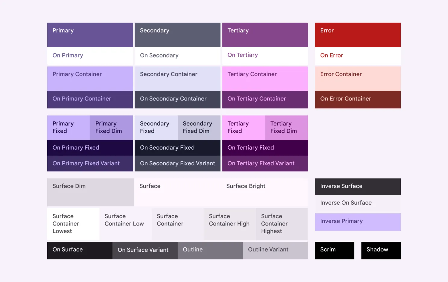
However, even with this control, we hit a snag with the standard color preview layout used in the official Material 3 documentation.
First, the Figma plugin does not seem to support rendering a custom Material 3 JSON configuration as-is. When a JSON file is uploaded, the plugin rewrites the custom definitions using its own color algorithm, regardless of the selected settings.
Second, in the standard view, each color is shown as a background box (e.g., Primary, On Primary). We found the “On {Color}” logic particularly counter-intuitive to visualize this way.
For instance, if “On Primary” is white, you have to look at the background of the “On Primary” box to see the actual color, while the text inside that box (usually the Primary color) can be misleading. This cognitive load only increases when dealing with the Surface semantic colors with several background and foreground combinations.
Recognizing that we might be approaching this with “newbie” eyes, we developed an alternative color preview strategy. Instead of isolated boxes, our tool displays a comprehensive color overview where:
- Each semantic background color is represented as a distinct colored surface.
- Compatible foreground colors, such as text and outlines, are rendered directly onto these surfaces.
- Color token names are positioned outside the surfaces to maintain visual clarity and independence.
This layout enables instantaneous assessment of legibility and contrast in real-time.
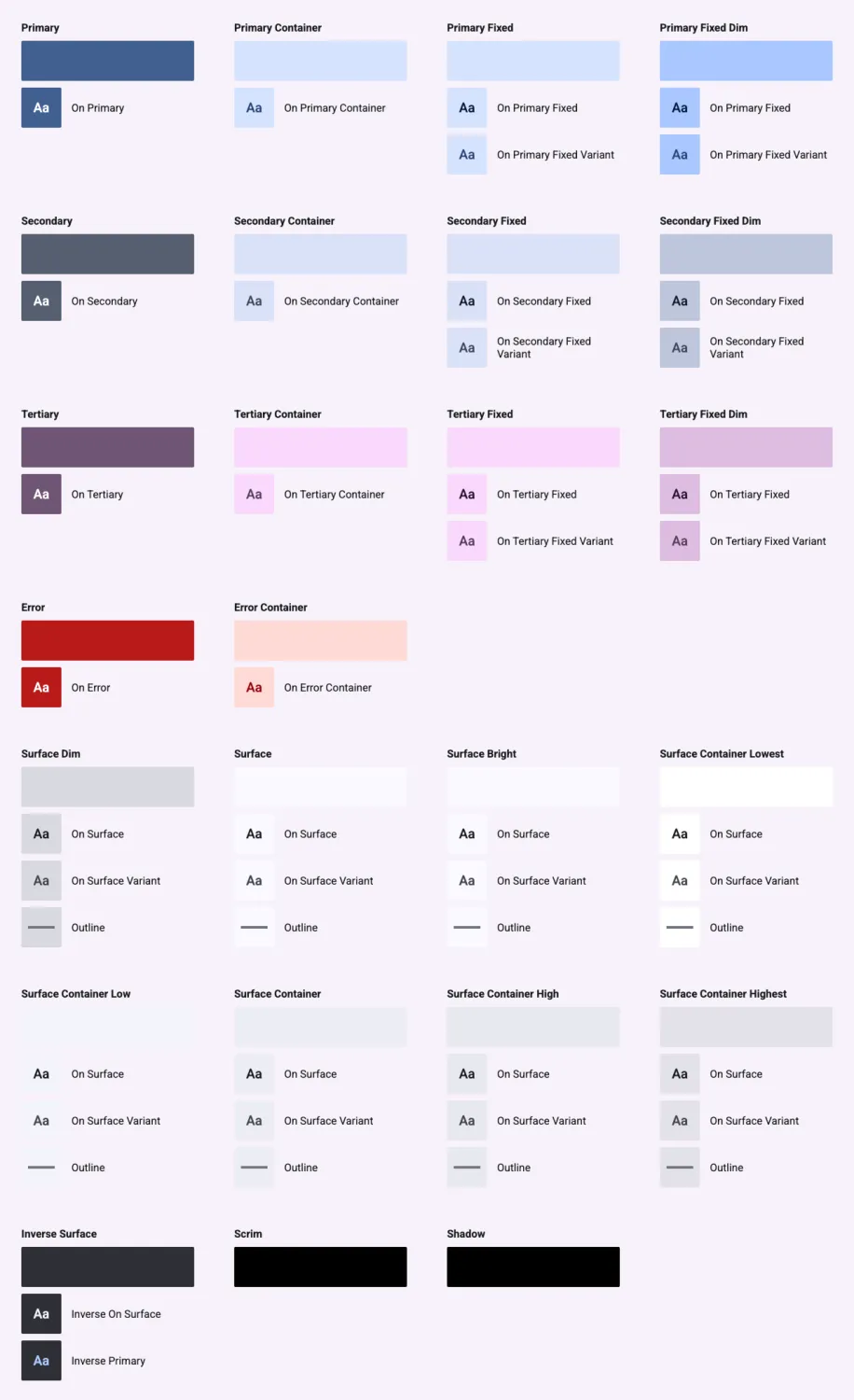
This view provides a clear WYSIWYG map of the theme’s accessibility. While there might be edge cases or M3 concepts we’ve interpreted uniquely, this approach gave us the clarity we needed to finalize our theme.
We believe this visualization style could be useful for other teams struggling with the abstraction of the “On” color system. Feel free to adopt this layout in your own documentation or tools.
As for our vibe-coded custom editor, if you think this granular level of control would be helpful for your own workflow, let us know! If there’s enough interest, we’d be happy to look into cleaning it up for an open source release.